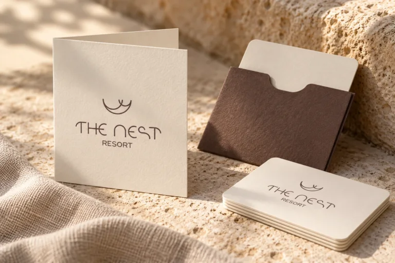
The Nest Resort
Brand naming and visual identity for The Nest Resort in Hersonissos, Crete.

Architecture, translated into identity.
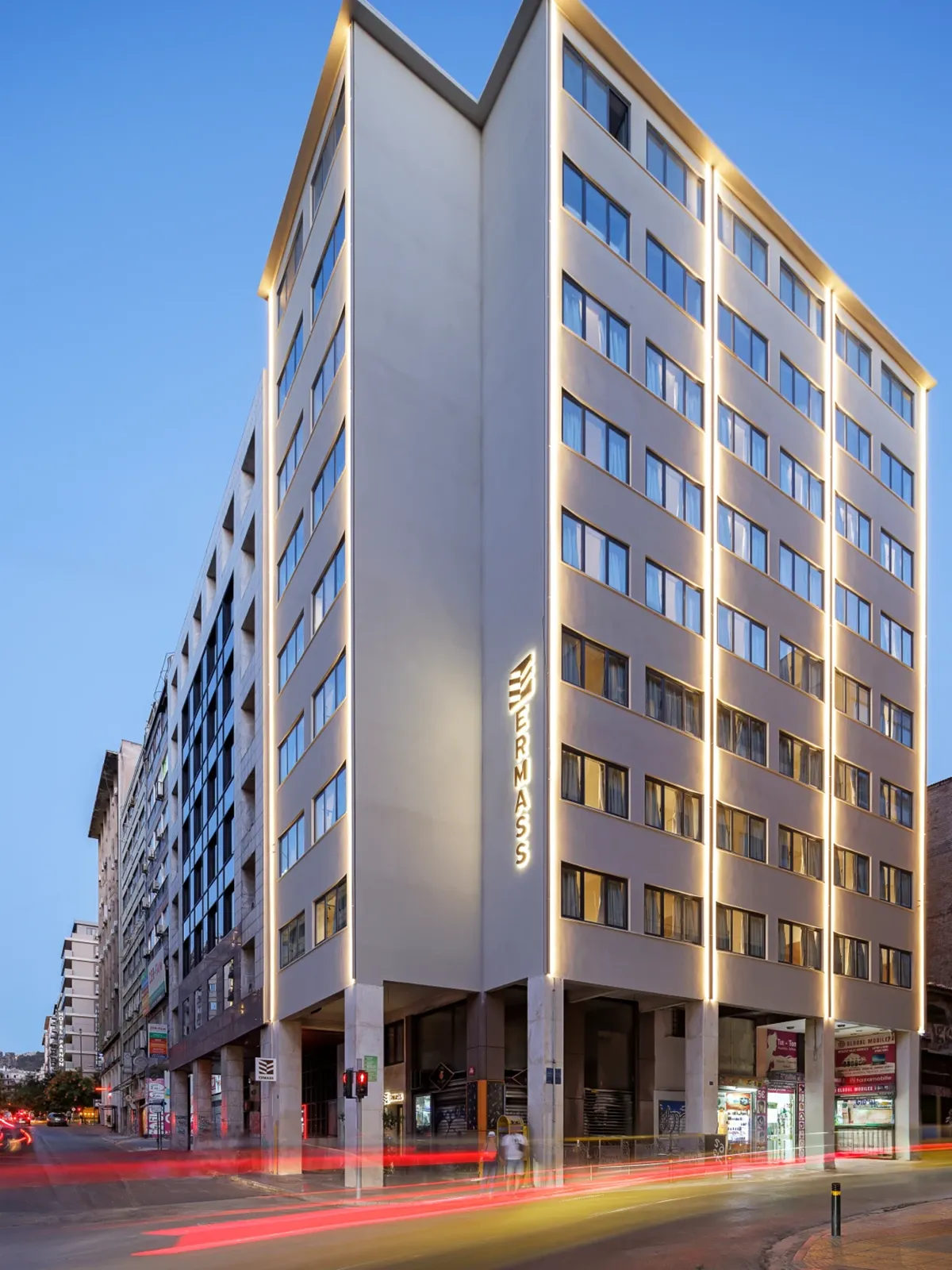
ERMASS brings a contemporary approach to urban hospitality in the centre of Athens, with studios and apartments that connect the comfort of a private space with the rhythm of the city. In 2025, Hello Design developed its logo, corporate identity, environmental graphics and signage in collaboration with MAMAProject.
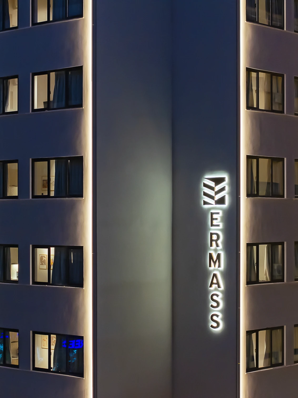
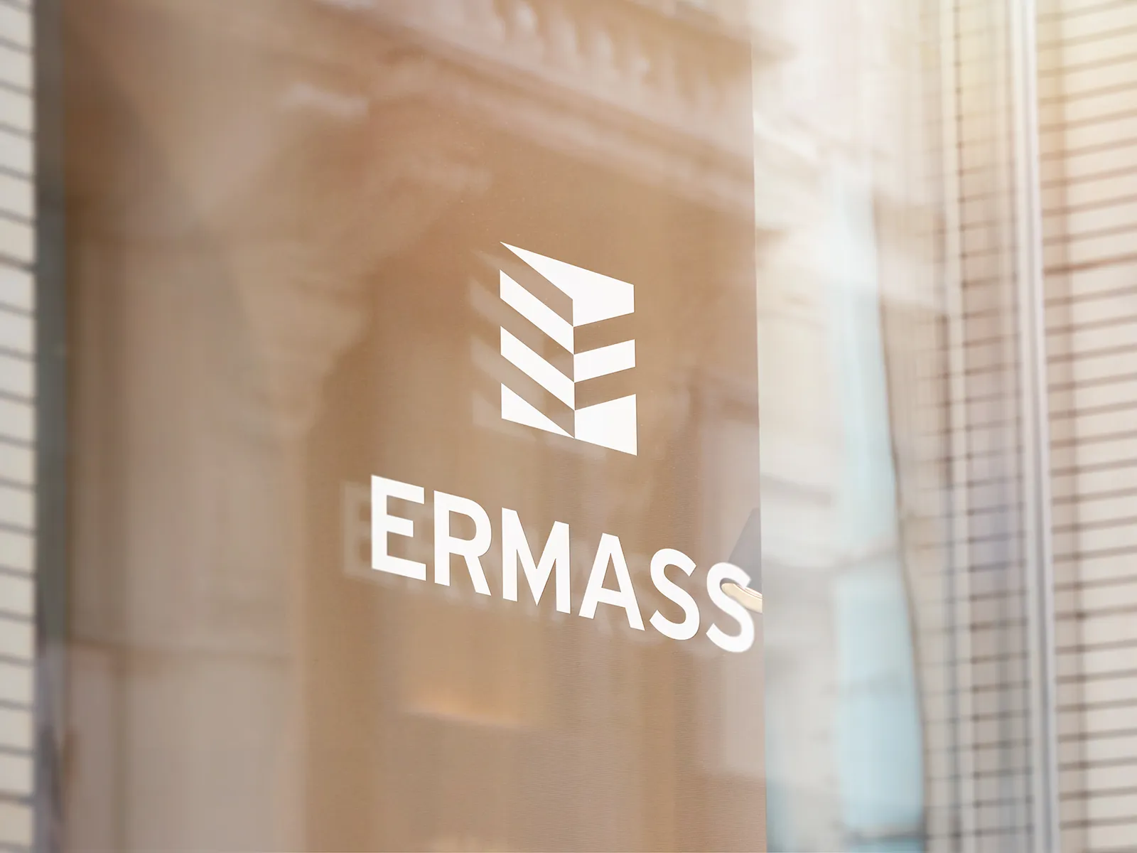
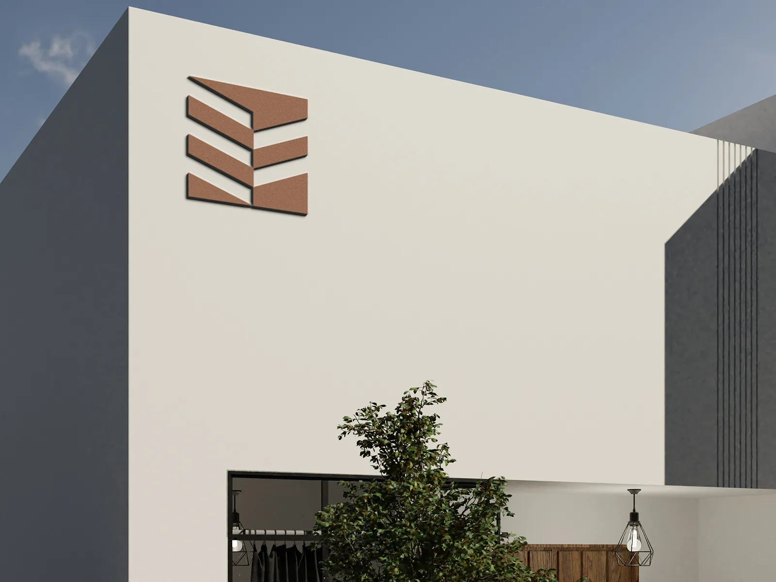
The idea starts with the architecture itself. The recess in the building’s façade, its number of floors and the letter E come together in a single geometric symbol. The stacked forms echo the building’s levels, while the central negative space recalls its distinctive indentation. This gives ERMASS a mark with a direct connection to its own address and architecture.
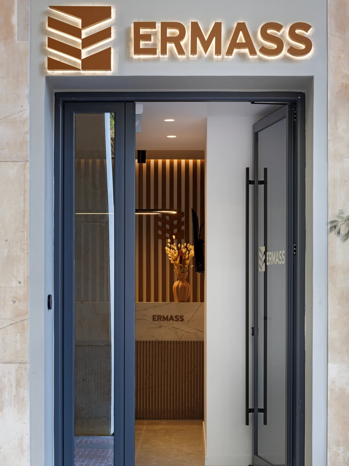
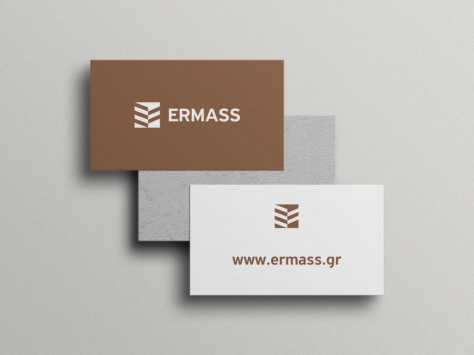
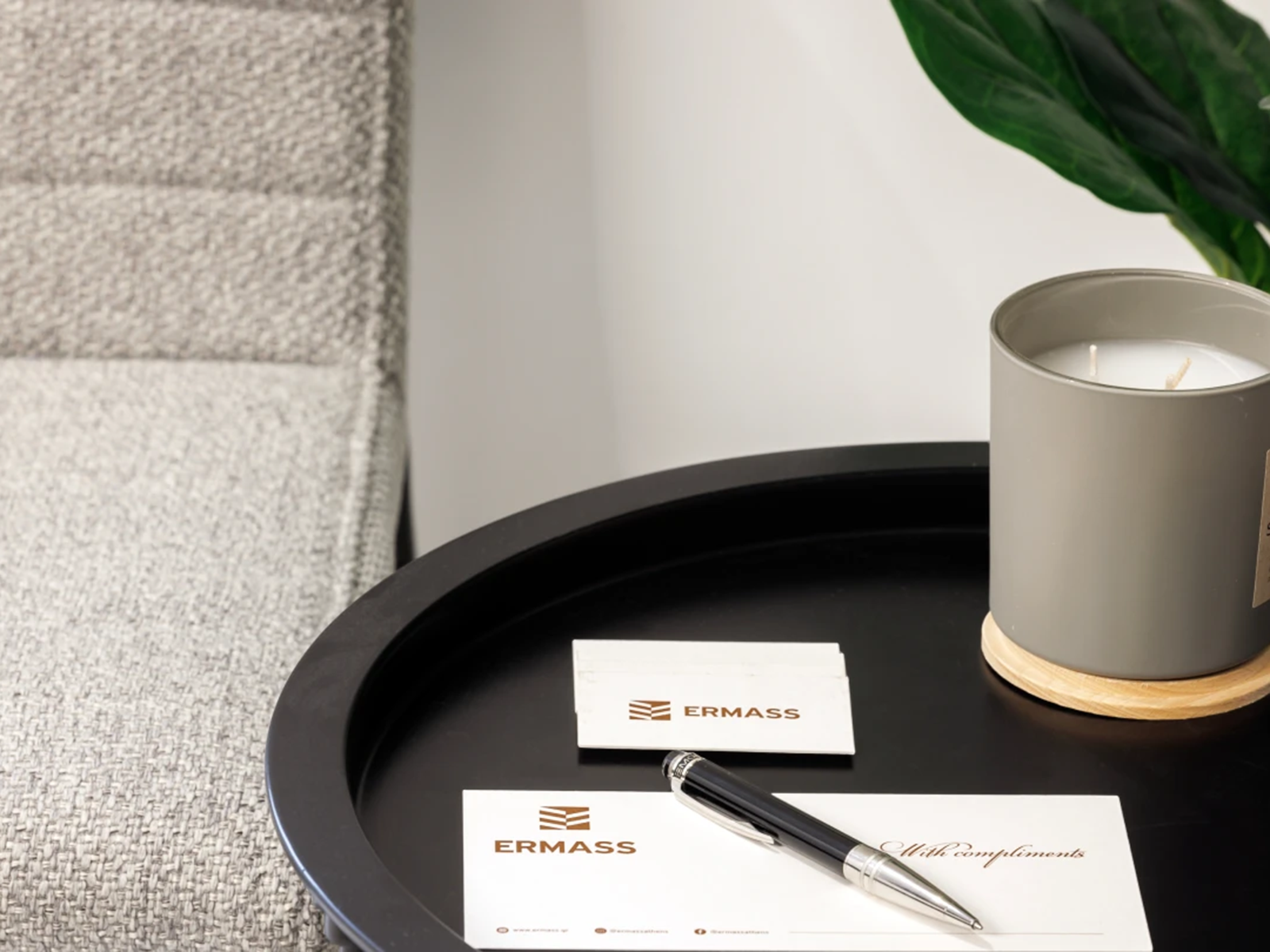
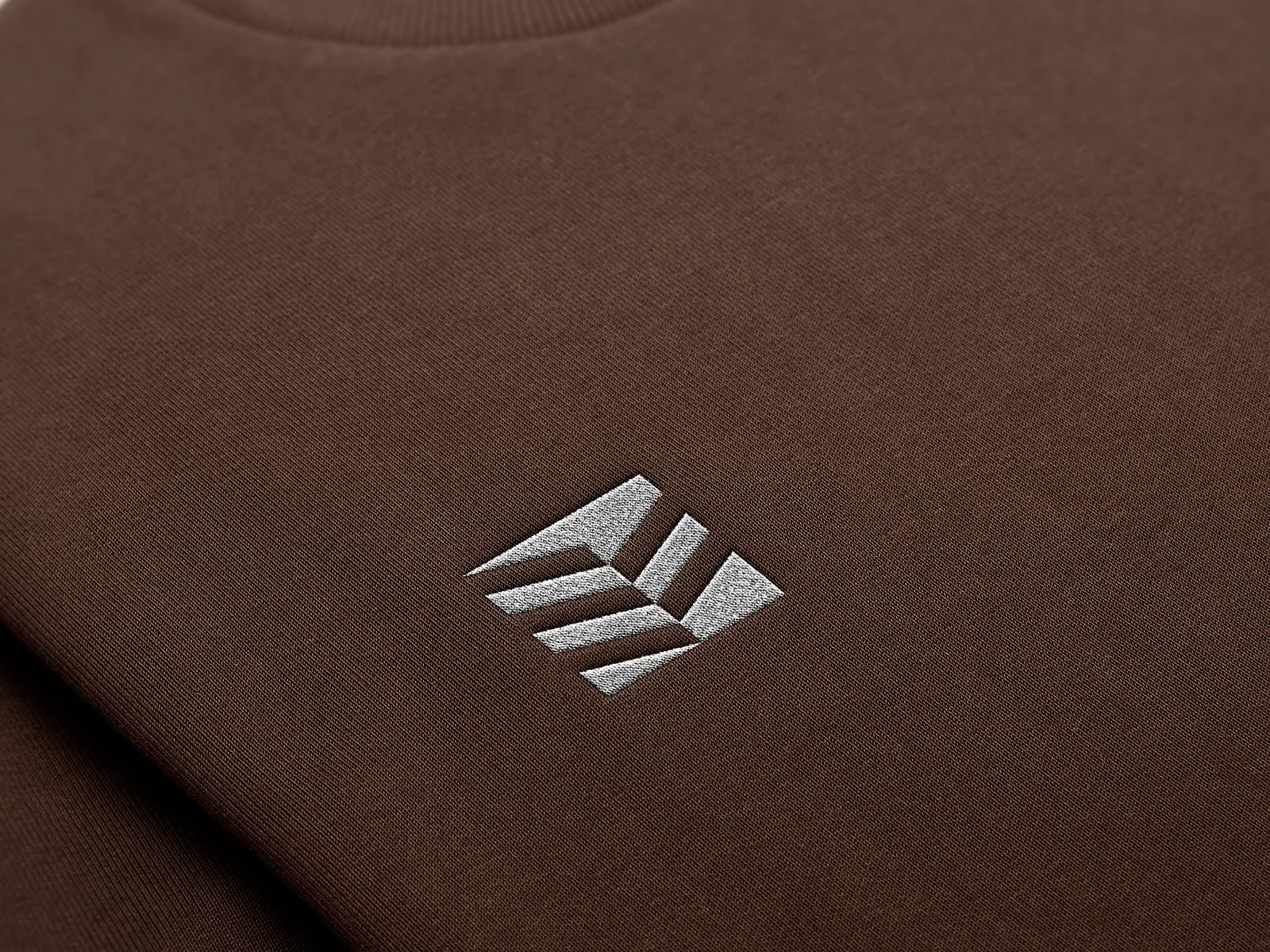
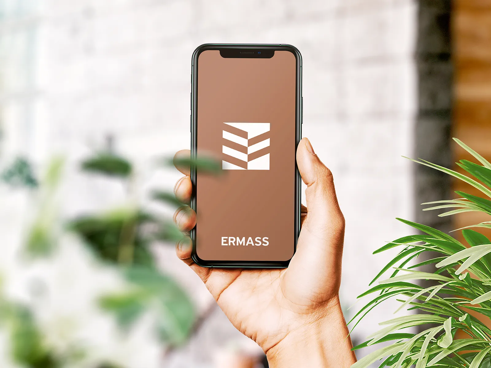
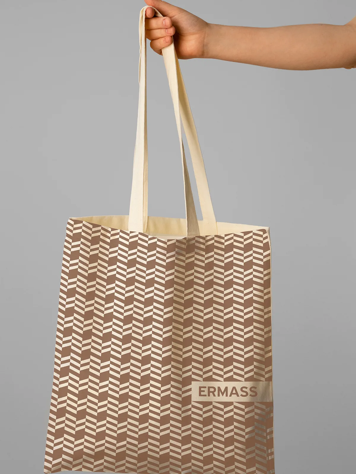
Warm brown tones, off-white surfaces and clear typography create a composed, welcoming identity. The symbol works both as a compact signature and as a repeating pattern, extending across business cards, correspondence, textiles and digital brand applications. Its geometry remains recognisable in print, embroidery and three-dimensional signage.
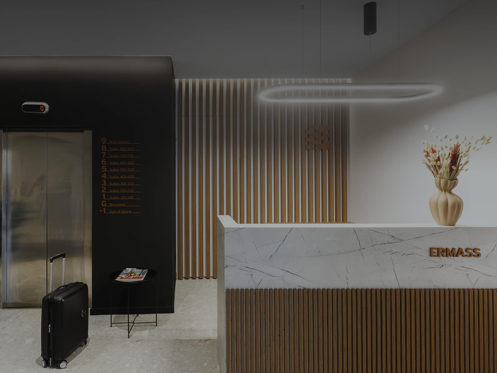
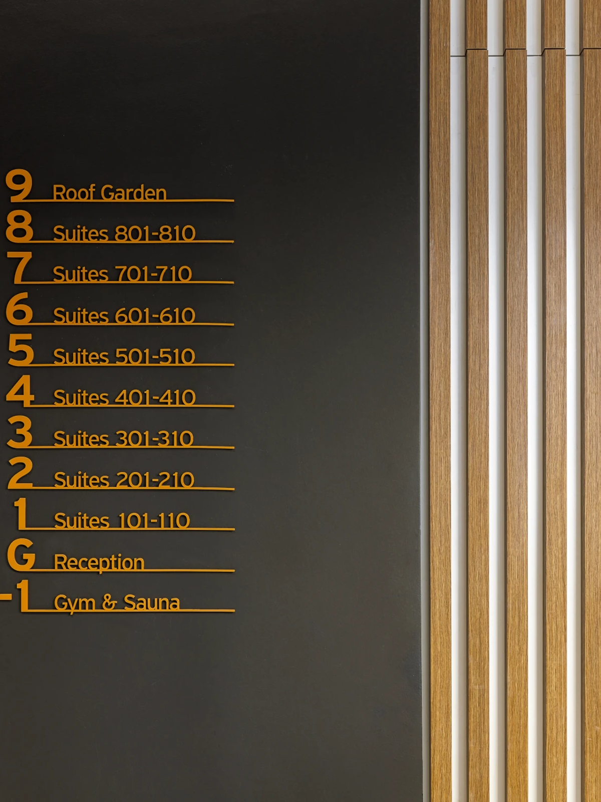
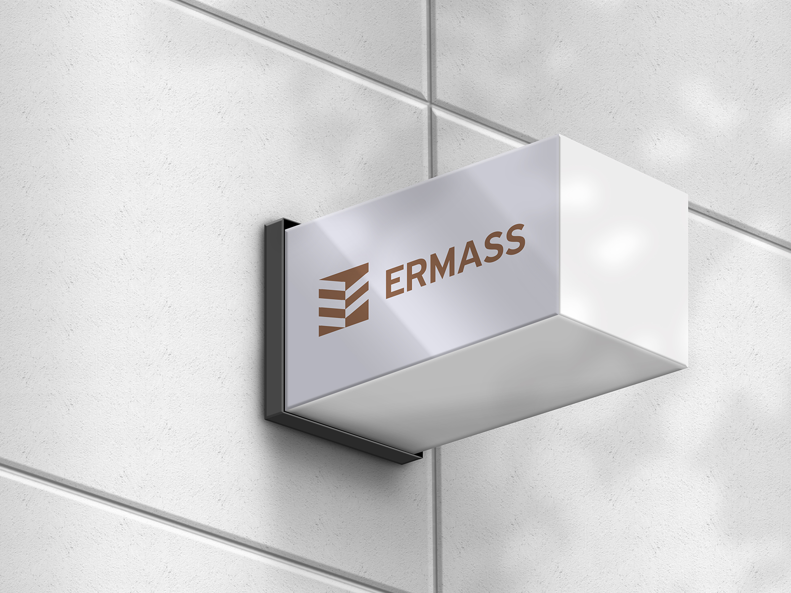
The identity continues through the exterior sign, the entrance, the reception and the floor directory. Scale, contrast and information hierarchy adapt to each location, connecting recognition with orientation. Architectural detail becomes a consistent visual language that guests encounter from their arrival through their movement inside the building.
Collaboration: MAMAProject
ClientERMASSServicesLogo Design, Visual Identity Design, Environmental Graphics, Wayfinding & SignageLinkermass.grYear2025
Save up to three projects as a starting point for our conversation. Your choices are stored temporarily in this browser tab.
You have no saved projects yet. Choose “Save project” on a project card or page.