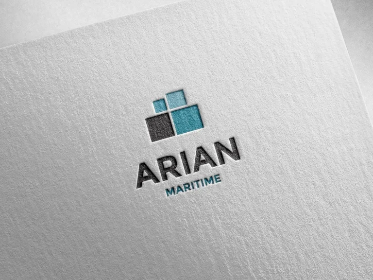
Arian Maritime
Rebranding and corporate applications for an international freight and logistics company.

Environmental expertise. A bold red signature.
Founded in Athens in 1994, ECHMES is an environmental consultancy working across environmental permitting, project development, site rehabilitation and sustainable resource management. Its work brings scientific knowledge into complex decisions for public and private sector projects. In 2025, hello! designed its logo and corporate identity, giving this depth of expertise a clear, confident visual expression.
The company’s background is closely connected to the longstanding scientific and consulting work of Katerina Adam, Professor Emerita at the National Technical University of Athens. Her experience spans environmental management, the rehabilitation of industrial and mining sites, research and advisory work. This depth of knowledge provides a meaningful context for an identity built around precision, structure and authority.
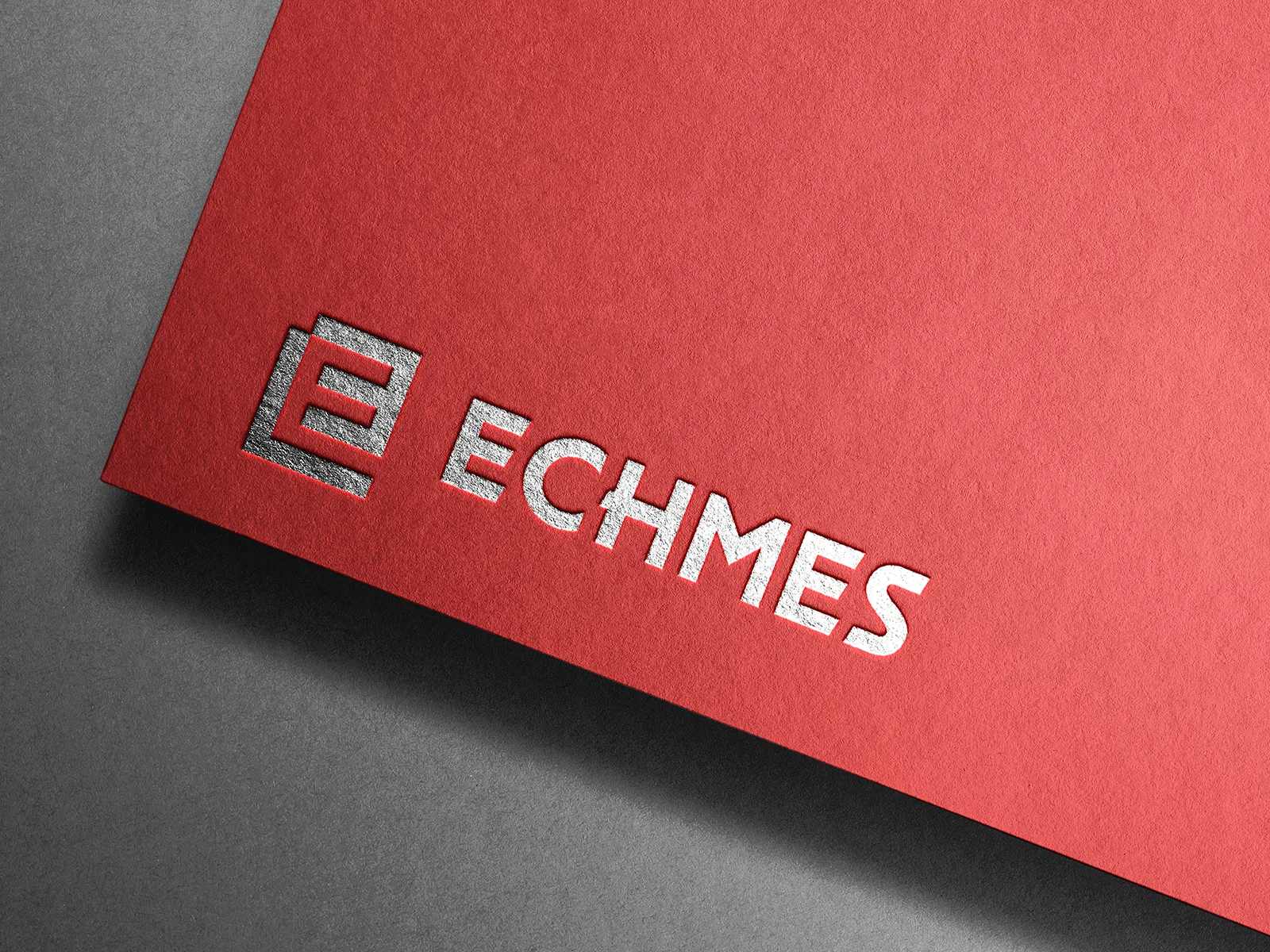
Red is the defining element of the ECHMES identity. Within a field closely associated with nature and sustainability, it gives the brand a distinctive, energetic presence. Used alongside white and charcoal, it creates a direct visual language that expresses decisiveness and keeps information clear. The compact geometric symbol and uppercase wordmark reinforce this sense of strength, with angular forms and carefully defined spaces.
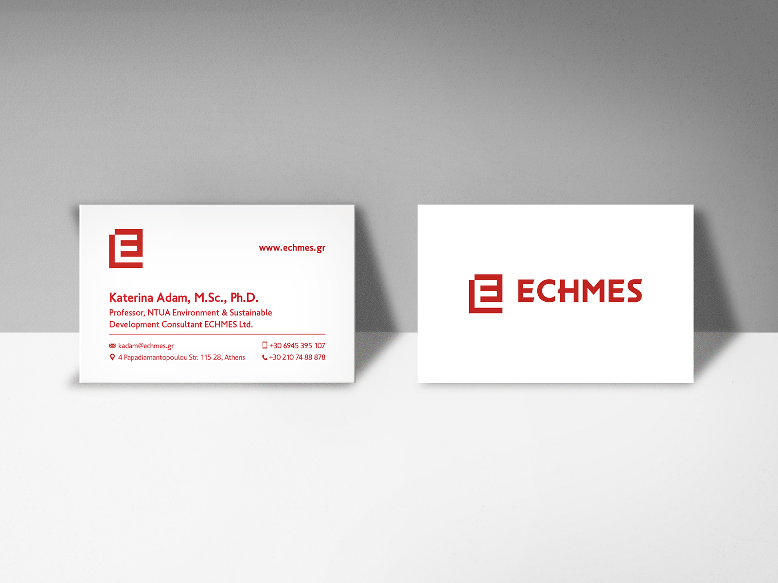
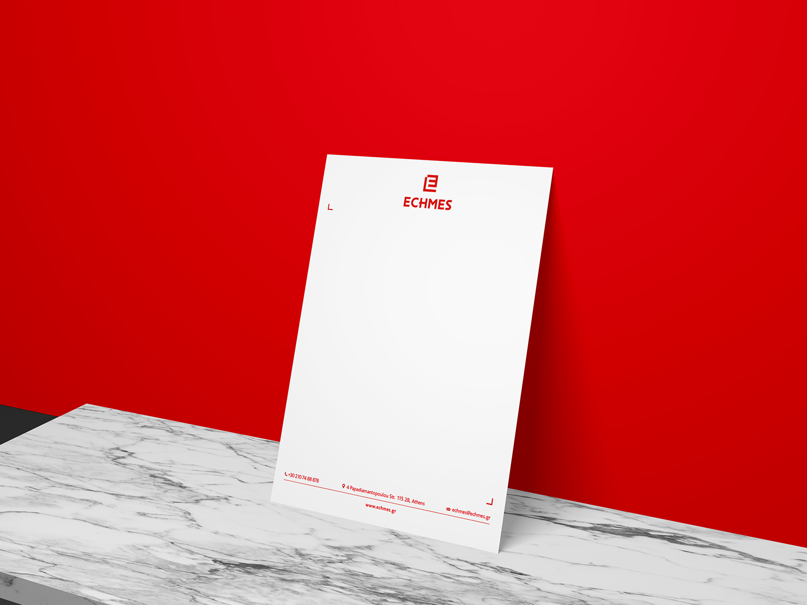
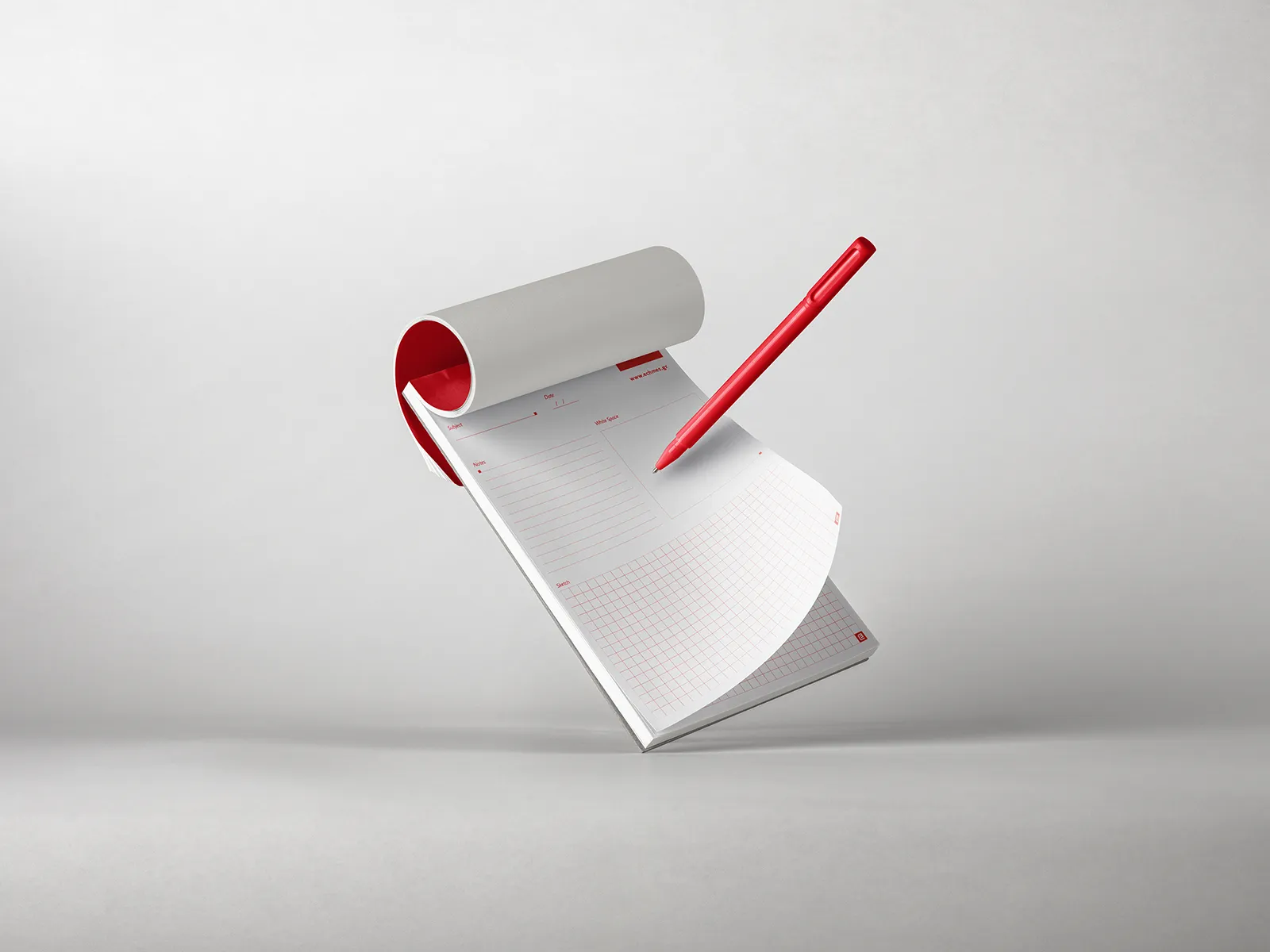
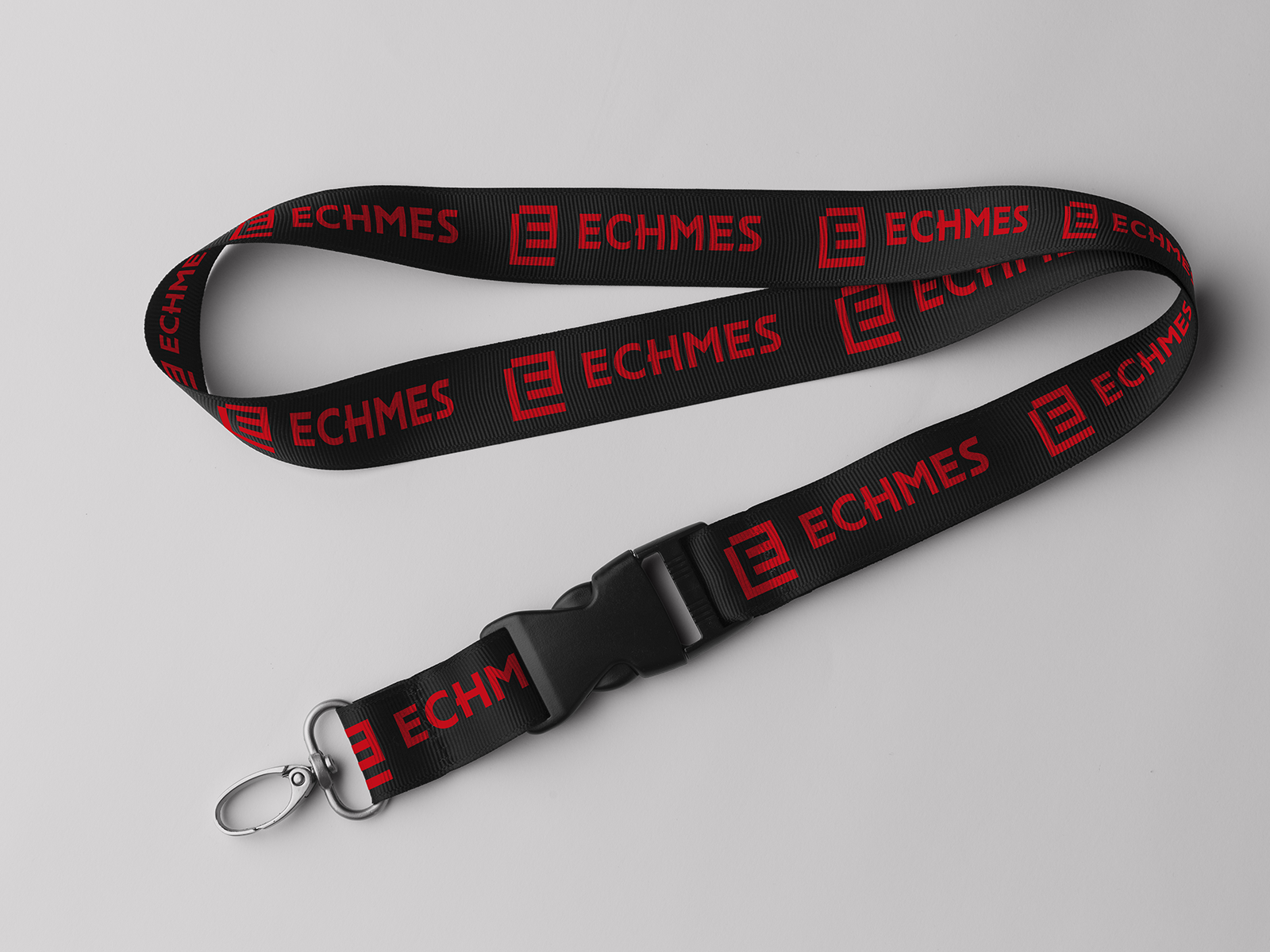
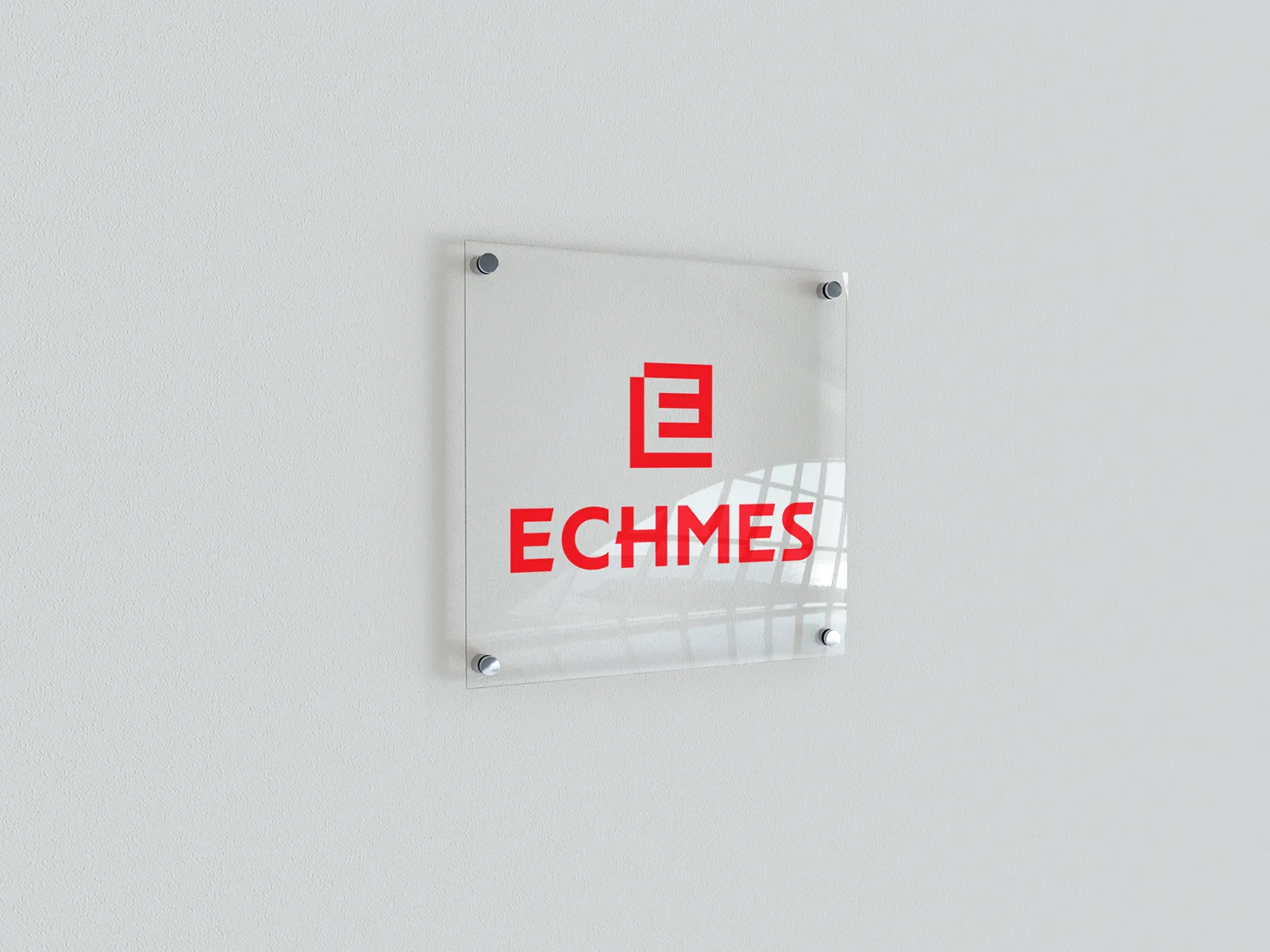
The same visual principles carry through business cards, letterhead, notepads, lanyards and office signage. Fine rules, generous white space and red accents organize the printed material, while the symbol remains recognizable across different scales and surfaces. The silver foil embossed application adds a tactile dimension to the logo, bringing together the sharpness of its geometry and the texture of the paper.
ClientECHMESServicesBranding, Logo Design, Visual Identity Design, Print Design, Environmental GraphicsLinkechmes.grYear2025
Save up to three projects as a starting point for our conversation. Your choices are stored temporarily in this browser tab.
You have no saved projects yet. Choose “Save project” on a project card or page.