Echmes
Logo and corporate identity for an environmental consultancy.

Rebranding with one shared direction, from a business card to exhibition communication.
Arian Maritime works in international freight and logistics across sea, air and land transportation. The 2024 commission covered the redesign of its existing logo and the development of a corporate identity, together with materials for exhibitions and events. The design task was to establish a shared direction for the company’s everyday communication and public presence.
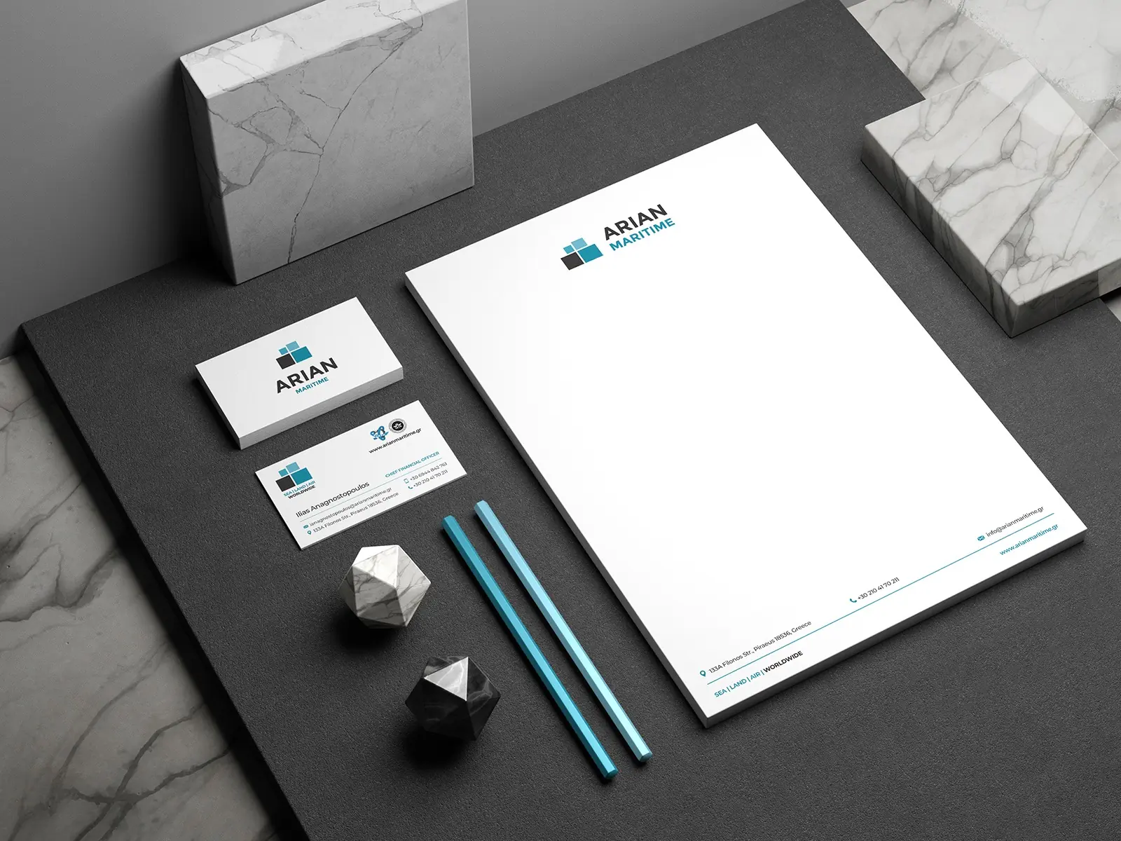
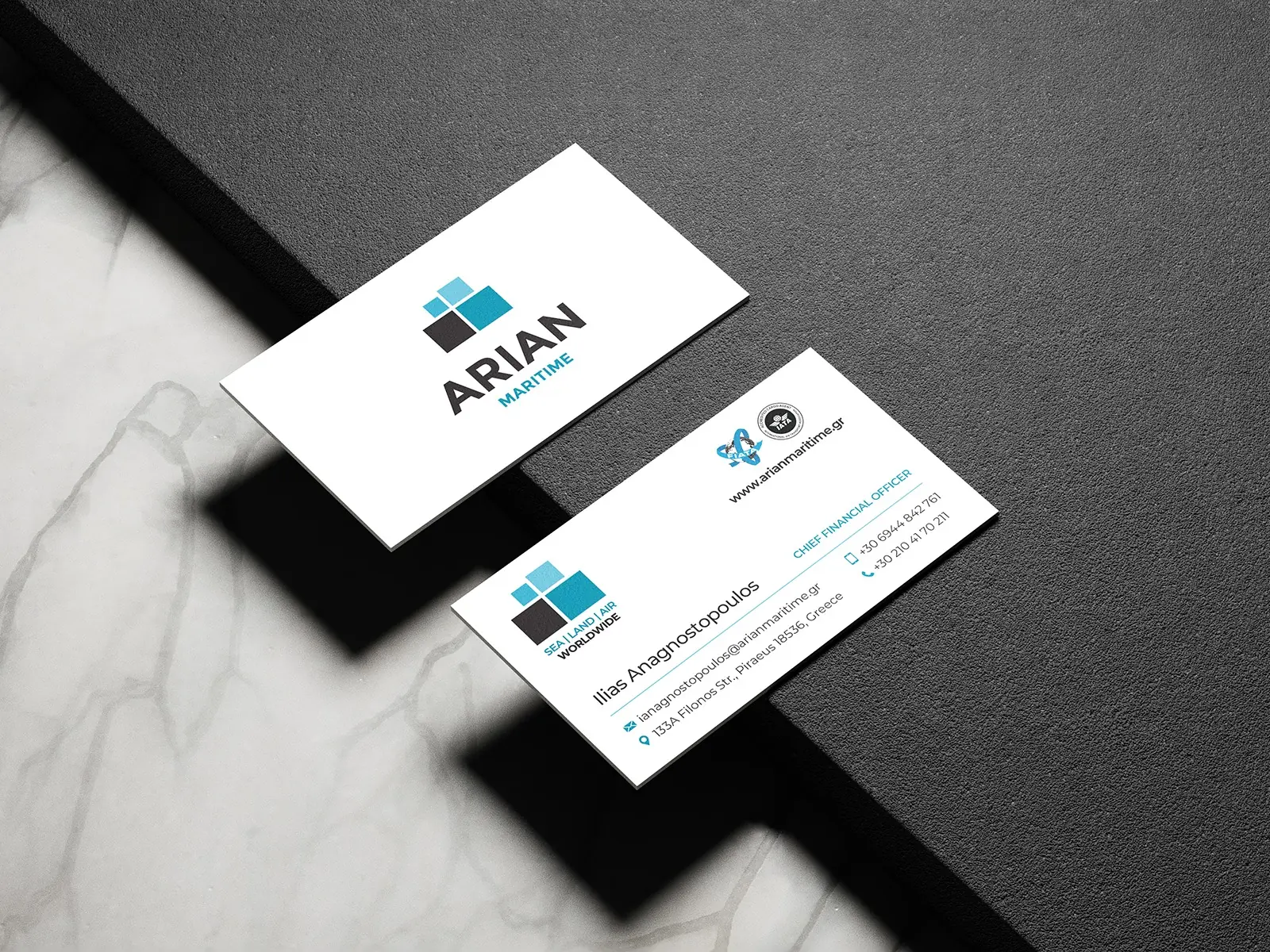
We redesigned the logo and organised the new identity around a geometric symbol, clear typography and shades of blue with black and white. We applied that language to letterheads, business cards, printed materials, advertising layouts and exhibition and event banners.
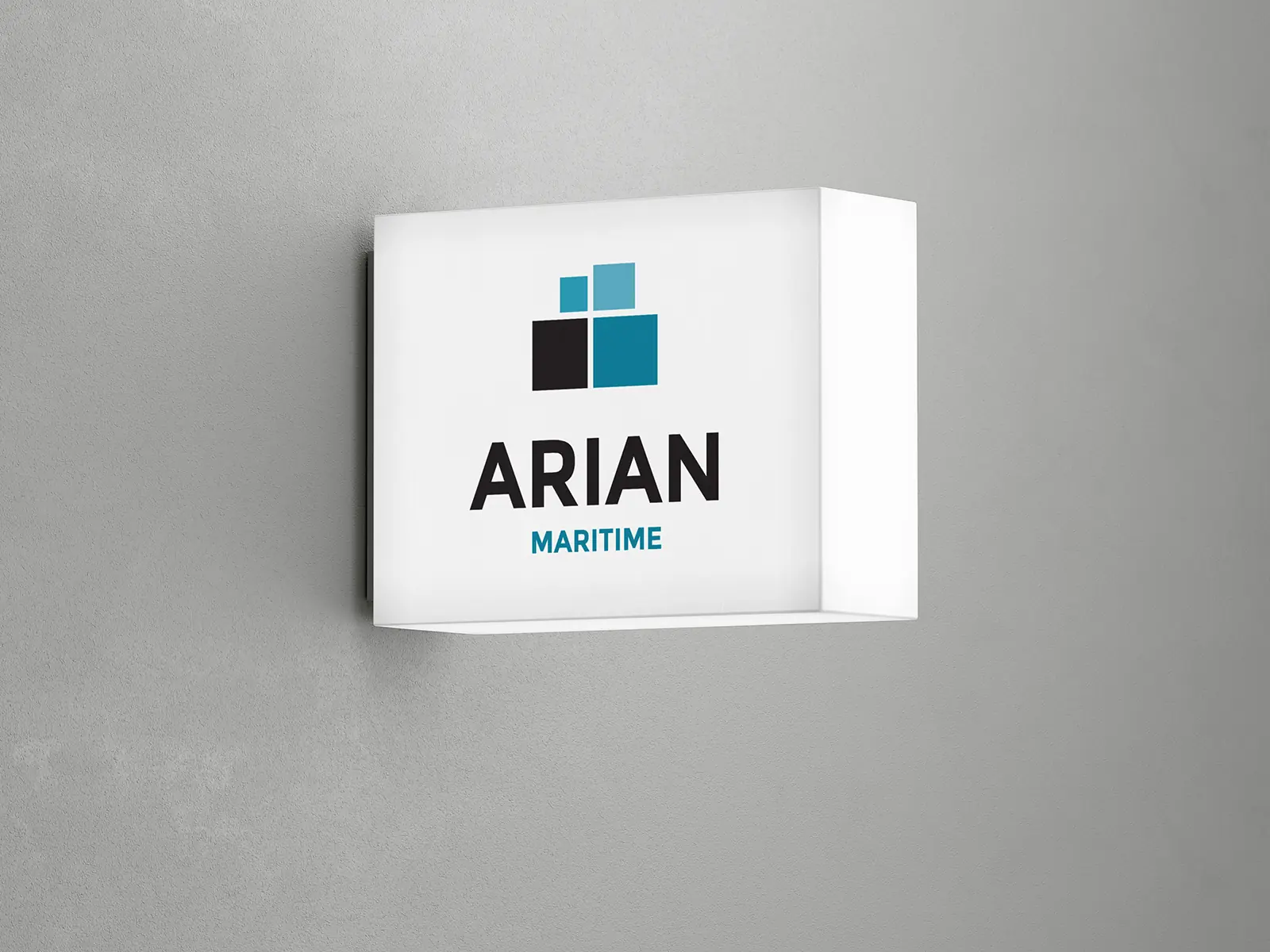
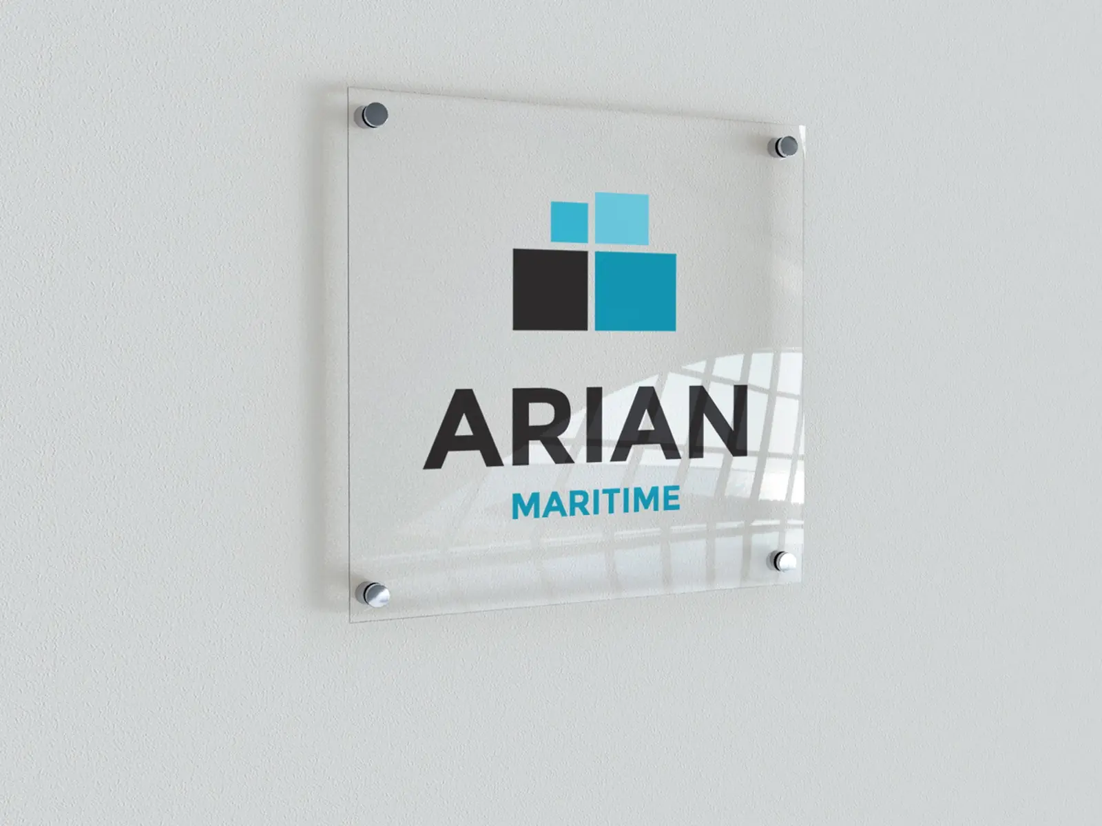
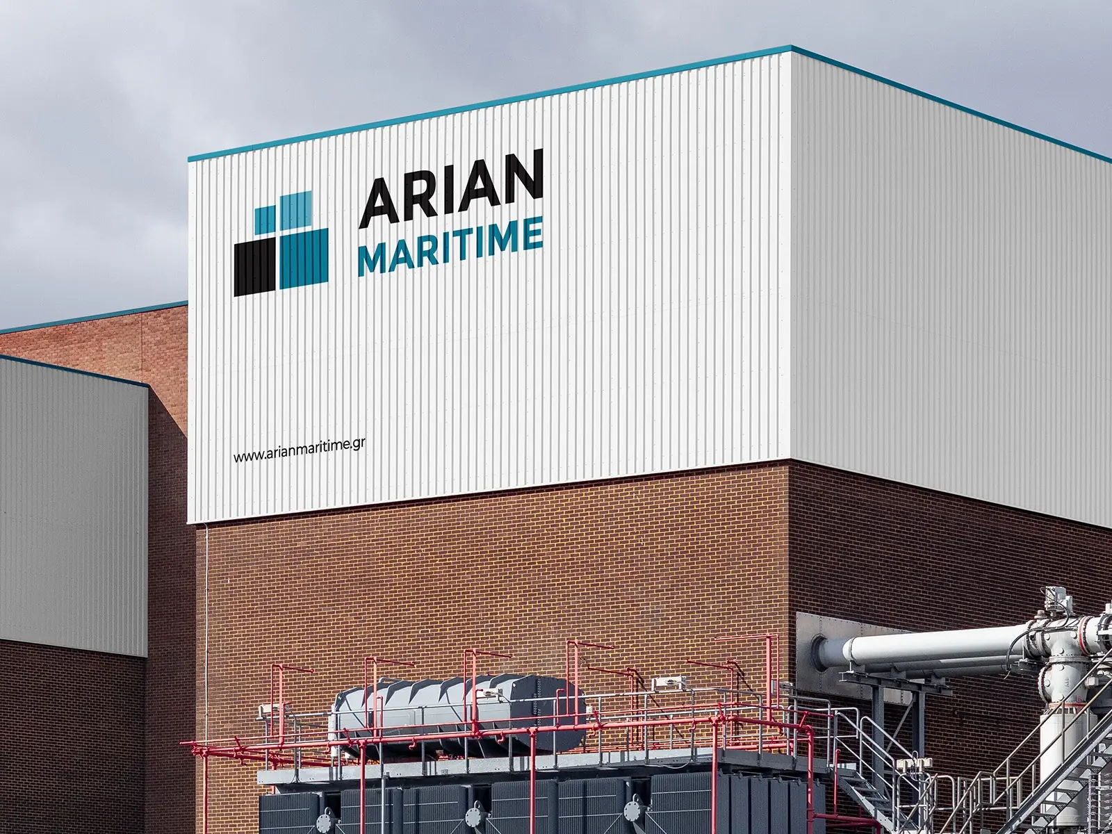
The presentation shows the logo, corporate stationery and advertisement, alongside signage proposals for a lightbox, an acrylic sign and a building façade. These signage applications are presented as mockups and visualisations of the identity.
IN THEIR OWN WORDS
“We had a meaningful dialogue with Alexandros about how we wanted Arian Maritime’s image to evolve. He respected what we had already built and helped us see what could change. We appreciated that he explained his proposals and paid attention to the practical applications of the identity. Consistency and personal contact are qualities we value from our collaboration.”
ClientArian MaritimeServicesRebranding, Logo Redesign, Visual Identity Design, Print Design, Advertising Design, Exhibition & Event Banners, Corporate SignageLinkarianmaritime.grYear2024
DESIGN DECISIONS IN USE
Two applications show how the refreshed identity changes scale while keeping the same relationship between symbol and name.
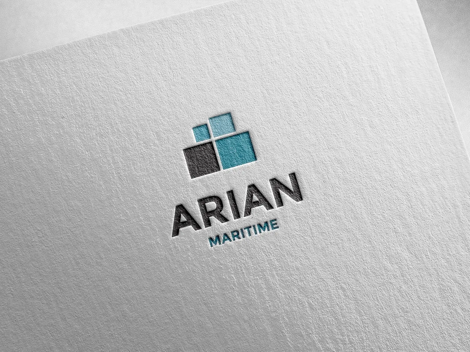
The geometric mark and wordmark are presented together in a letterpress mockup. The paper application makes their proportions and spacing visible.
The lightbox-sign mockup carries the same mark and name into a spatial application. The design can be assessed across paper and signage as parts of one system.
FROM DECISION TO APPLICATION
The Arian Maritime commission brought an existing company’s identity into one system for stationery, print communication, exhibitions and events. The examples make the design decisions visible at different scales.
A geometric symbol, clear typography and blue, black and white form the shared vocabulary. The mark and company name keep the same relationship across the applications.
The logo and stationery presentation show the proportions and spacing at close range.
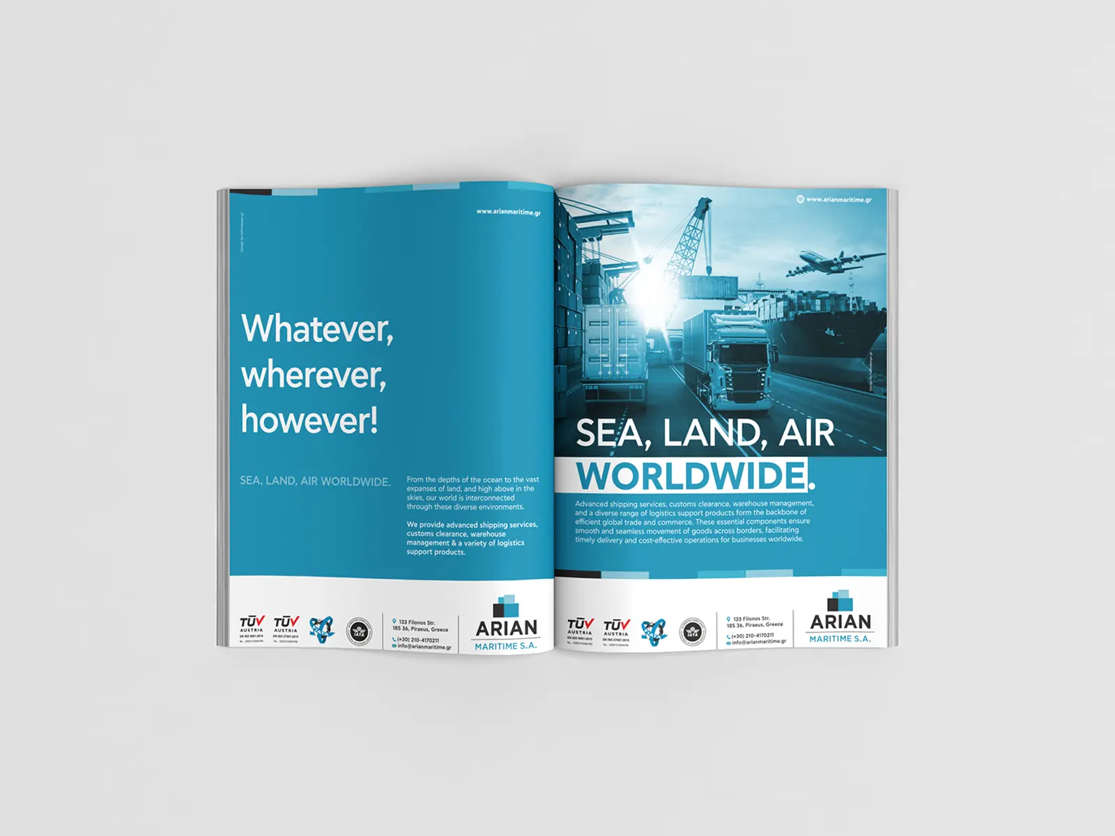
The same identity extends from letterheads and business cards to advertising layouts and event banners. The application changes while the visual direction stays consistent.
The double-page Posidonia advertisement provides a specific example of the identity in sector communication.
The lightbox, acrylic sign and building-façade images explore spatial applications of the identity. They are identified as mockups and visualisations.
These proposals can be assessed alongside the corporate print and advertising designs without implying that every sign shown was installed.
Project scope: Logo redesign, visual identity, corporate print, advertising layouts and exhibition/event banners, with signage proposals.
Save up to three projects as a starting point for our conversation. Your choices are stored temporarily in this browser tab.
You have no saved projects yet. Choose “Save project” on a project card or page.