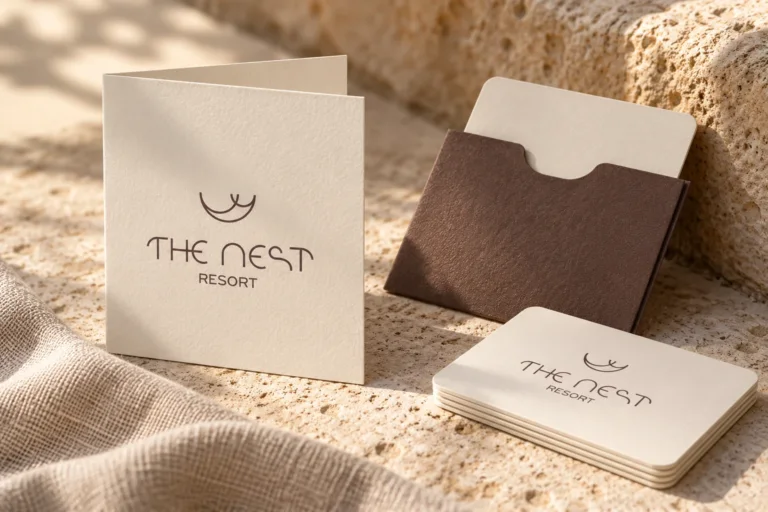
The Nest Resort
Brand naming and visual identity for The Nest Resort in Hersonissos, Crete.

Hospitality shaped by its surroundings.
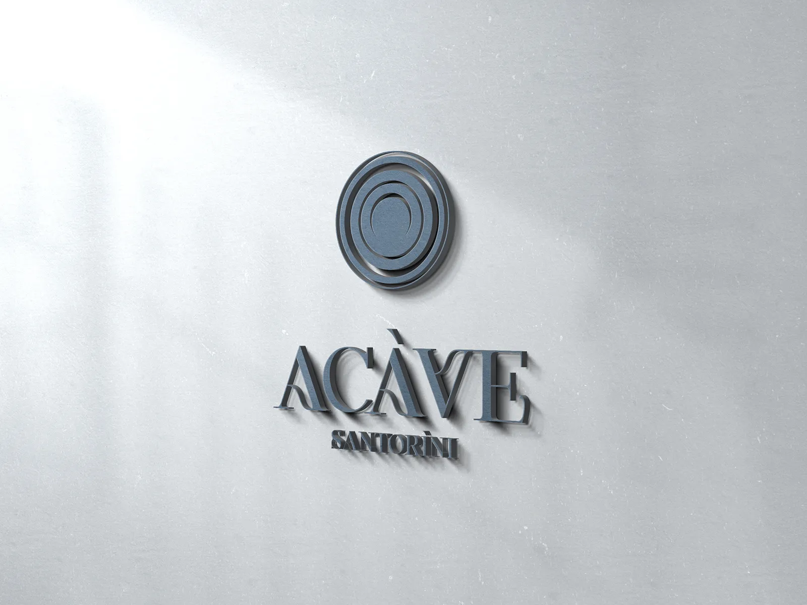
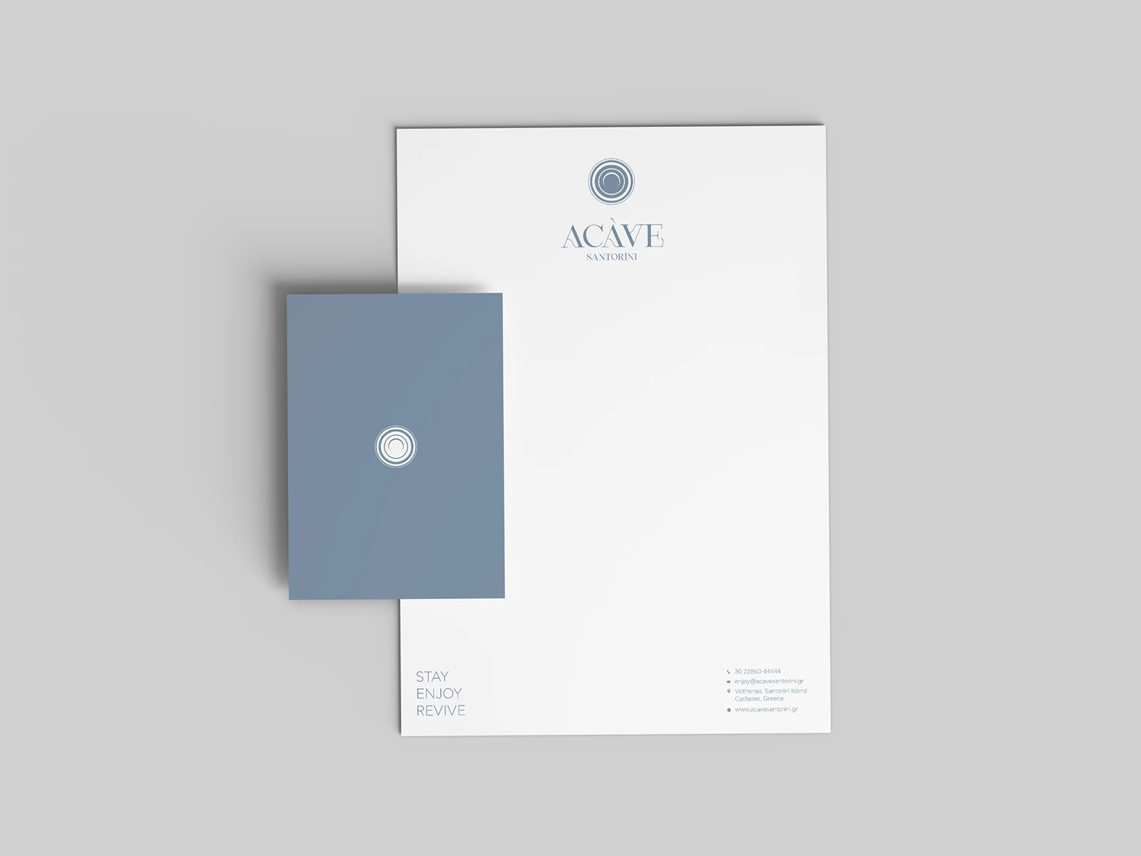
In Vothonas, Santorini, ACAVE Santorini Suites brings the character of cave architecture into a contemporary guest experience. Working with MAMAproject, Hello Design developed the name, logo and visual identity, drawing a connection between the architecture, the material character of the place and the human gesture.
ACAVE comes from “a cave”: a direct reference to the suites carved into the rock. Two simple words became a concise, distinctive name that introduces the character of the property from the very first encounter. The architecture itself provided the starting point for the brand, giving a physical space a memorable verbal identity.
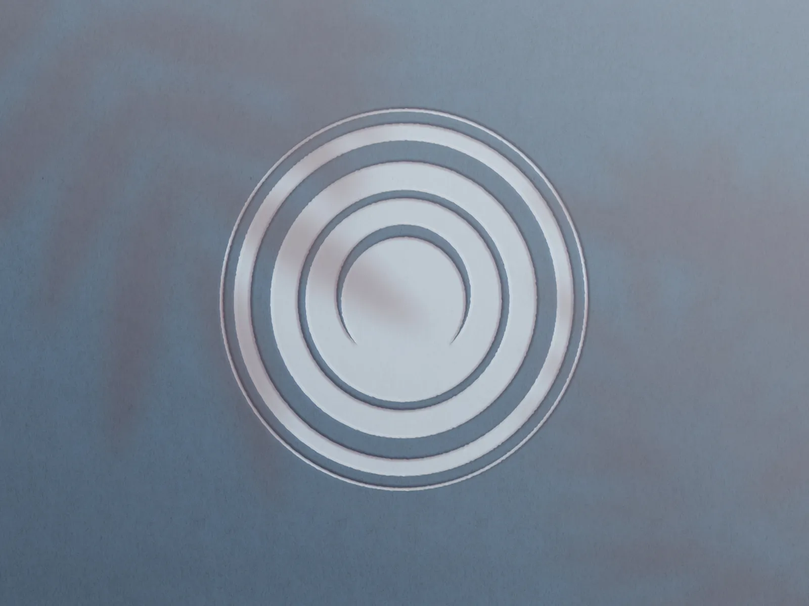
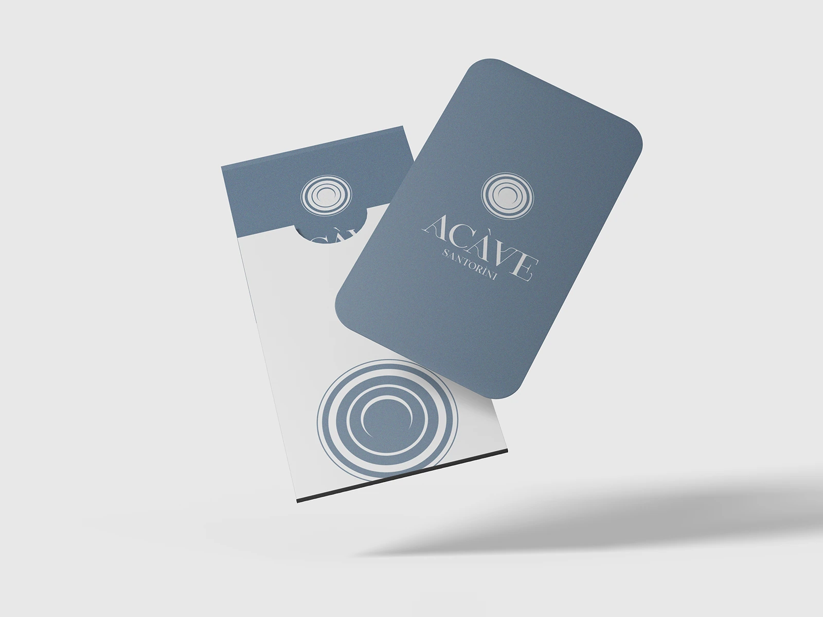
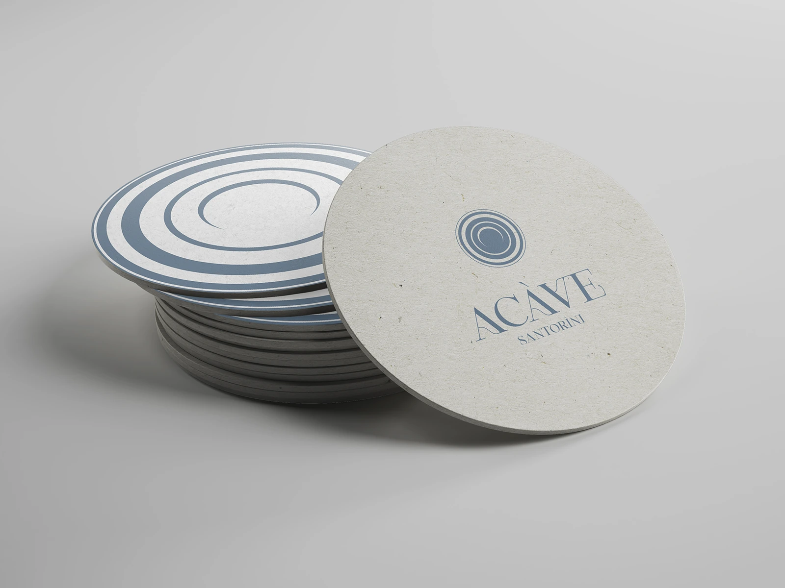
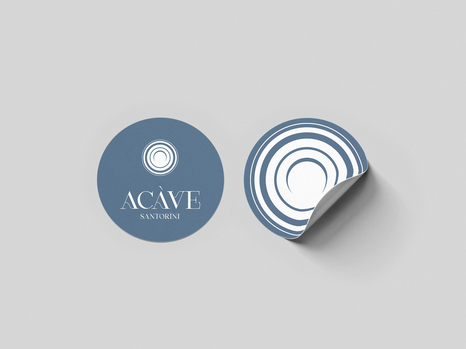
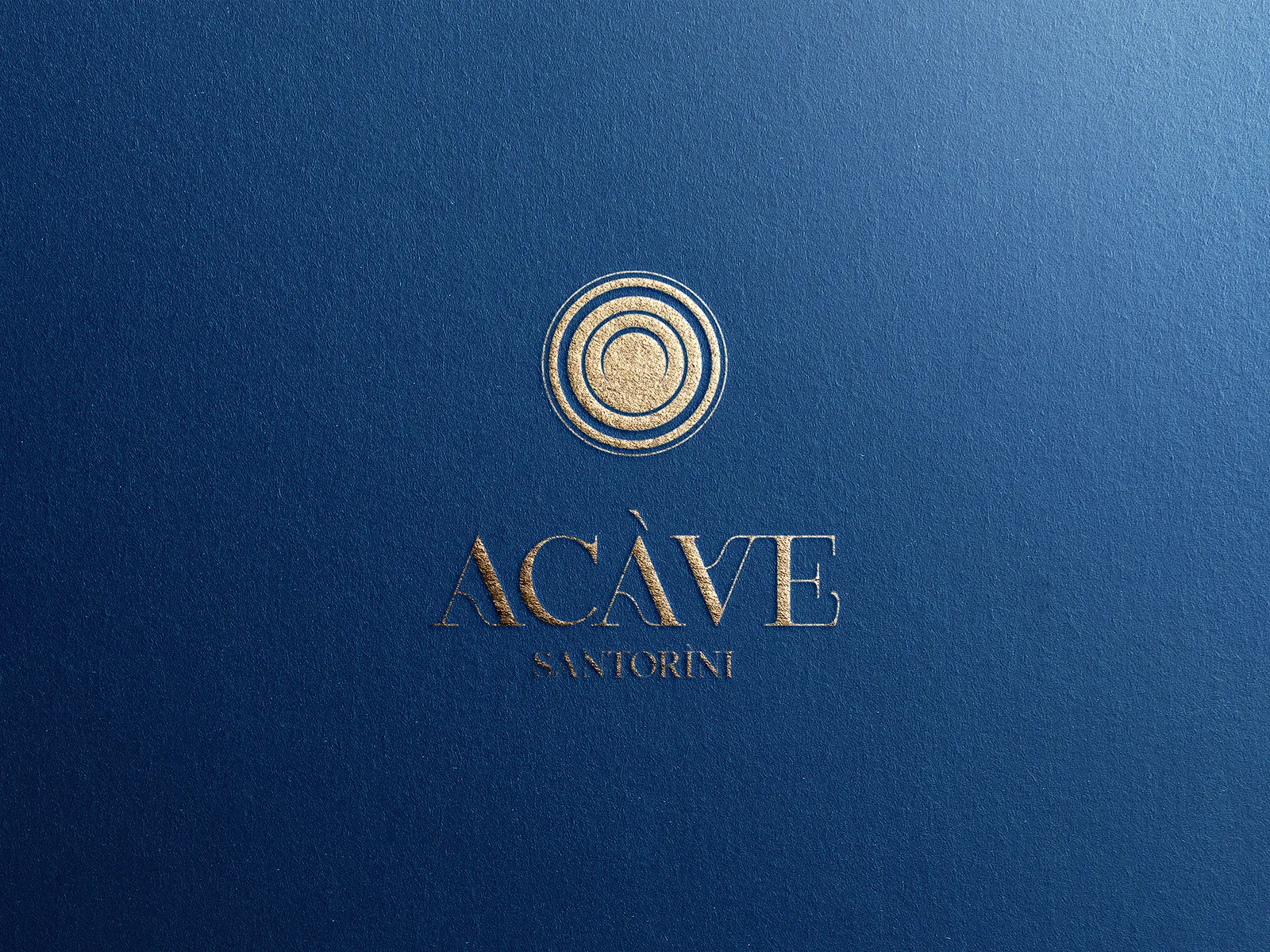
The symbol takes its inspiration from pottery: the rounded forms of ceramic vessels, the rotation of the traditional potter’s wheel and the hands that shape the clay. Concentric, gently irregular lines capture that rhythm while preserving a sense of craftsmanship. The organic symbol is paired with an elegant typographic wordmark, balancing expressive movement with quiet precision.
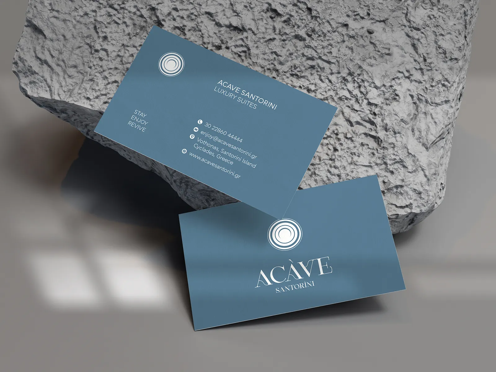
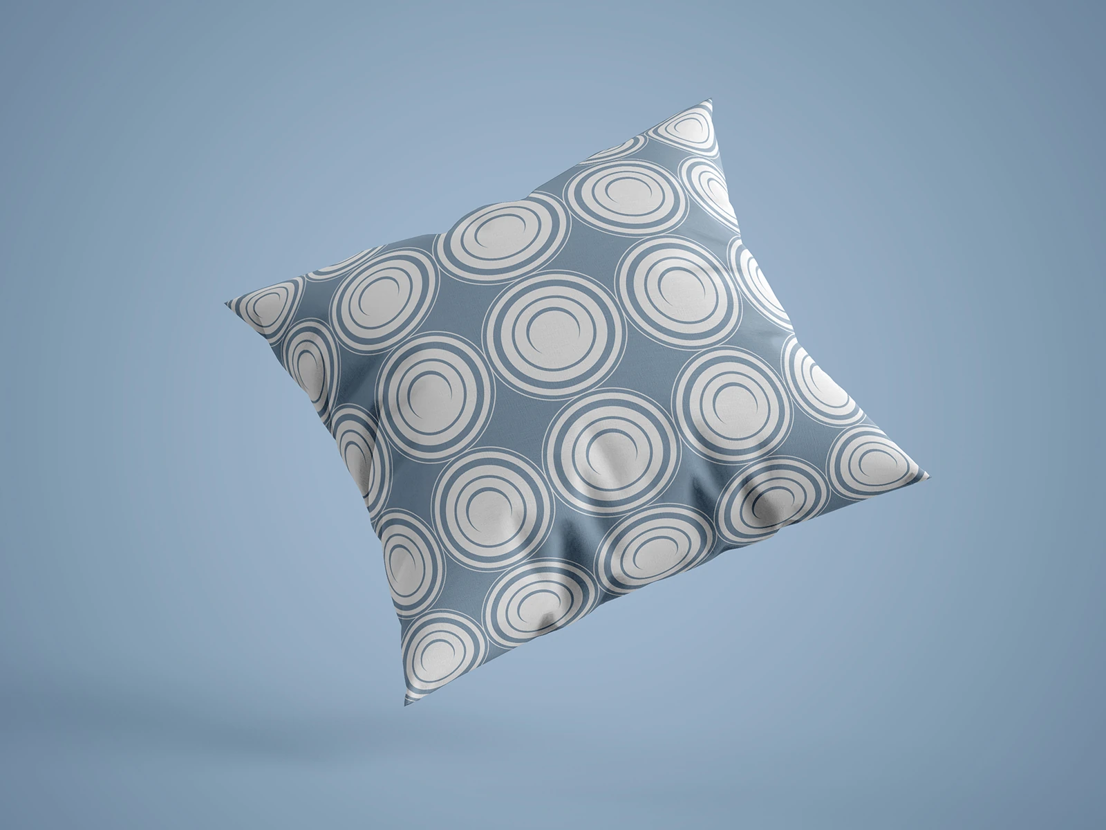
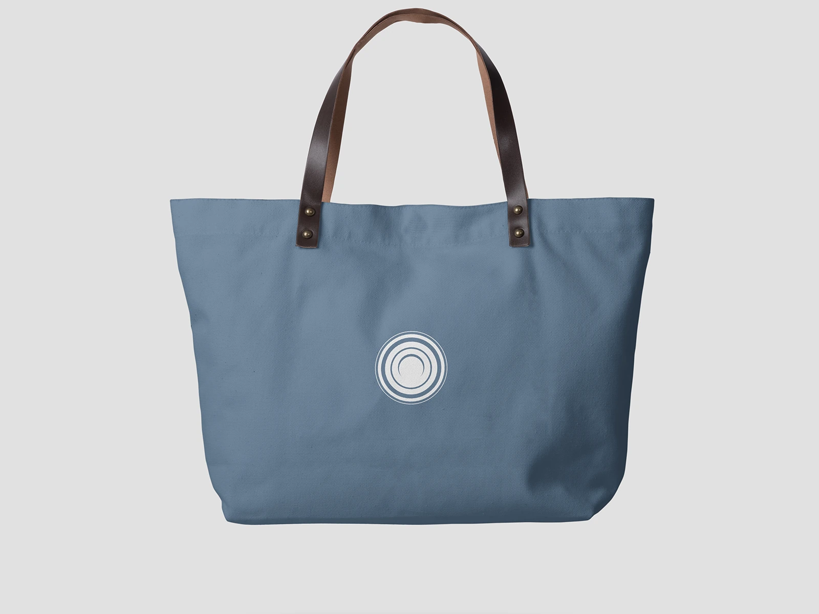
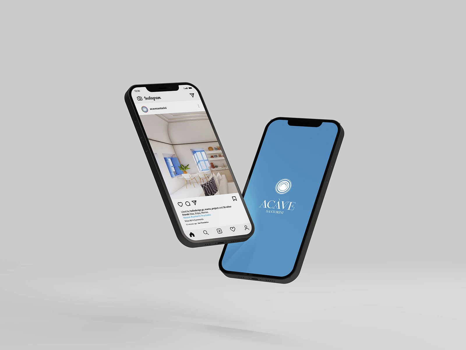
Soft blue, light neutral tones and embossed textures create a calm visual language. The symbol works both as a standalone mark and as a repeating pattern, extending across signage, stationery, room key cards, coasters, textiles and digital applications. Every application follows the same design logic, giving the guest experience a consistent and recognisable visual character.
ACAVE. A name drawn from the space. An identity shaped by human movement.
Branding & visual identity: Hello Design
Architecture & construction: MAMAproject
Branding year: 2023
ClientACAVE Santorini SuitesServicesBrand Naming, Branding, Logo Design, Visual Identity Design, Print Design, Environmental Graphics, Digital AssetsLinkacavesantorini.grYear2023
Save up to three projects as a starting point for our conversation. Your choices are stored temporarily in this browser tab.
You have no saved projects yet. Choose “Save project” on a project card or page.
Brand naming and visual identity for The Nest Resort in Hersonissos, Crete.
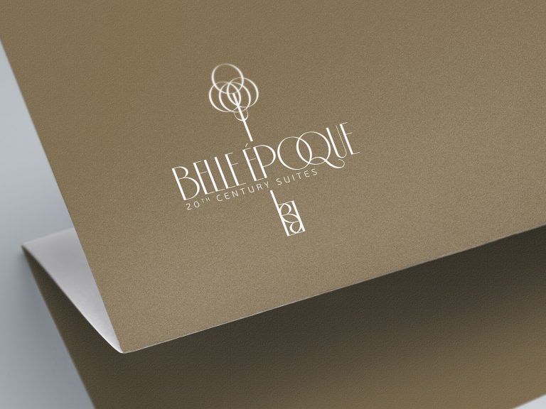
Naming and identity connecting a listed building with contemporary hospitality.
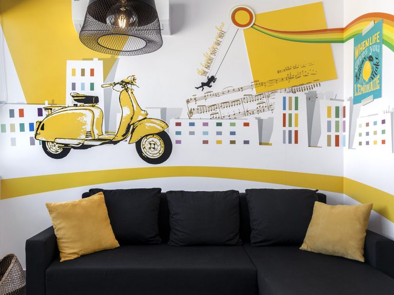
Hospitality naming and identity inspired by the routes of Athens.