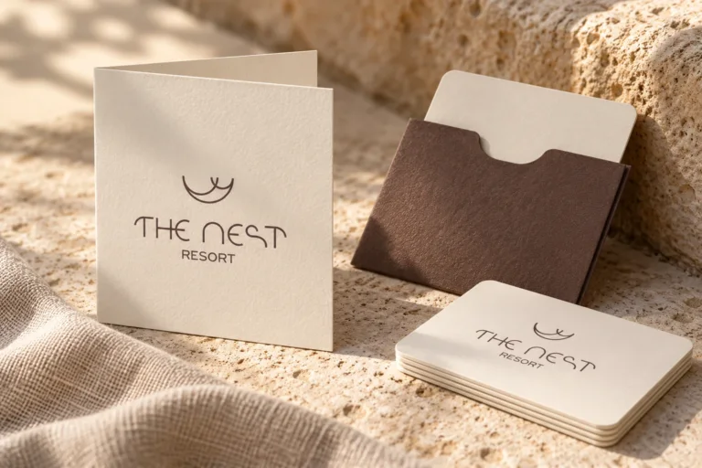
The Nest Resort
Brand naming and visual identity for The Nest Resort in Hersonissos, Crete.

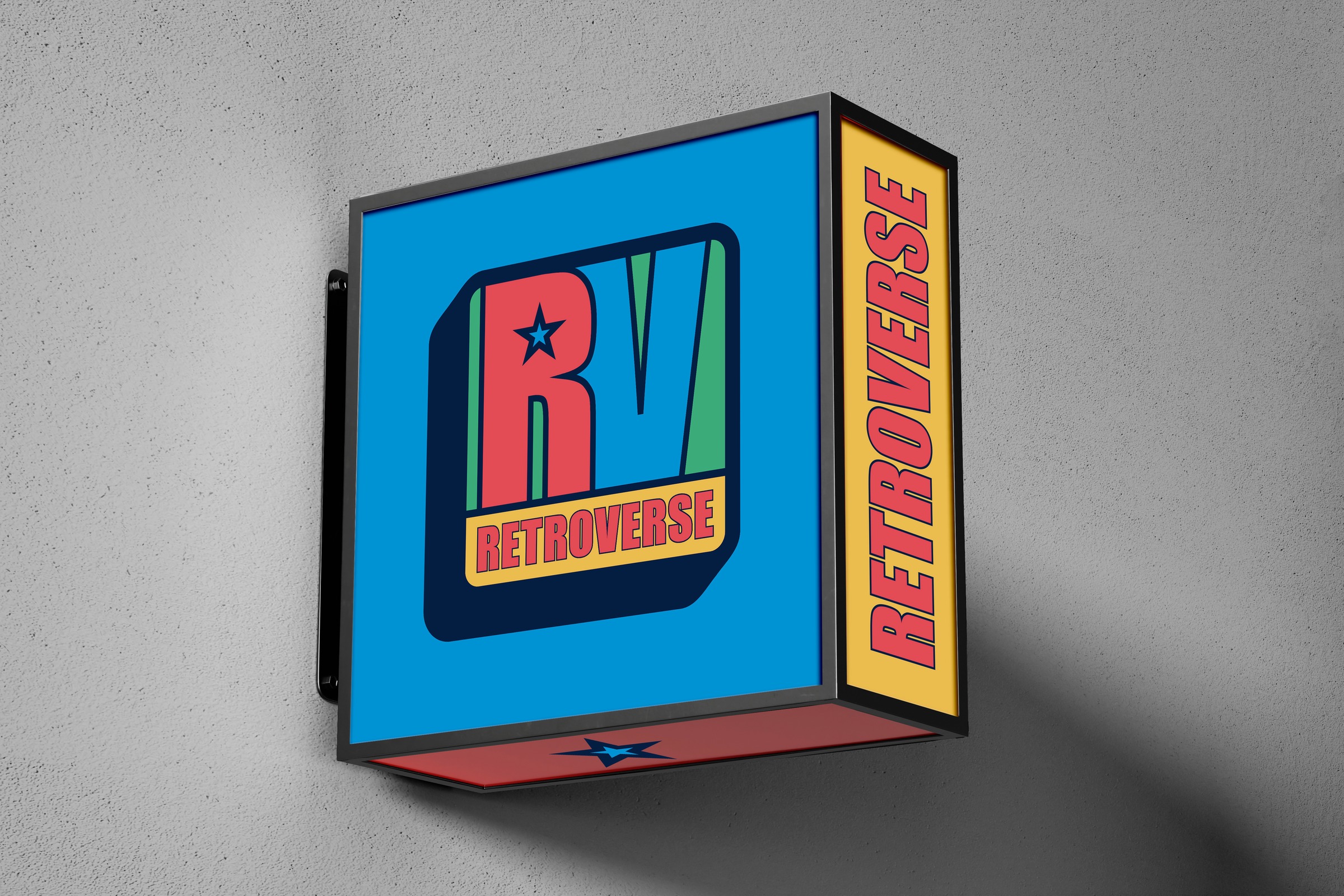
A new hostel in central Athens needed a name, a visual identity and an internal and external signage system. The design task was to give the hospitality concept a shared expression, from the entrance sign to the information inside the rooms.
The connection between the Kaniggos Square area and arcade culture became the starting point. “Retroverse” brings together “retro” and “universe”: a world with references to gaming, music television and 1990s street culture.
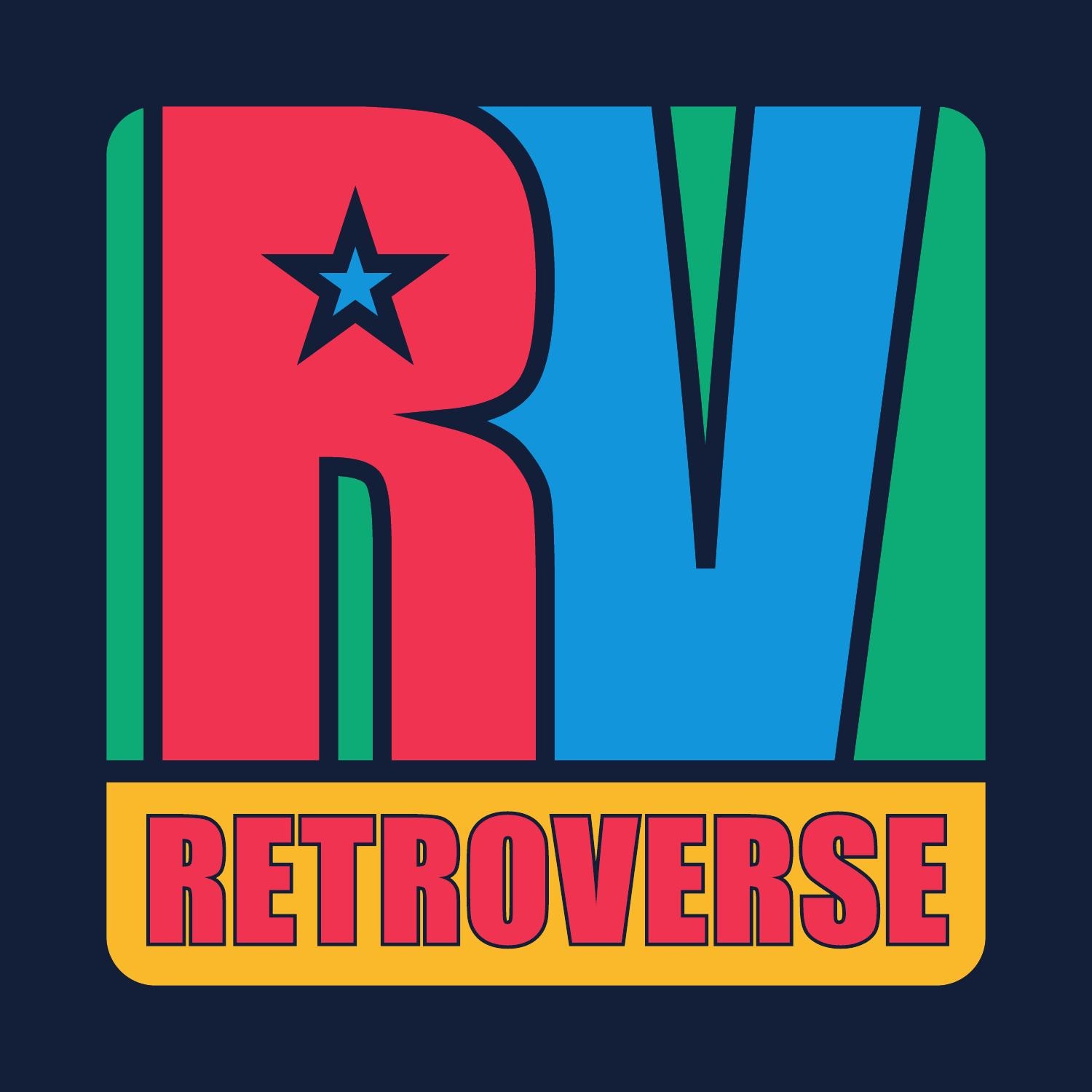
We created the RV emblem with its star, emphatic typography and a palette of red, blue, green and yellow. These elements became the foundation for the project’s graphic applications.
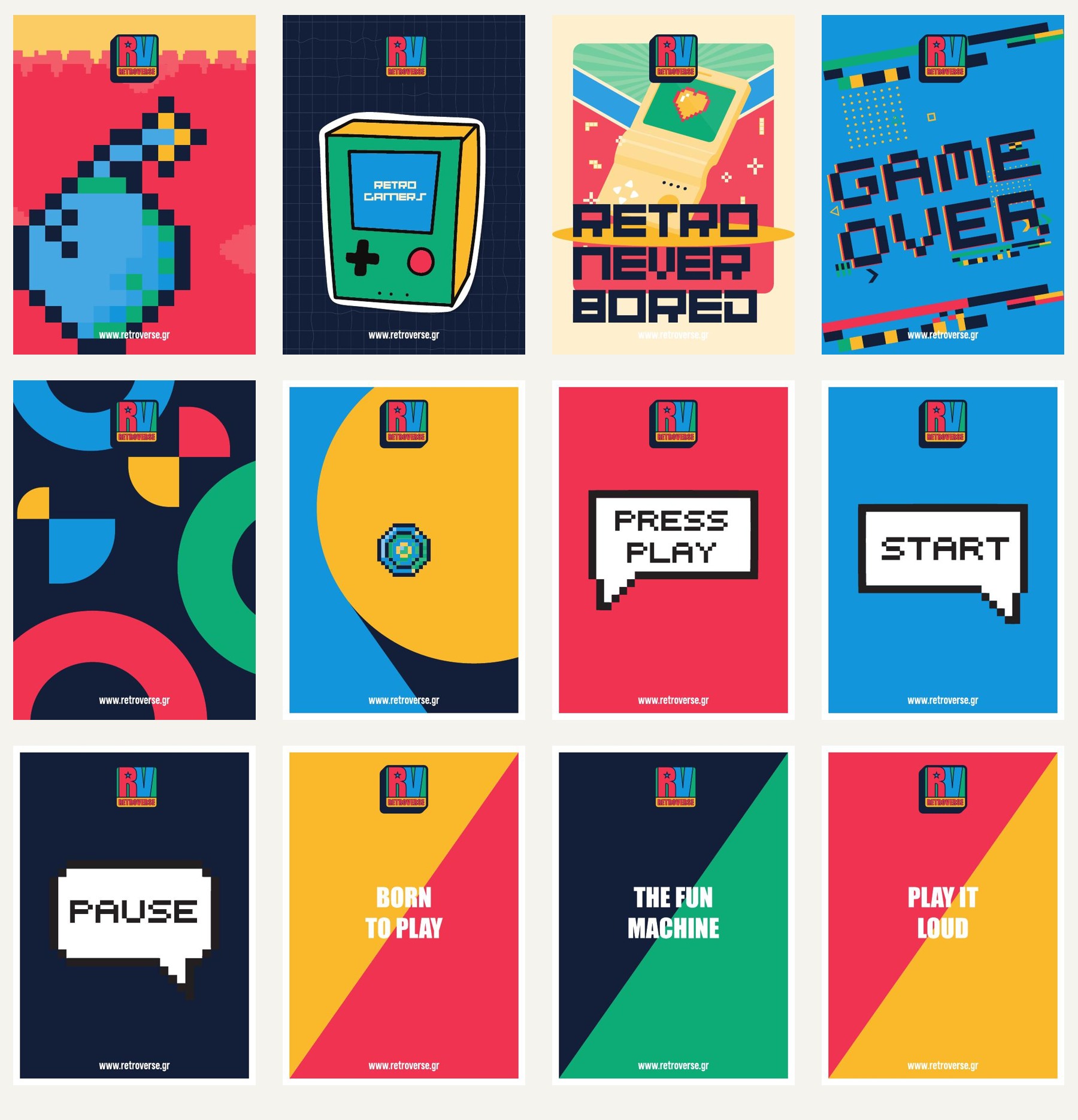
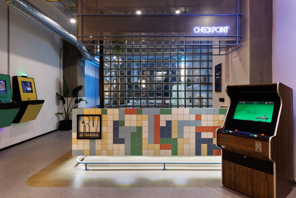
We carried the identity into external and internal signage, environmental graphics, posters and neon sign designs. The reception took on the “Checkpoint” label, while floors and rooms adopted the language of levels and play.
Alongside these elements, we designed floor, bed and storage numbering. Functional information and messages such as “Level Up Your Stay” now draw on the same visual system. The following photographs show these applications inside the hostel.
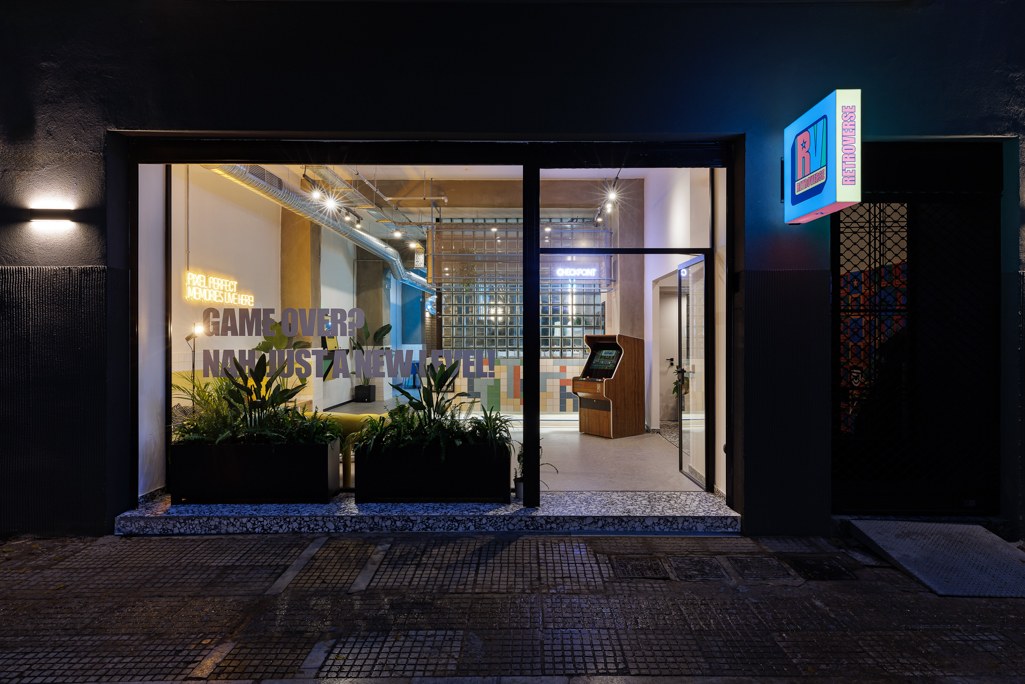
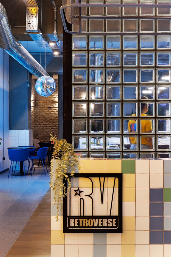
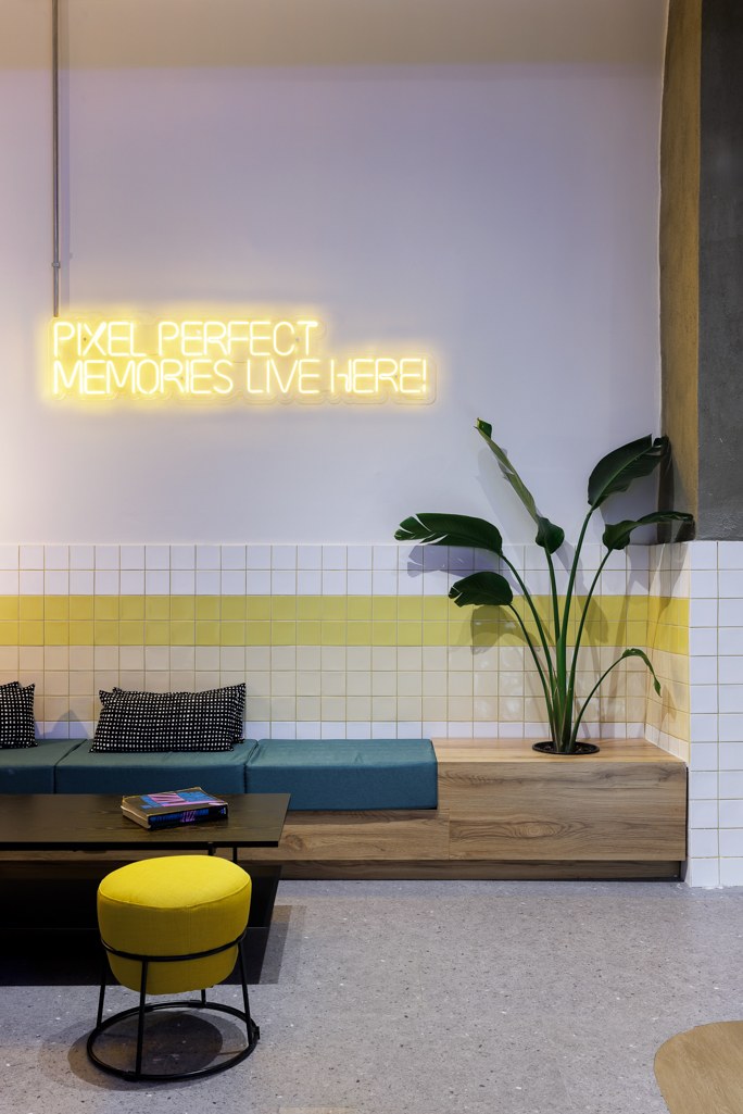
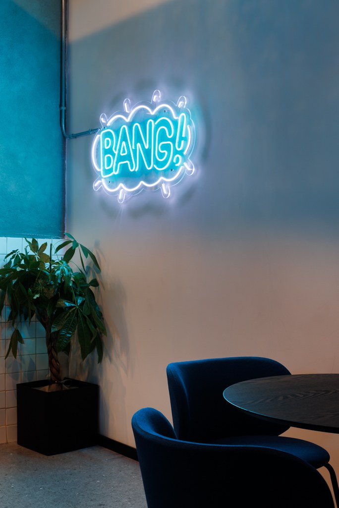
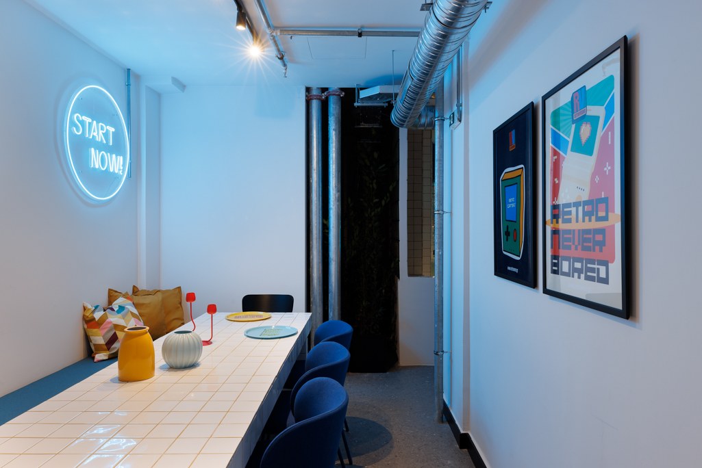
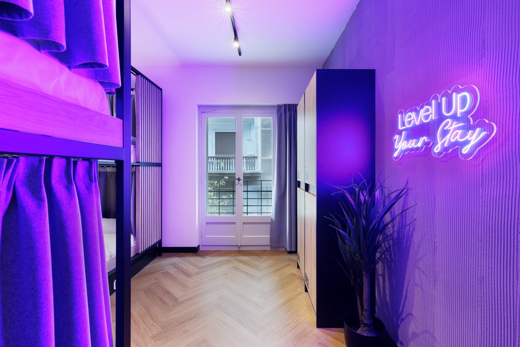
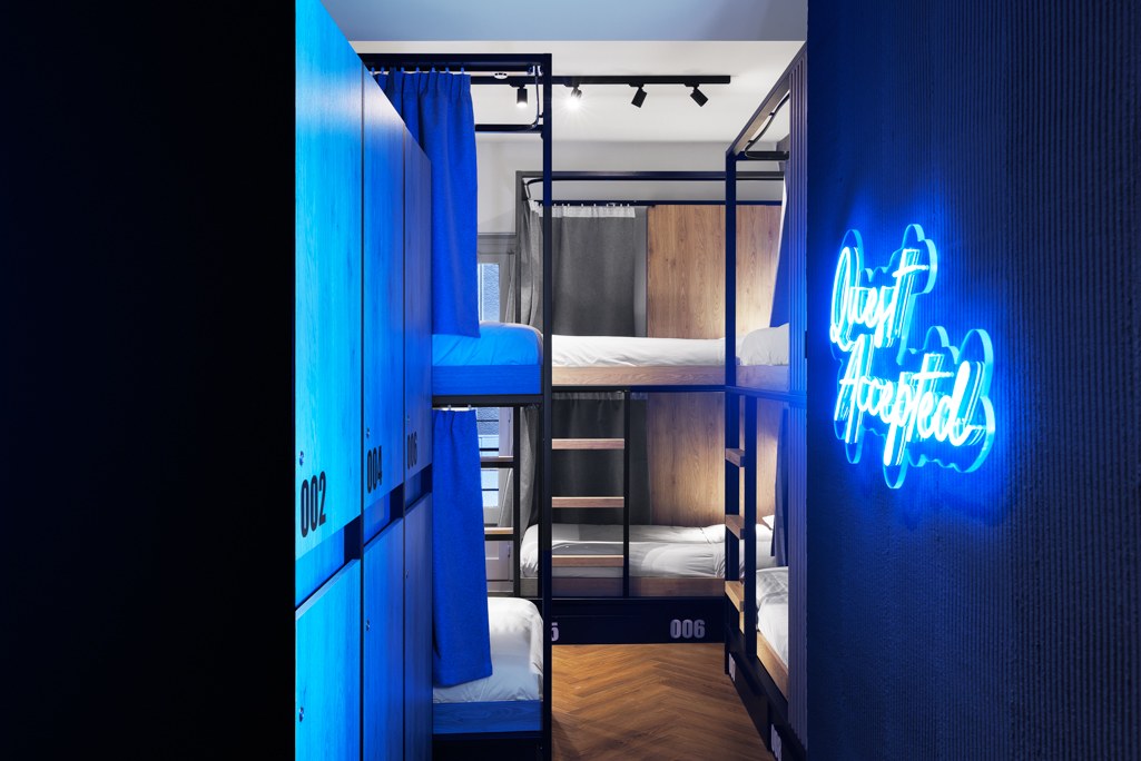
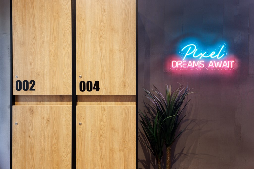
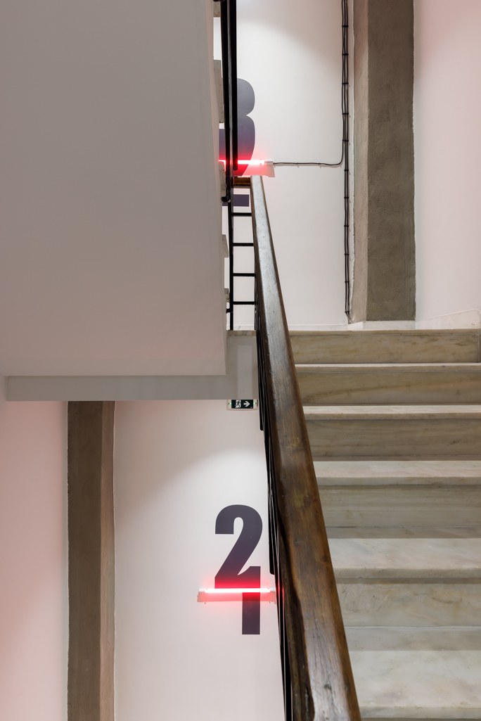
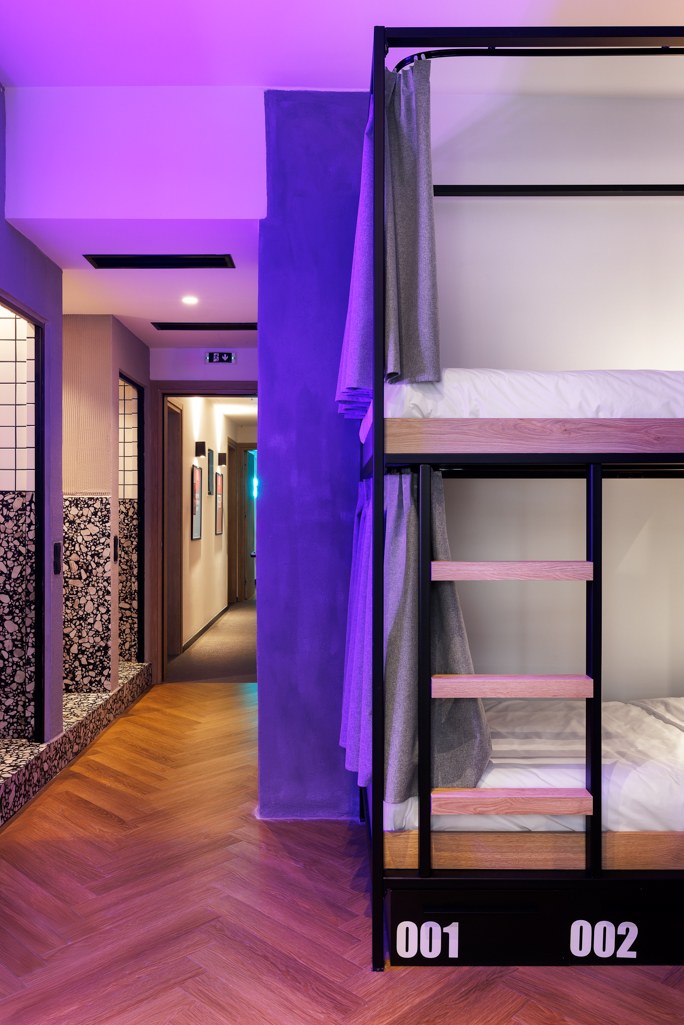
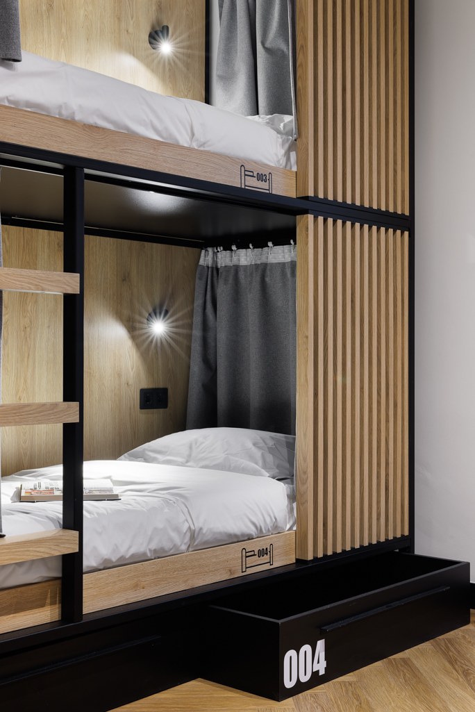
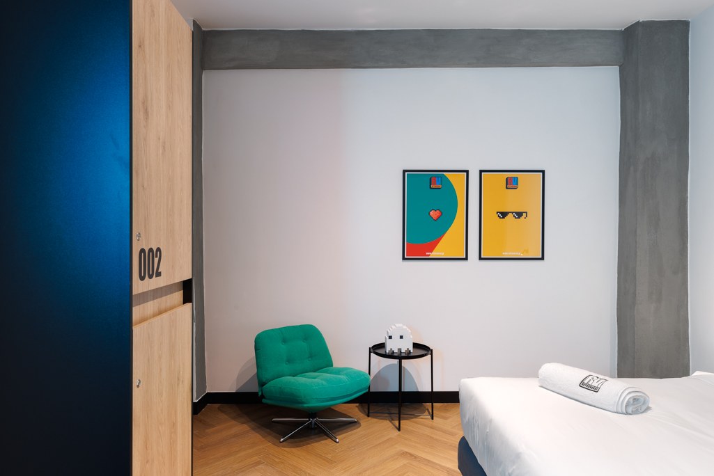
The following design proposals explore the identity across cards, stickers, posters, clothing, packaging, digital communication and merchandise. They are presented as mockups and visualisations, separately from the photographed applications in the physical space.
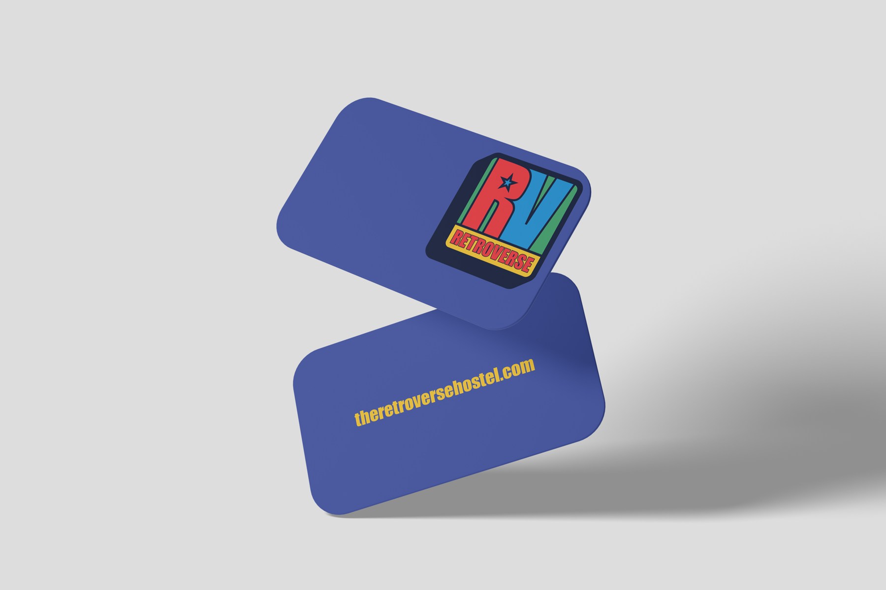
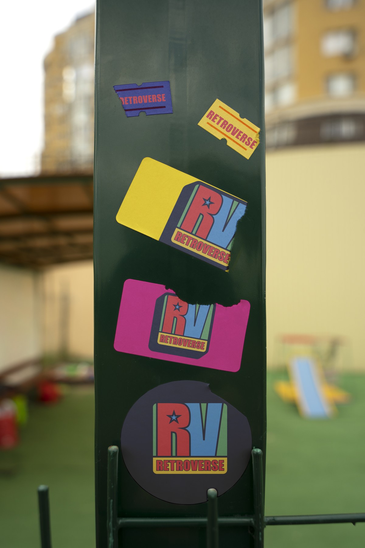
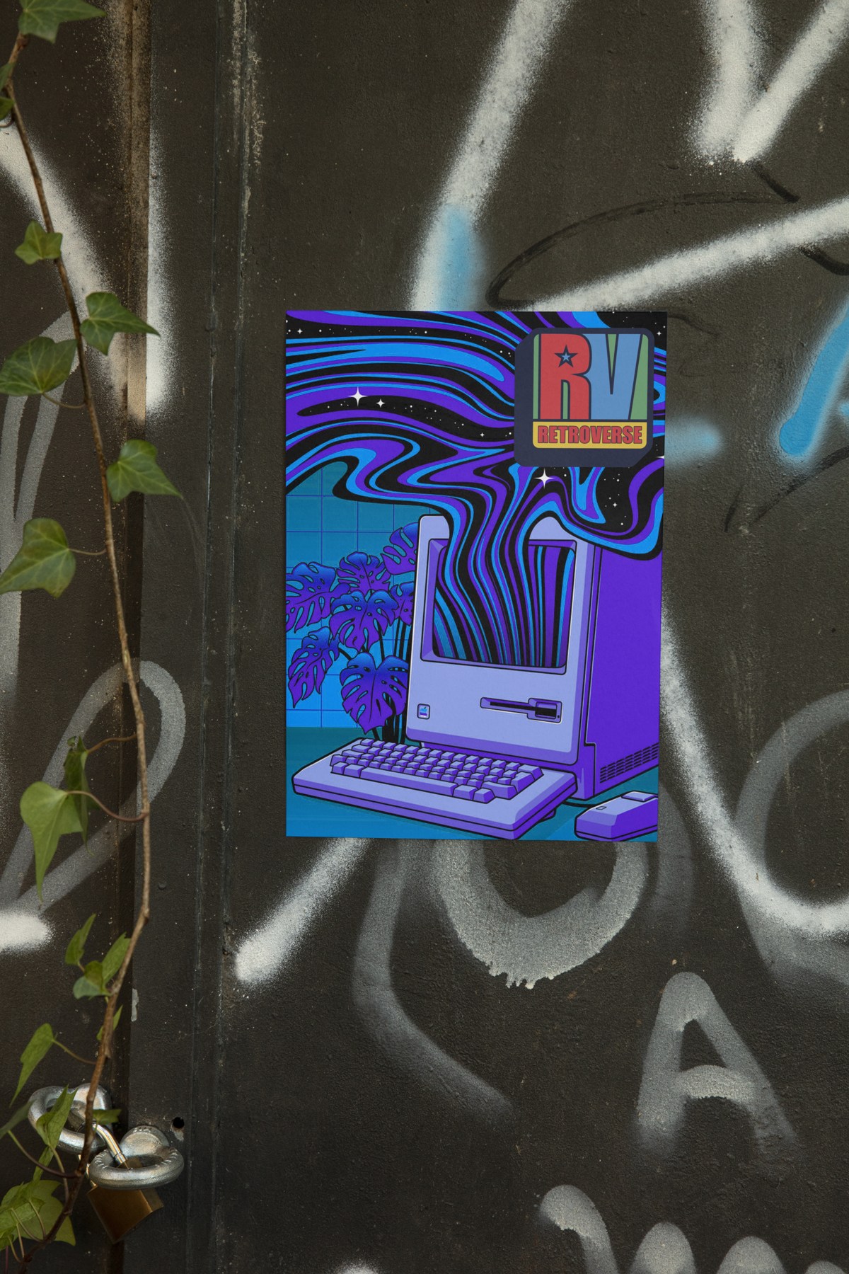
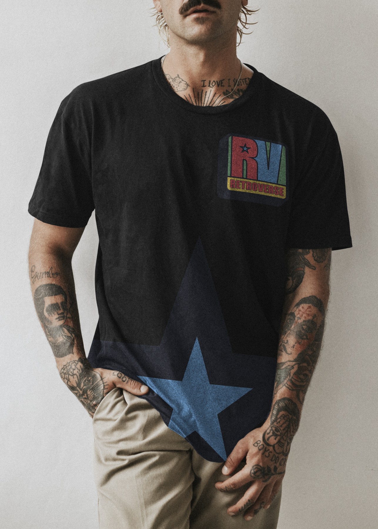
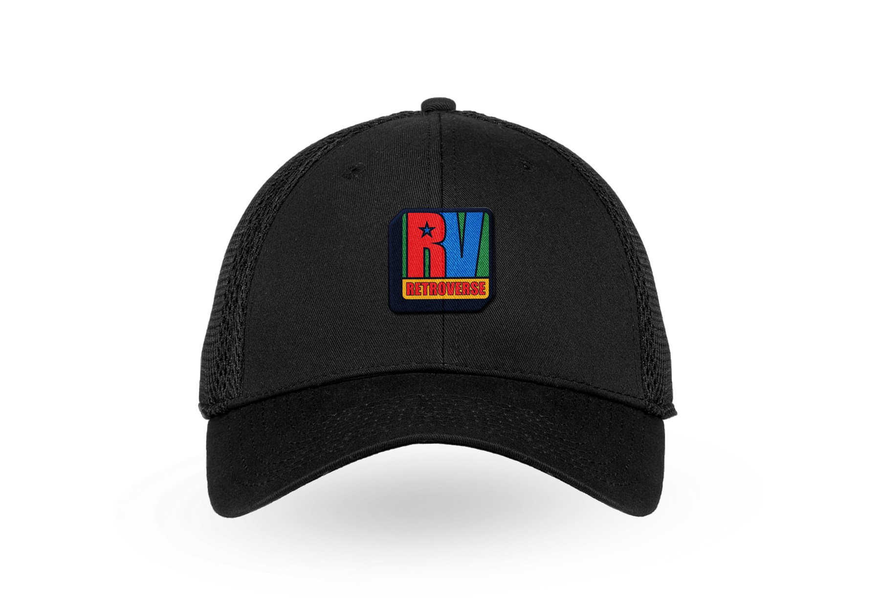
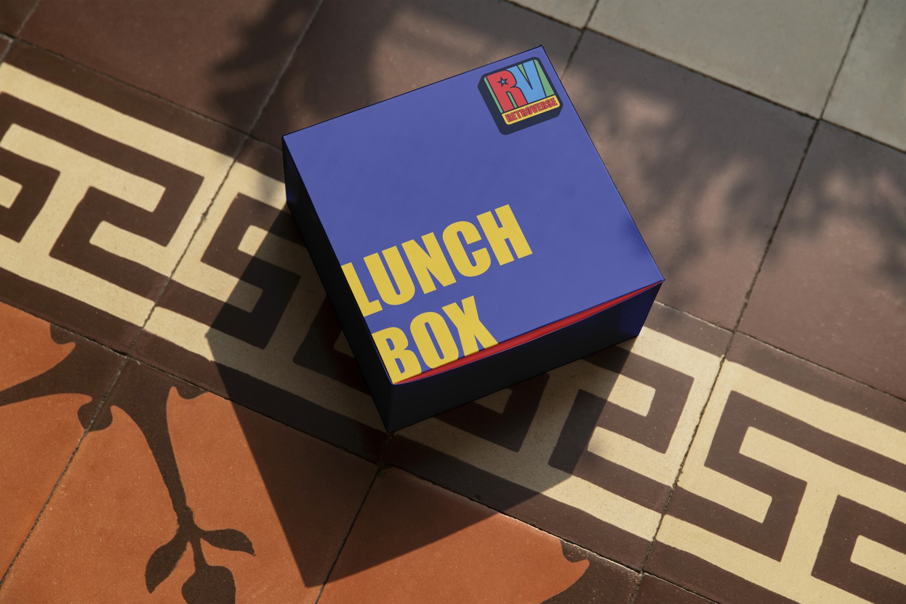
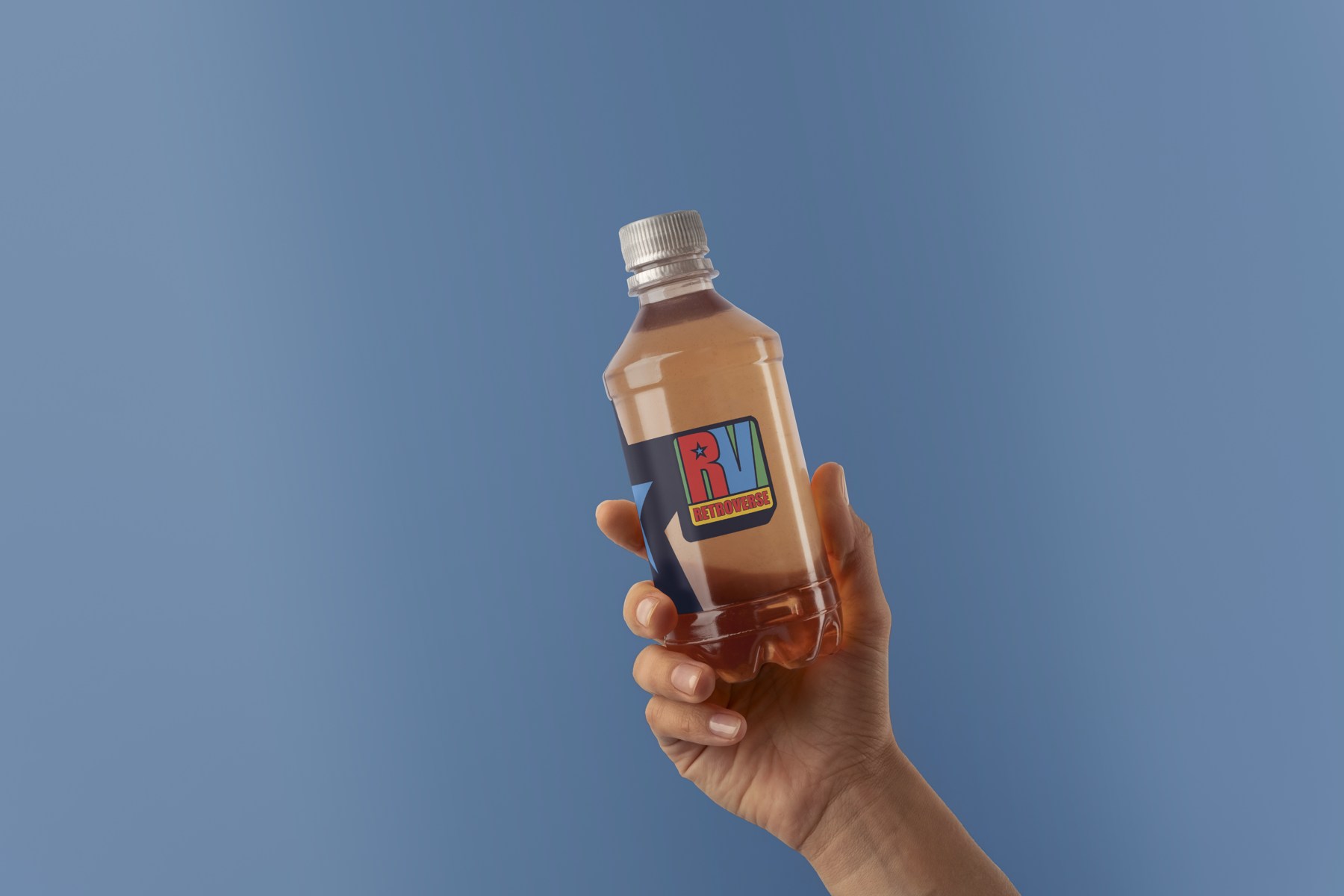
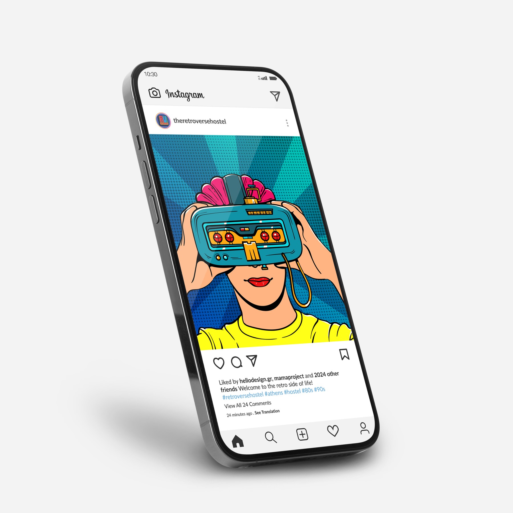
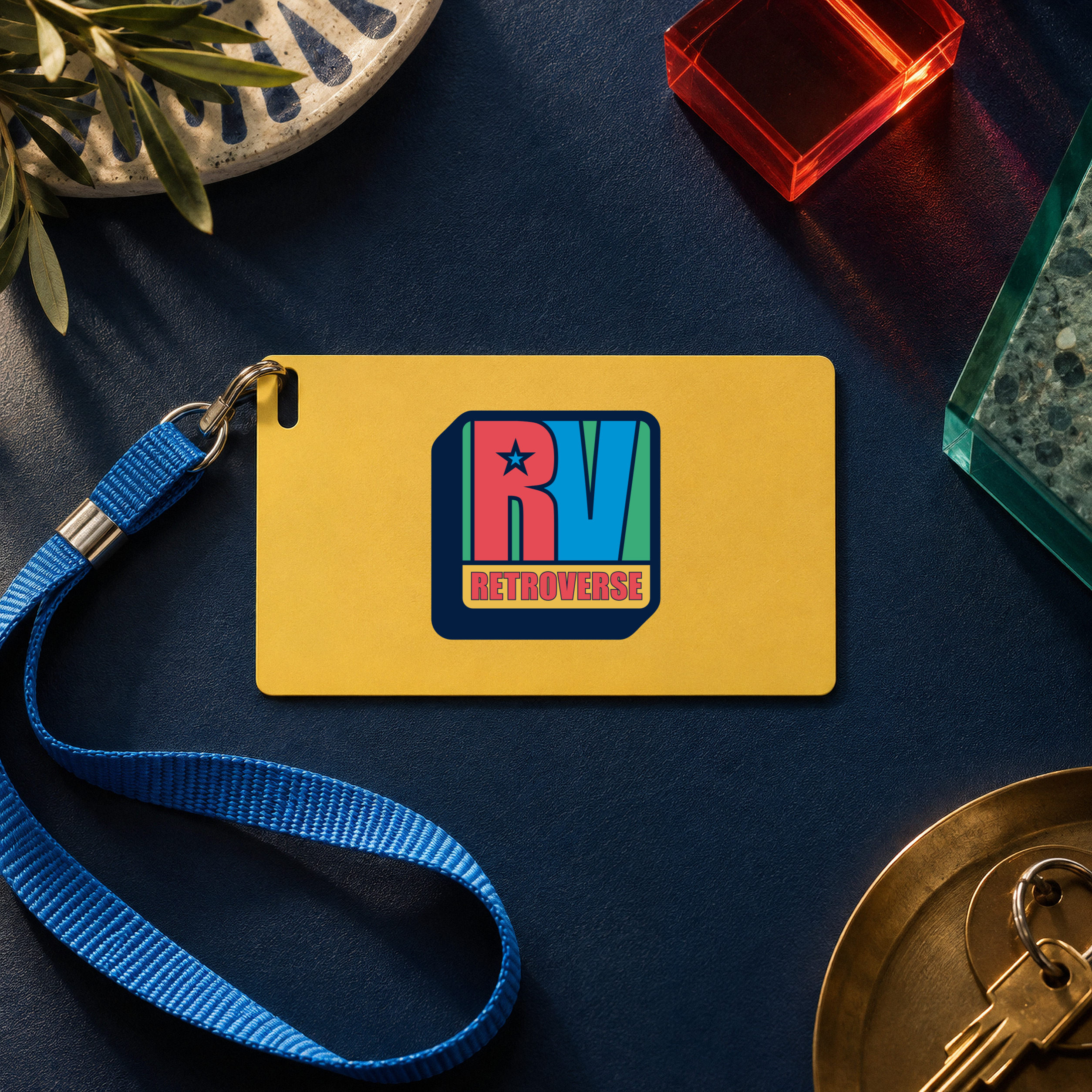
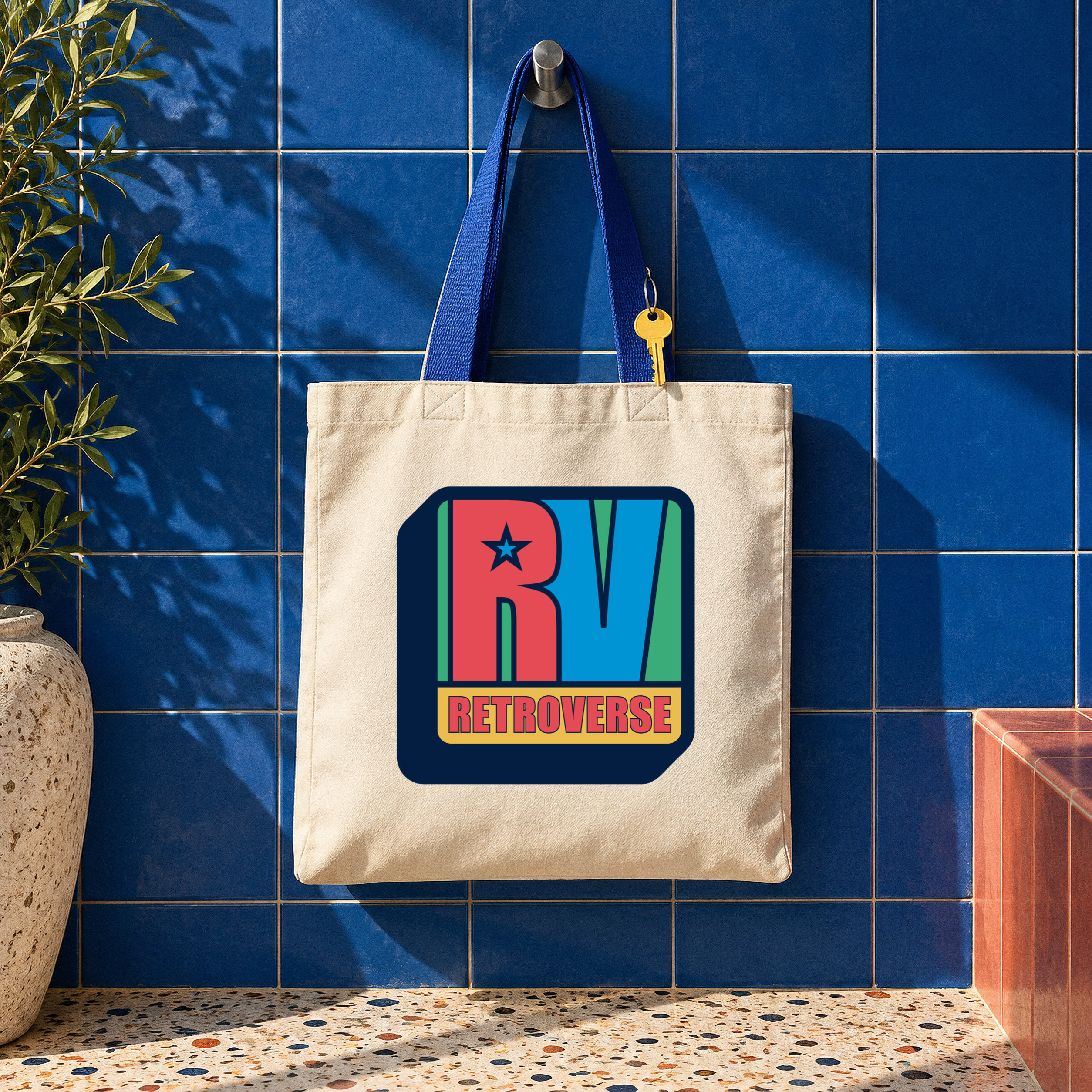
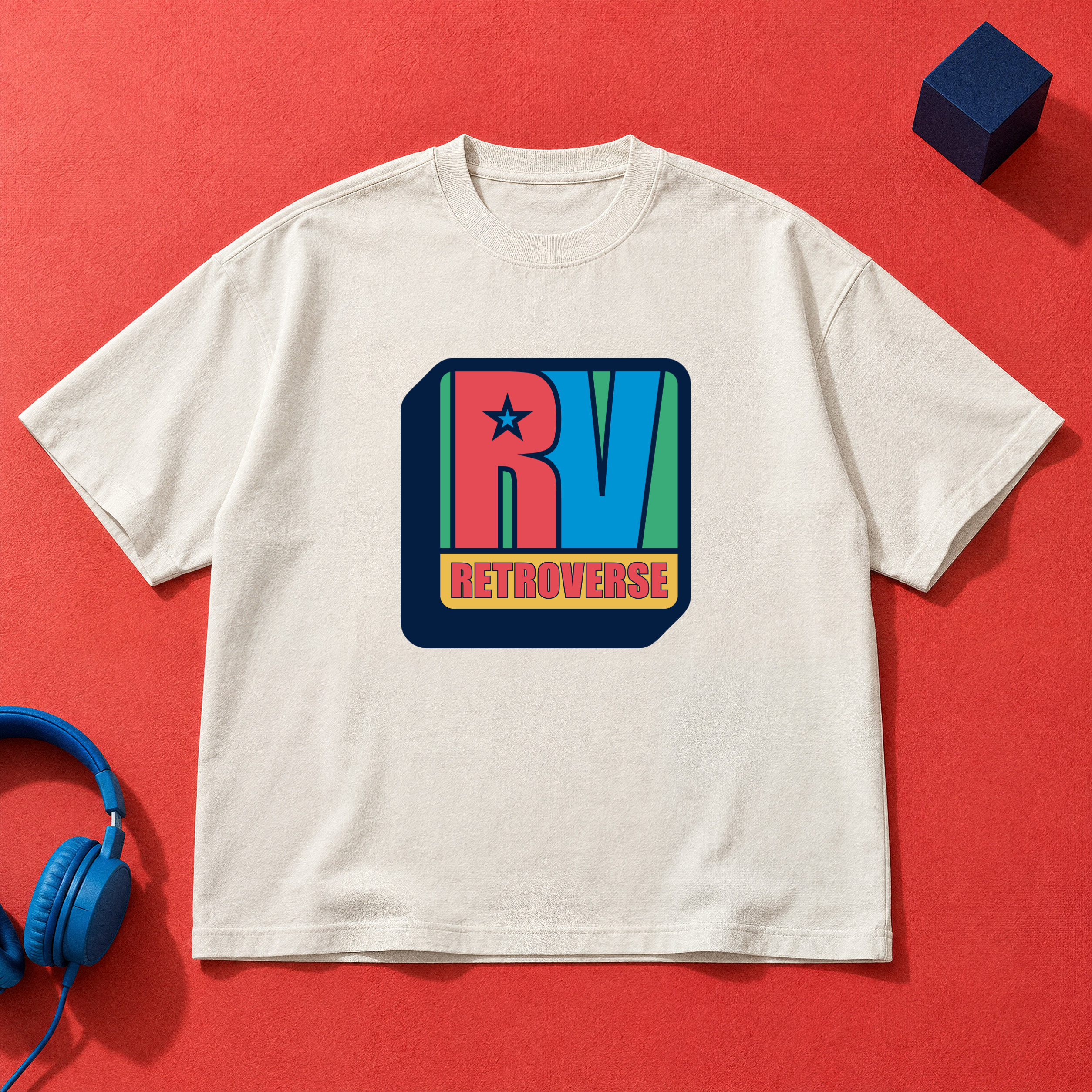
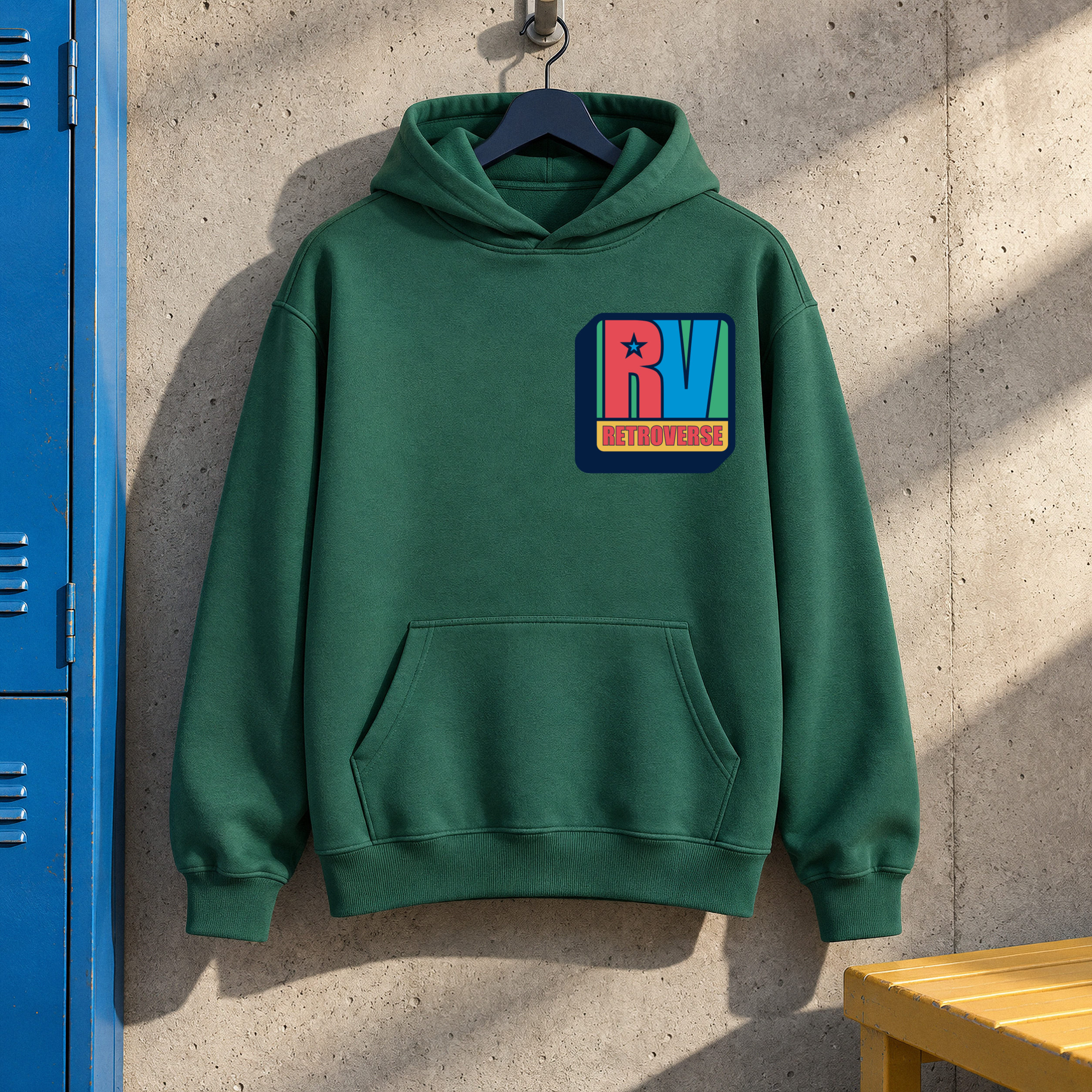
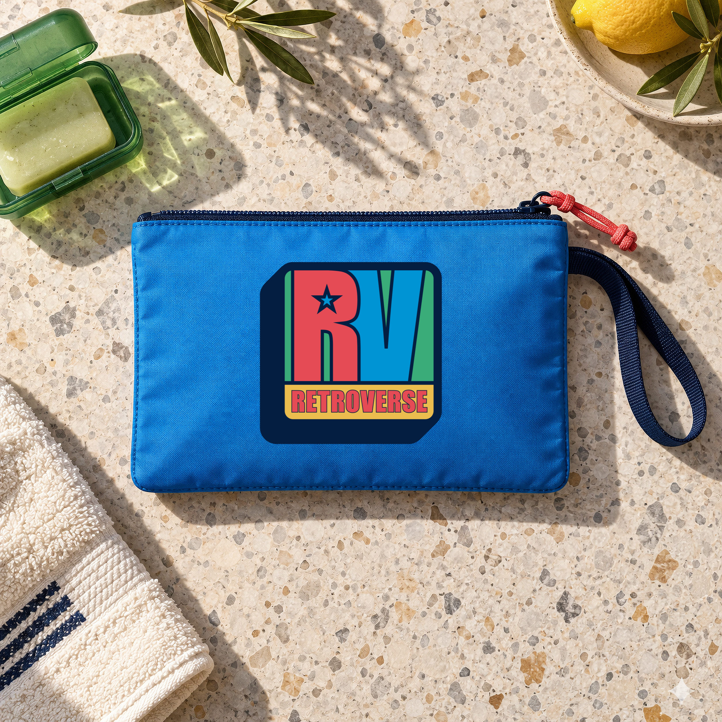
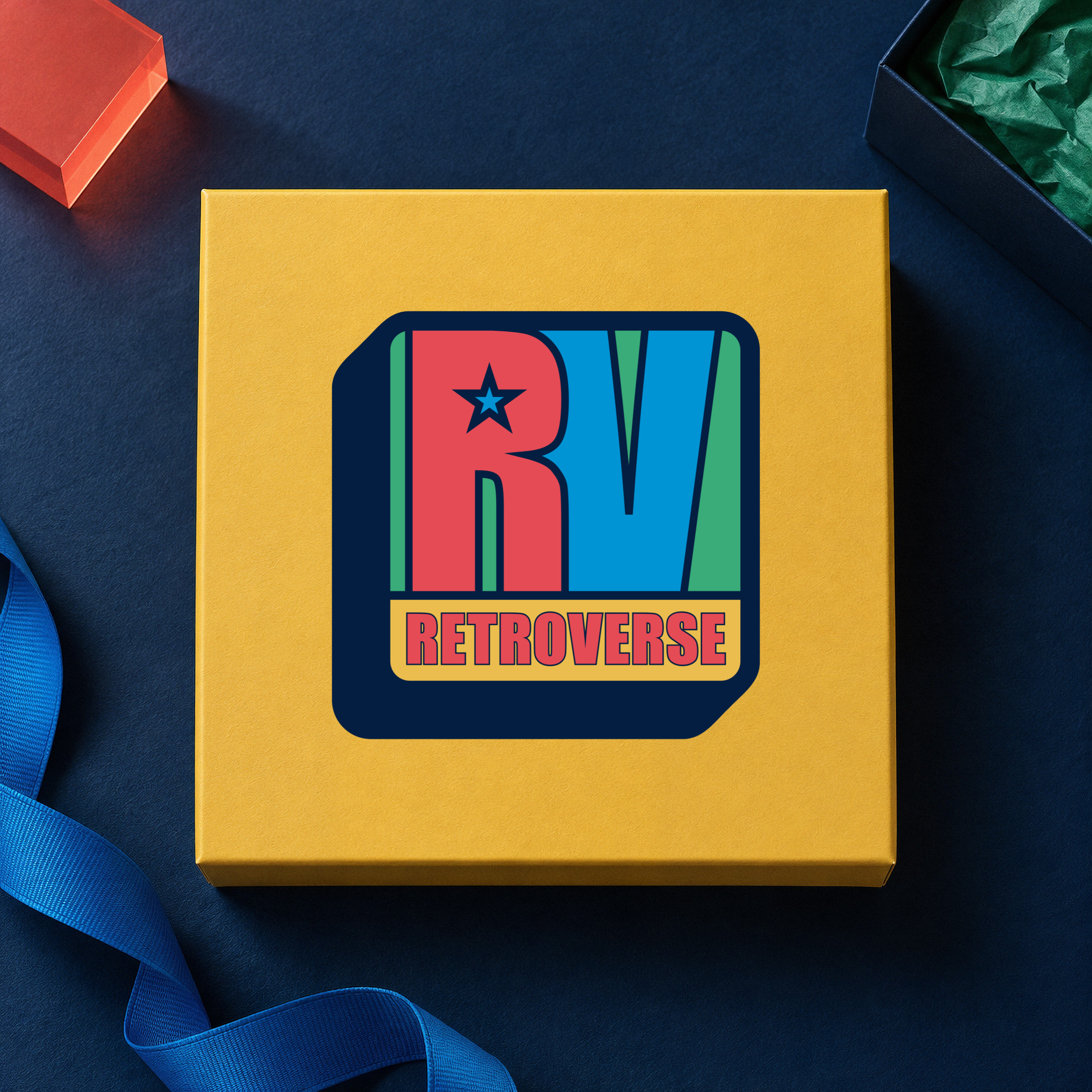
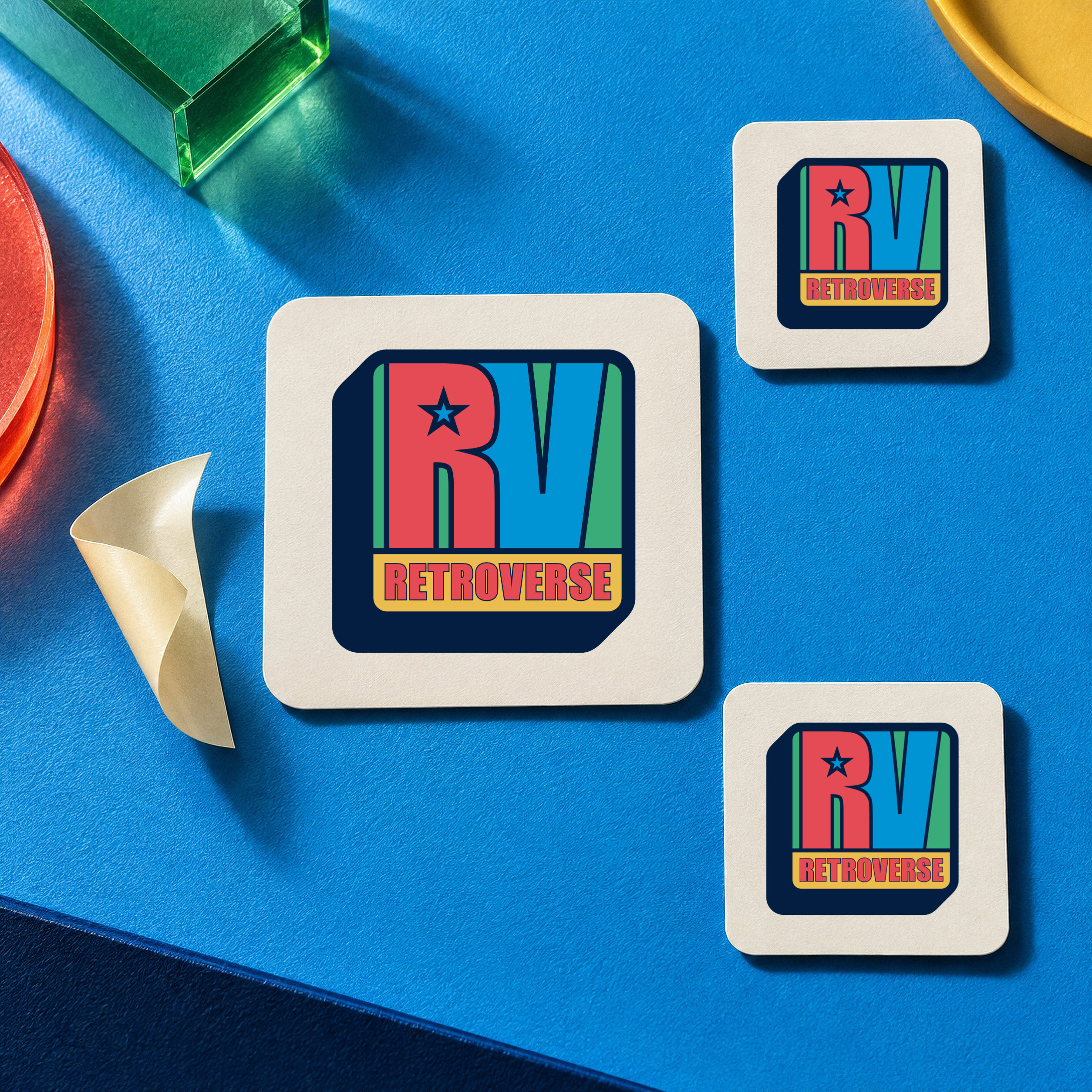
The project connected the concept and name with a system applied to specific parts of the stay:
The photographs of the space document the move from design proposal to application. Hello Design’s contribution covers the concept, naming, identity and graphic artwork prepared for production.
Brand concept, naming, identity & all graphic applications: Hello Design.
Architecture & design/build: MAMAproject.
Architectural photography: Panagiotis Voumvakis.
Explore Retroverse · Instagram
Read the story: how branding transforms the hostel experience ↗
DESIGN DECISIONS IN USE
The identity system and the reception photograph connect the graphic language with a specific moment in the guest journey: arrival.
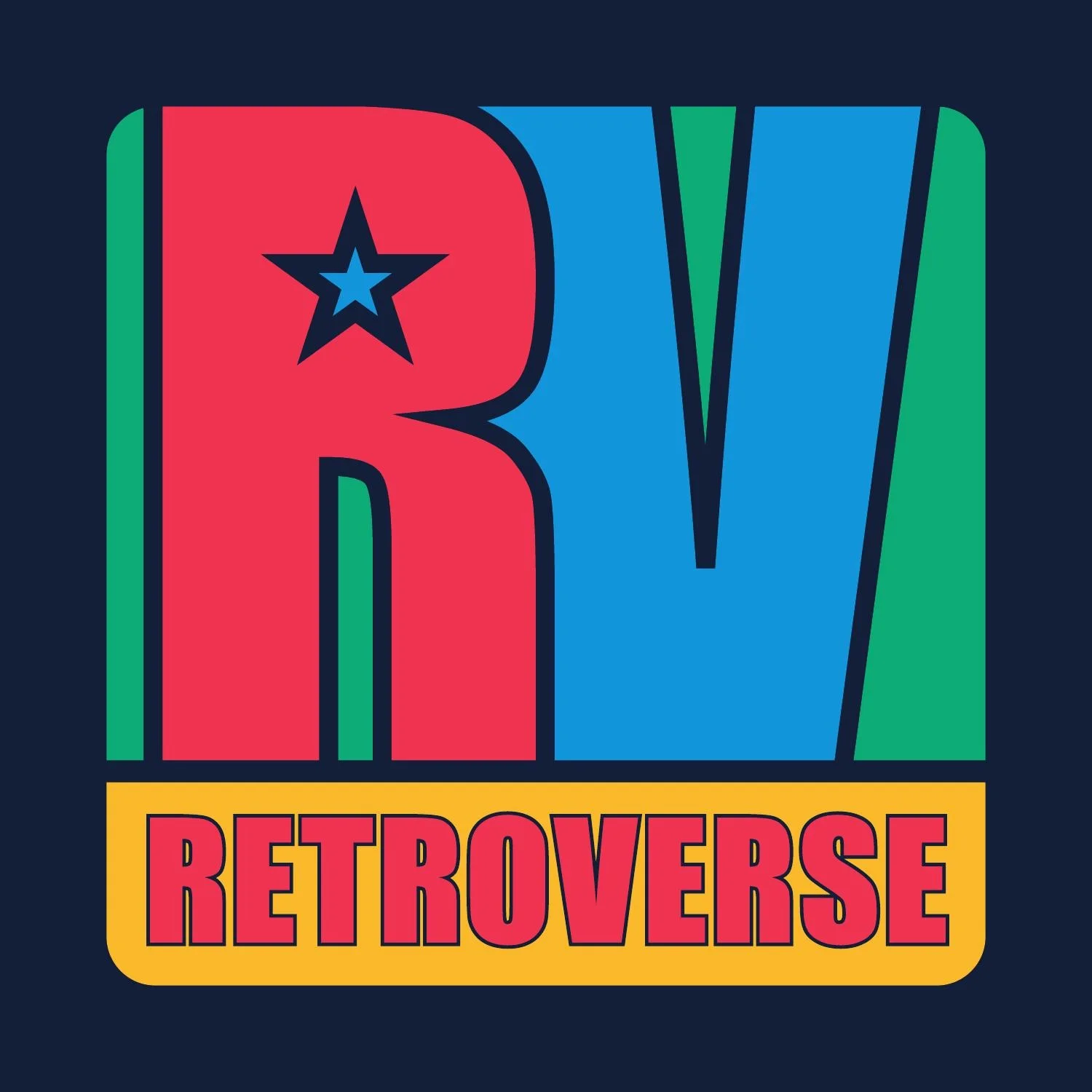
The RV mark, star and vivid colour palette establish the arcade-inspired identity. These elements provide a shared vocabulary for signs, posters and spatial graphics.
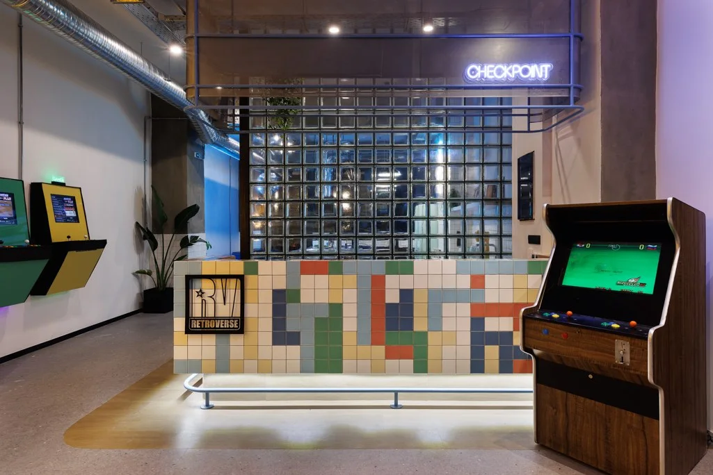
The reception photograph shows the RV identity alongside the Checkpoint neon. The name of the arrival point connects practical orientation with the retro-gaming concept.
Graphic design: Hello Design · Architecture: MAMAproject · Photography: Panagiotis Voumvakis
FROM DECISION TO APPLICATION
Retroverse connects a reference to local arcade culture with the practical needs of a hostel. The useful test of the concept is how it appears in arrival, orientation and the information inside the rooms.
Retroverse combines “retro” and “universe”. References to gaming and 1990s street culture give the name, RV emblem, star, typography and colours a shared starting point.
The graphic system carries that concept beyond the logo into posters, messages and spatial graphics.
Reception becomes “Checkpoint”, while the language of levels extends to floors and rooms. Bed and storage numbering bring functional information into the same graphic family.
Photographs of reception, wayfinding and numbering show where the identity meets the experience of staying at the hostel.
The page separates photographed applications in the hostel from merchandise and other application proposals shown as mockups.
The result is documented through the entrance, reception, shared spaces and rooms, with architecture and photography credits retained.
Project scope: Concept, naming, logo and visual identity, environmental graphics, wayfinding, numbering, posters and neon sign design.
Save up to three projects as a starting point for our conversation. Your choices are stored temporarily in this browser tab.
You have no saved projects yet. Choose “Save project” on a project card or page.
Brand naming and visual identity for The Nest Resort in Hersonissos, Crete.
Hospitality naming and identity inspired by Santorini’s cave architecture.
Naming and identity connecting a listed building with contemporary hospitality.