


Opposite at 507
A rooftop, a view and a different perspective on dining. Opposite by Botrini at 507 brings the city into the restaurant’s story. Hello Design shaped an elegant visual identity around a distinctive O, expressive typography and a restrained palette of gold, ivory and charcoal.
ClientOpposite at 507ServicesBranding, Logotype Design, Visual Identity, Restaurant Applications, Environmental GraphicsLinkoppositeat507.grYear2023
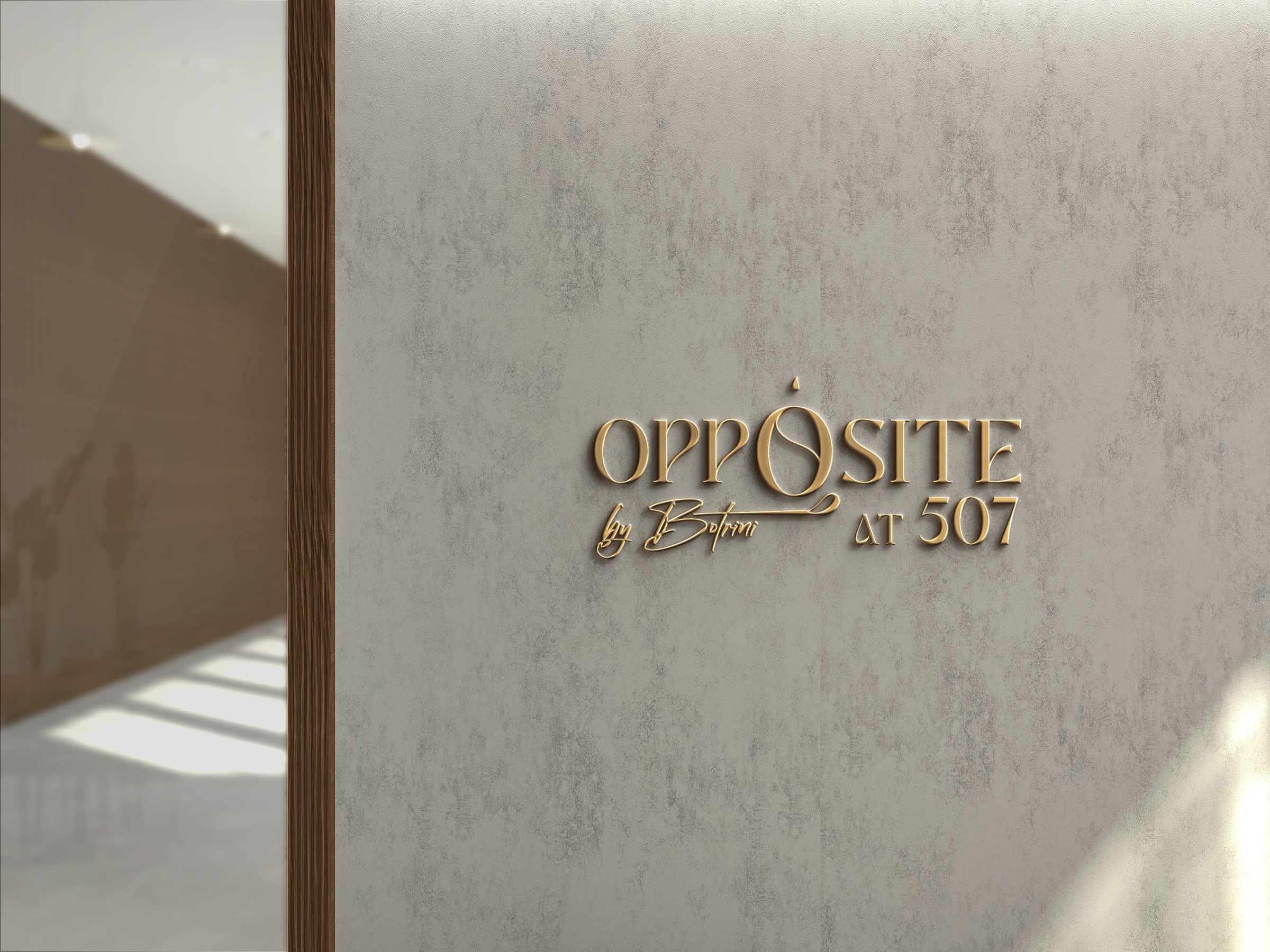
A name shaped by its point of view
Opposite sits on the rooftop of 507 Athens, with the city as the backdrop to its dining experience. Its name begins with this relationship: where you stand, what you face and the perspective a place offers. The restaurant’s identity gives that idea a clear visual expression.
The creative signature of Botrini adds a personal dimension. The branding brings the restaurant’s name, the chef’s signature and its location at 507 together in one considered composition. It connects a distinct dining destination with the hotel that hosts it.
An O that becomes a signature
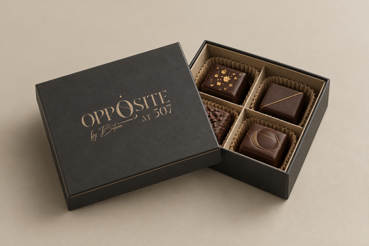
The wordmark is built around the fine contrast of Bodoni Display. Within its measured rhythm, the central O becomes the defining gesture: an interior curve divides the form, while the small drop above it gives the letter a recognisable silhouette.
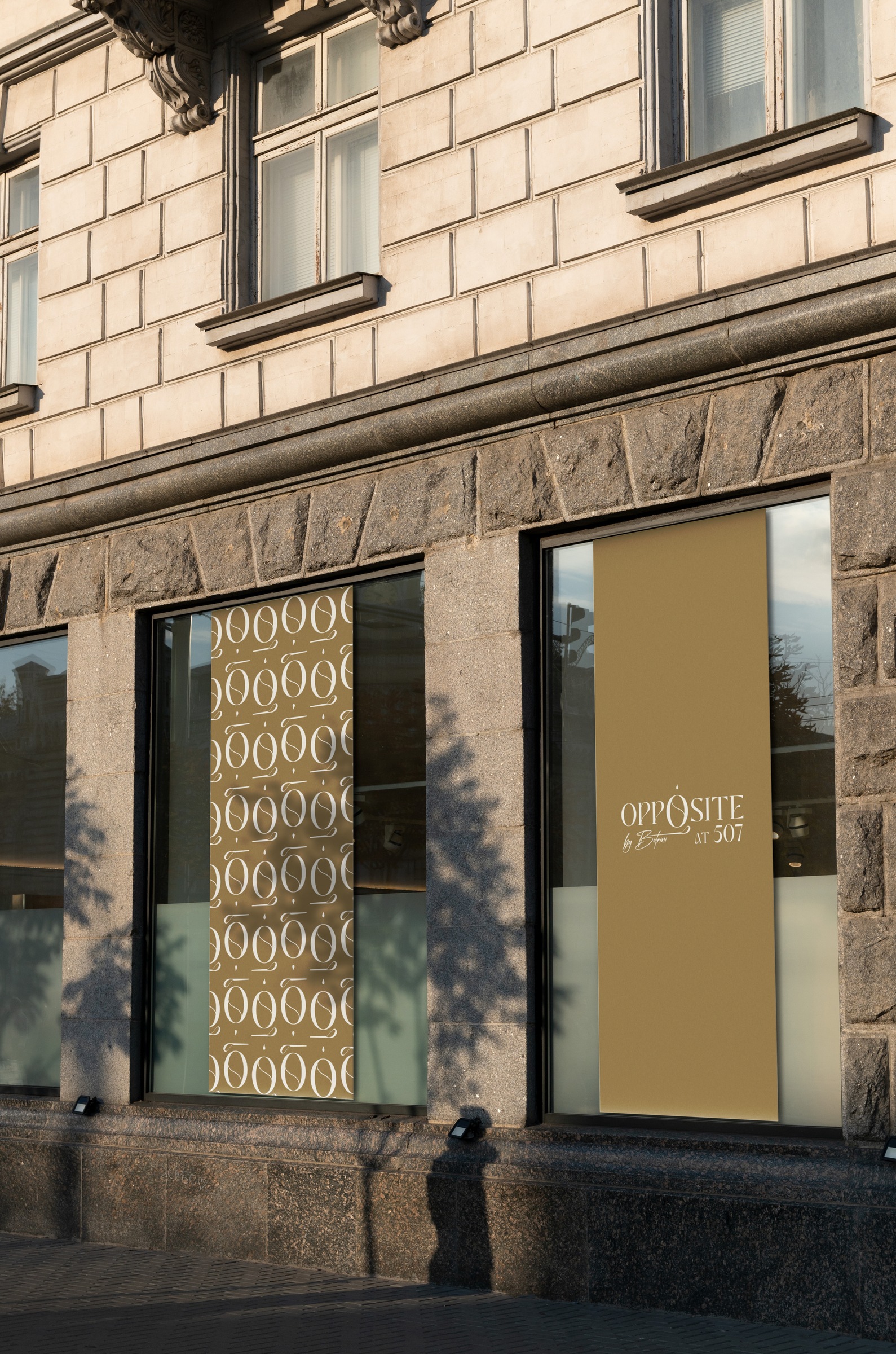
The handwritten “by Botrini” signature brings movement to the composition, balanced by the “AT 507” line. The O also works as an independent monogram, extending the identity to small surfaces and a repeating pattern. The full wordmark and the symbol give the brand two useful scales of expression.
A restrained palette, made tangible
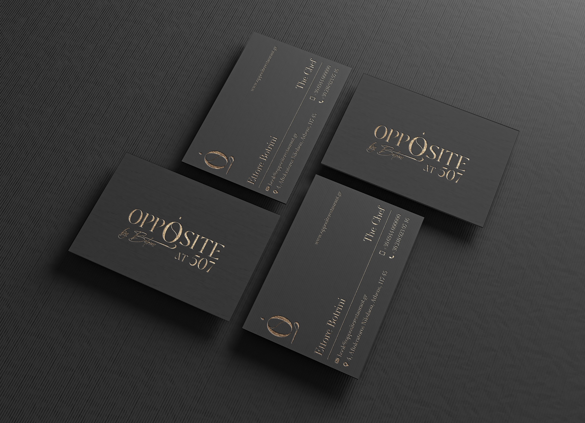
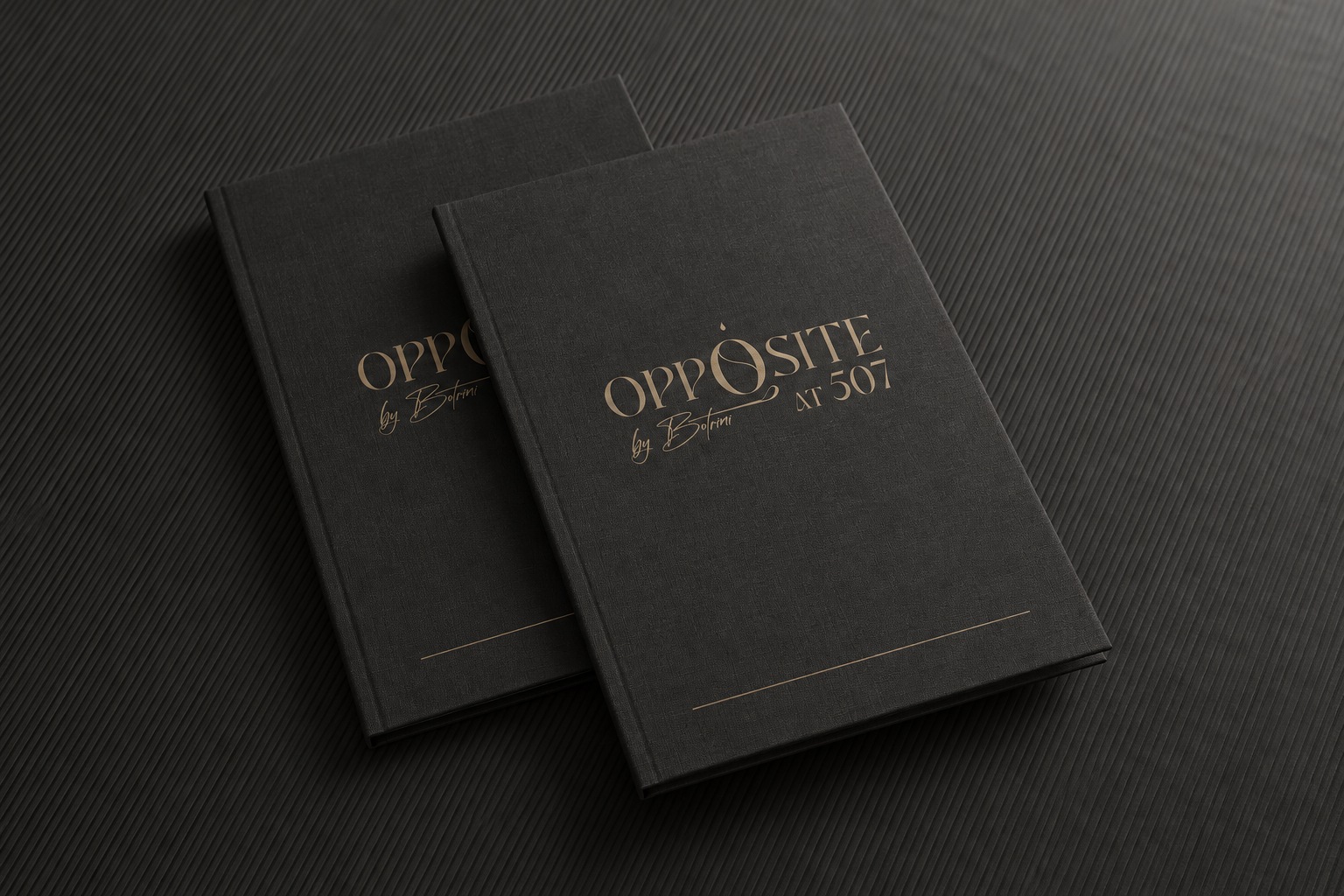
Muted gold, ivory and charcoal form the core palette. The gold gives the identity warmth; the dark surfaces bring depth; ivory leaves space for the fine strokes of the lettering. The visual character comes from proportion, texture and the way light falls on the material.
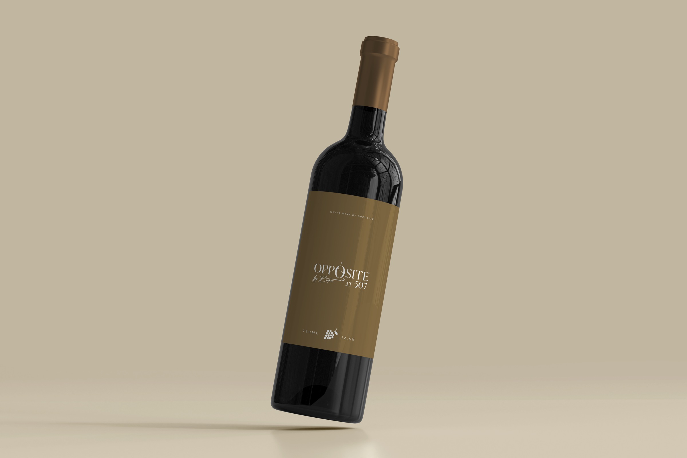
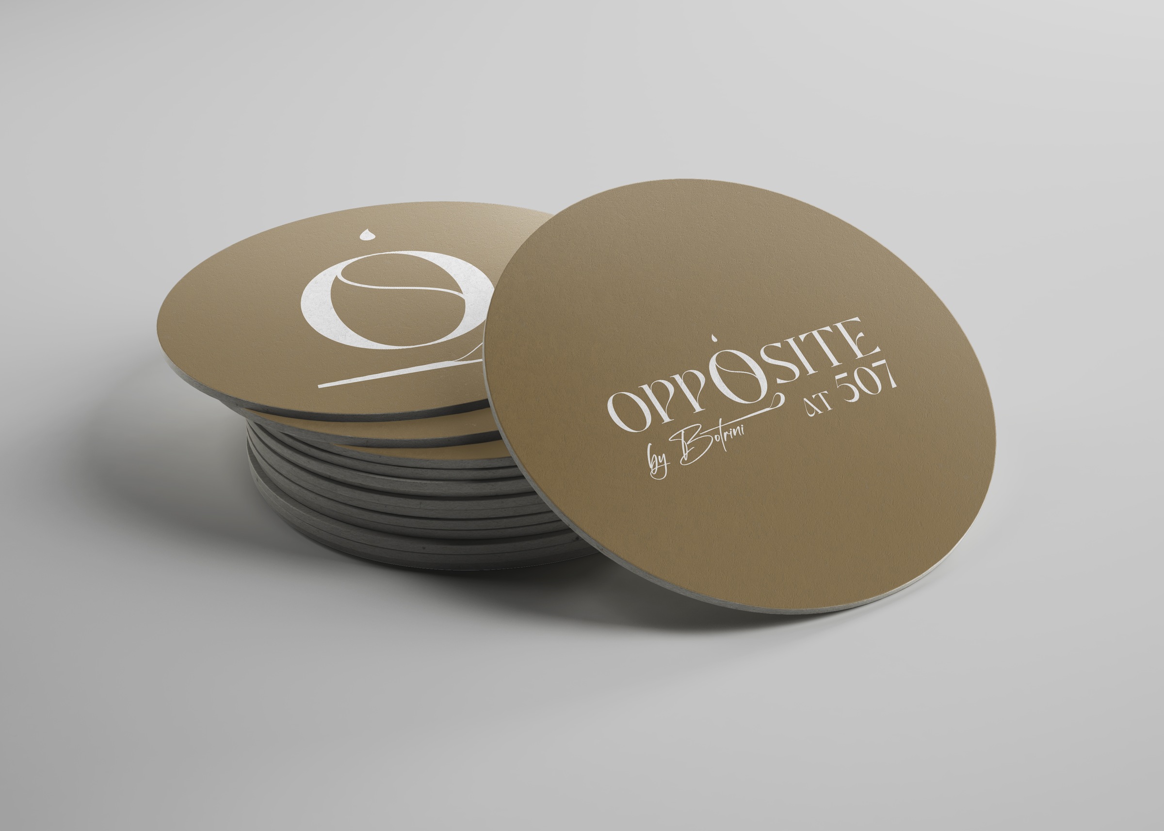
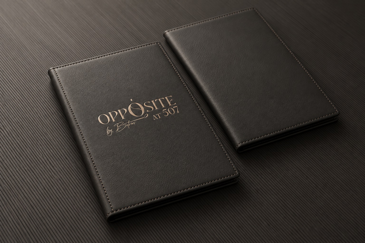
Foil on textured cards, metal against pale concrete, and ivory printing on a gold surface each express the same graphic language. The identity moves between paper, signage, glass and fabric while keeping a consistent presence.
From the first impression to the dining table
The applications follow the guest’s encounter with the restaurant. The exterior graphics and wall sign establish its presence. Business cards and correspondence carry the same identity into personal contact. The wine label and coasters bring it to the table.
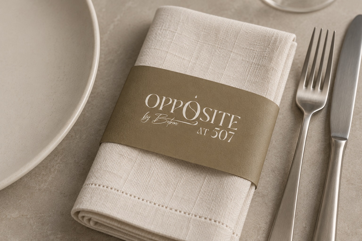
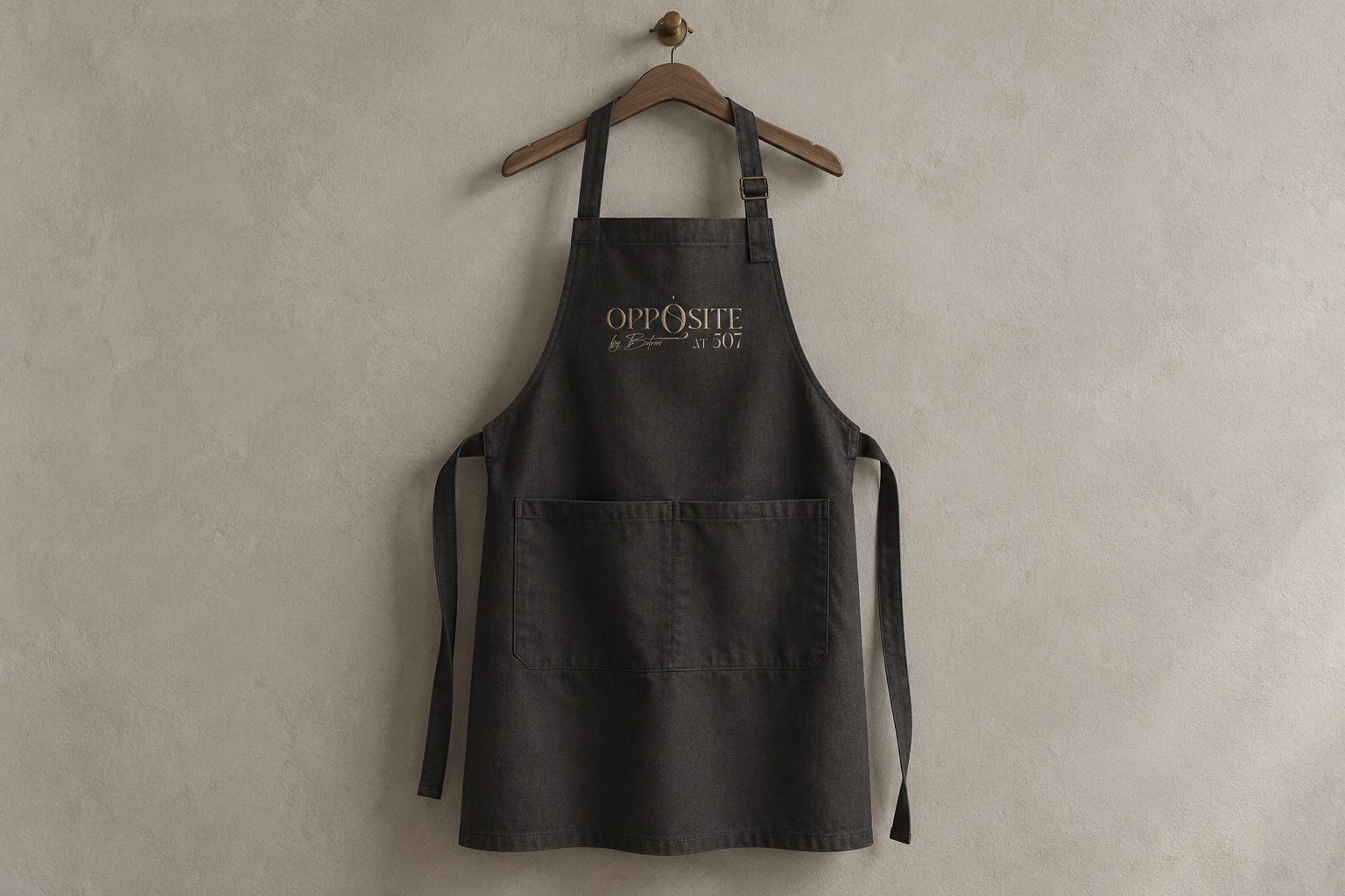
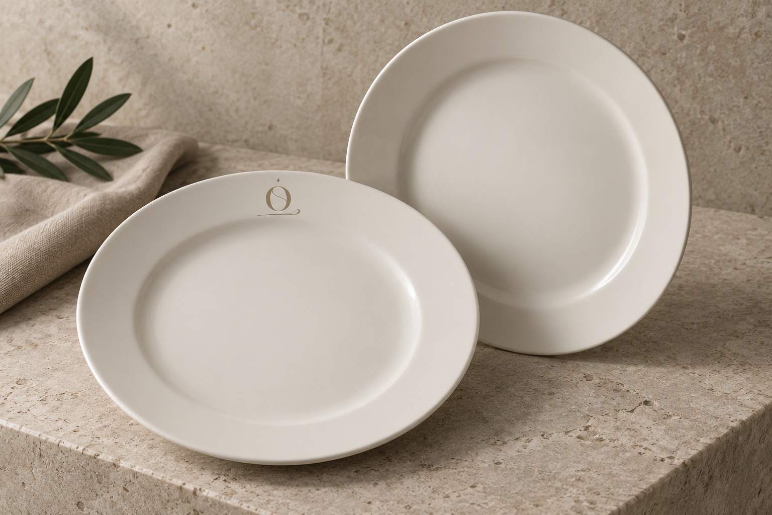
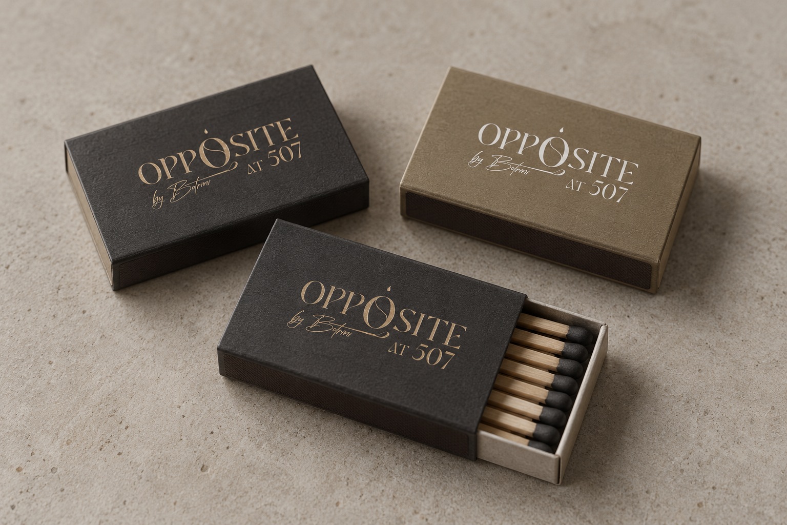
Menus, linen napkin sleeves, an embroidered apron, porcelain, bill folders, petit-fours packaging and bar matchboxes extend the system into the details of service. Each object uses the mark at a scale suited to its material and function. Together, the thirteen mockups present a coherent restaurant identity.
A dining identity connected with 507 Athens
Opposite shares a setting with 507 Athens while keeping its own visual voice. The relationship is stated directly in the lockup; the restaurant’s typographic character, monogram and culinary signature give it an identity of its own.
This project continues Hello Design’s work for 507 Athens, bringing the same attention to place and hospitality into a different guest experience.
Visual identity, logotype and brand applications: Hello Design.
Project: Opposite by Botrini at 507, Athens, Greece.
Identity presentation: 2023.