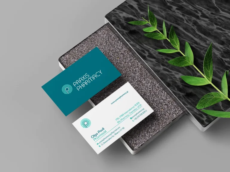
Praxis Pharmacy
Pharmacy naming and identity, from signage to packaging.

Care with a distinctive identity.
In 2025, Hello Design created the name and brand identity for Therabeau Pharmacy in Pyrgos, Greece. The project brought together naming, logo design, corporate identity, store signage and collateral, in collaboration with Plus Minus, who developed the architectural design.
A pharmacy’s identity needs to communicate care and confidence while giving the business a character of its own. For Therabeau, we developed a visual language built around a distinctive monogram, refined serif lettering and deep green balanced with white. The flowing lines of the symbol bring a softer, more personal quality to a clear and composed identity.
The monogram also becomes a repeating pattern, extending the brand beyond its logo. Business cards, letterheads, paper bags, signage and digital applications share the same visual vocabulary, while adapting to their different formats. The project’s presentation also explores the identity on personal-care packaging and social media.
The collaboration with Plus Minus connected the brand’s visual expression with the architectural study. Hello Design was responsible for naming and graphic identity; Plus Minus was responsible for architecture. Together, these complementary disciplines shaped a consistent direction for the pharmacy’s presentation.
From the name to everyday applications, Therabeau shows how pharmacy branding can combine clarity, recognition and a considered sense of care.
ClientTherabeau PharmacyServicesBrand Naming, Logo Design, Visual Identity Design, Store Signage, Brand CollateralLinkwww.instagram.comYear2025
DESIGN DECISIONS
The monogram, typography and green form the basis of the identity. Across applications, each element finds its place according to the format and use.
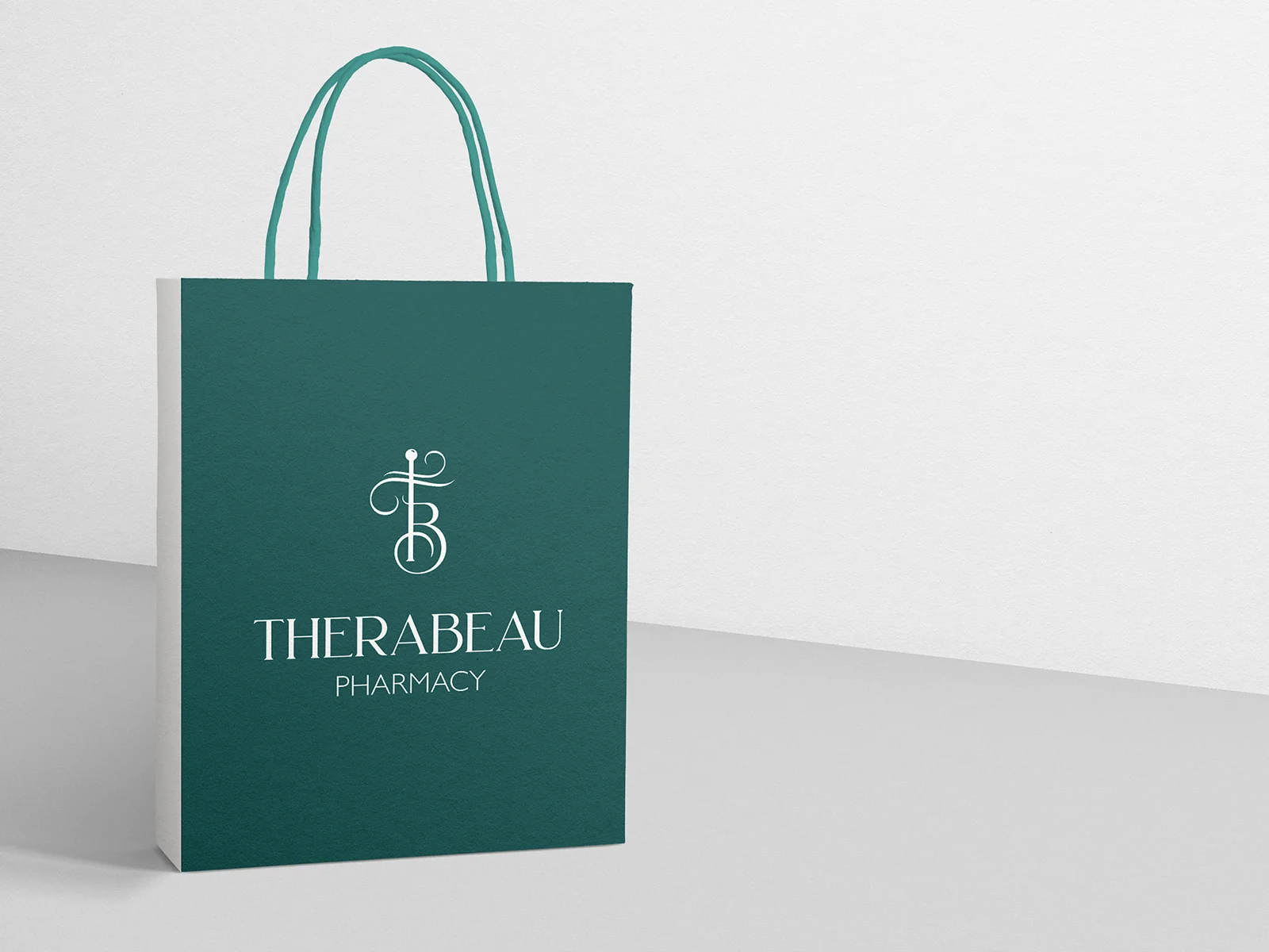
In the paper bag presentation, the monogram and name share the same space in white against deep green. The clear layout lets the flowing lines of the symbol set the tone: care with a gentle, personal character.
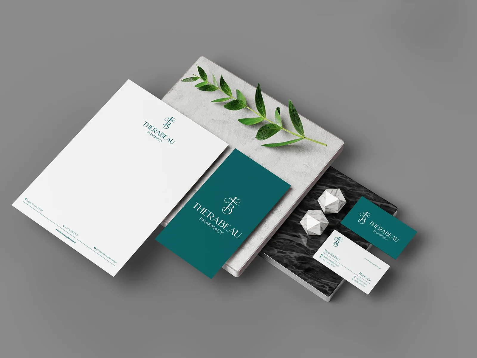
On the letterhead, envelope and cards, green changes role: it becomes a background or a detail on white. The position and scale of the logo adapt to the application while the set remains coherent.
Naming and graphic identity: Hello Design. Architectural design: Plus Minus. Application images from the project presentation.
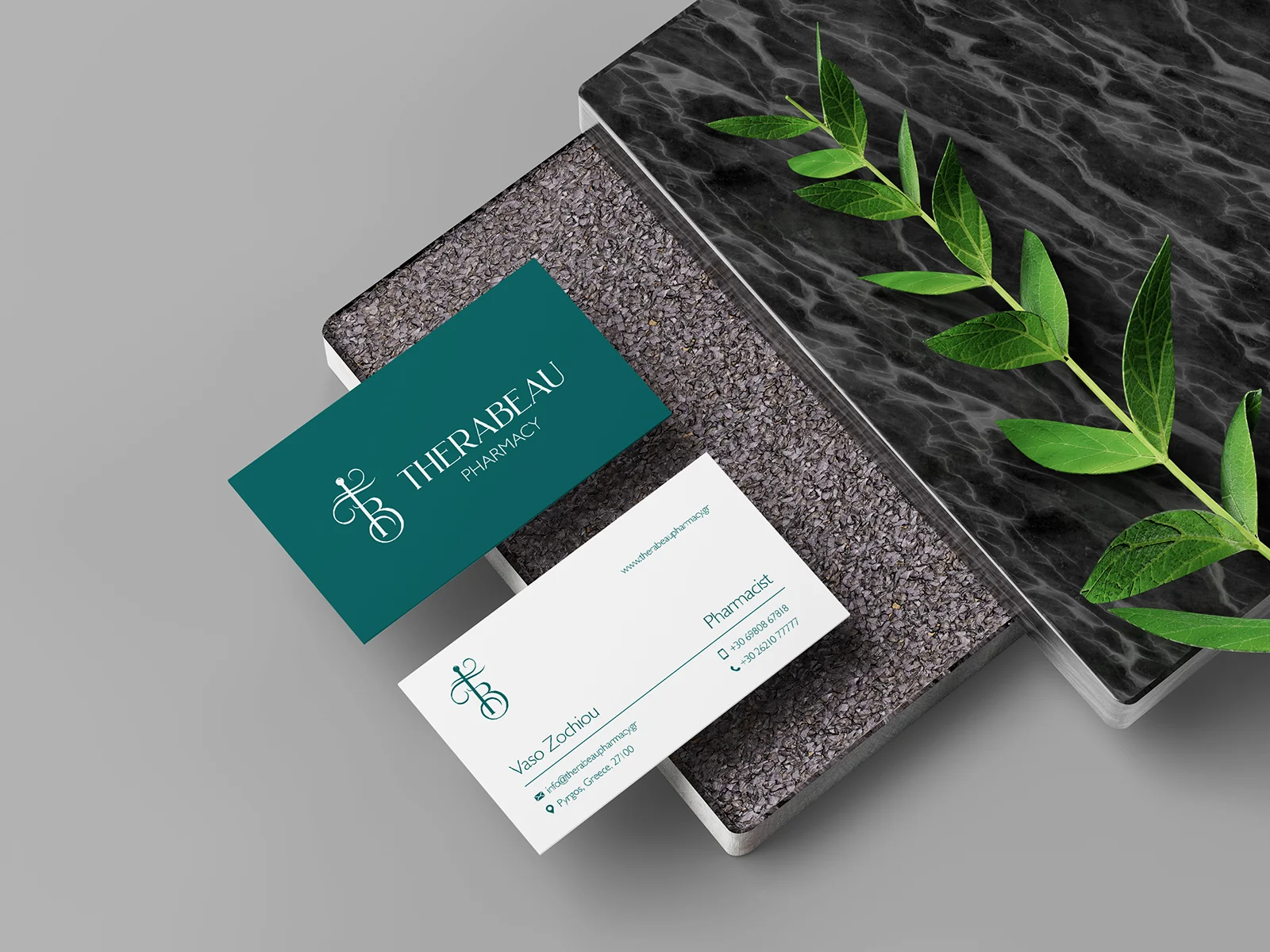
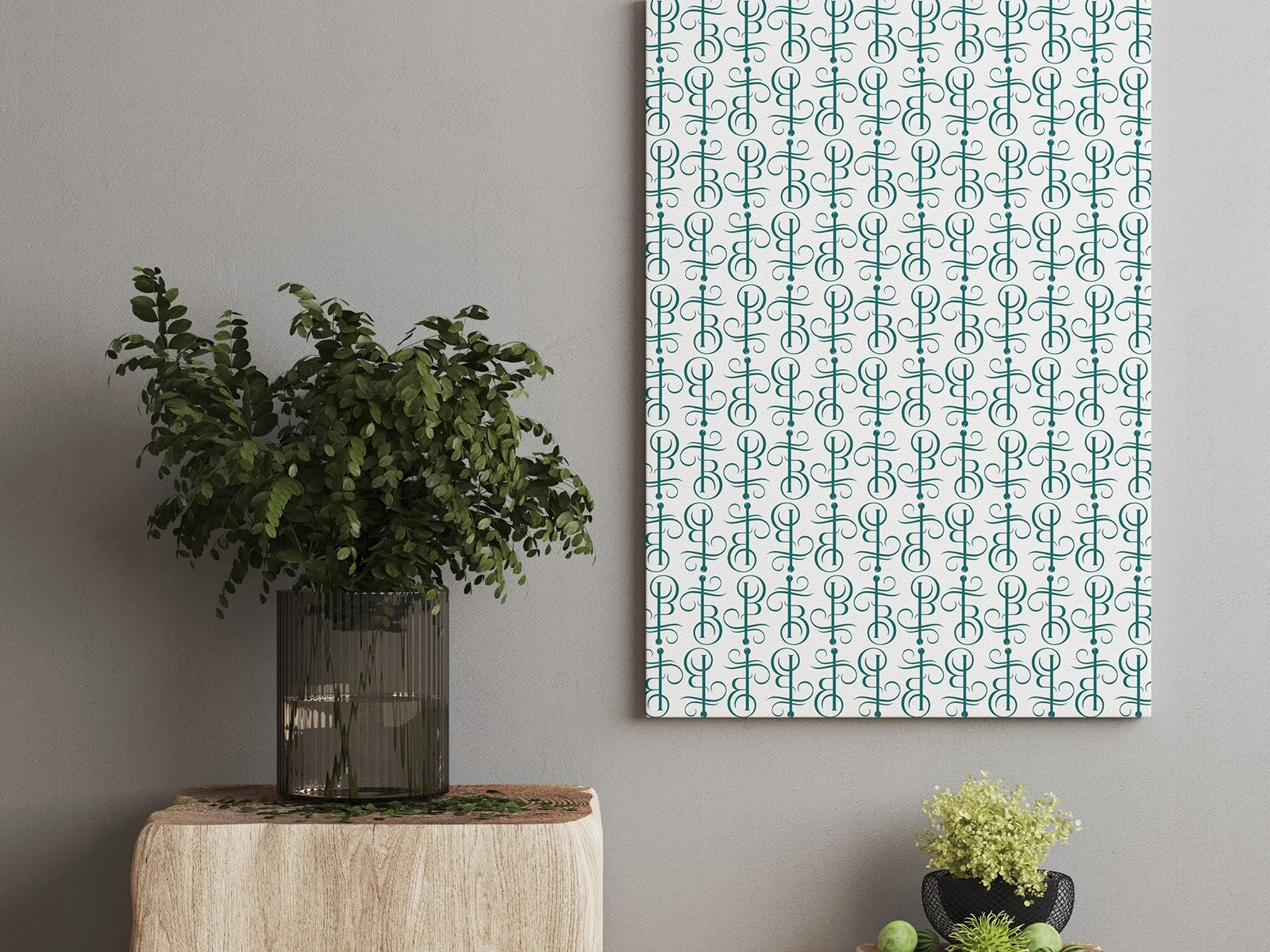
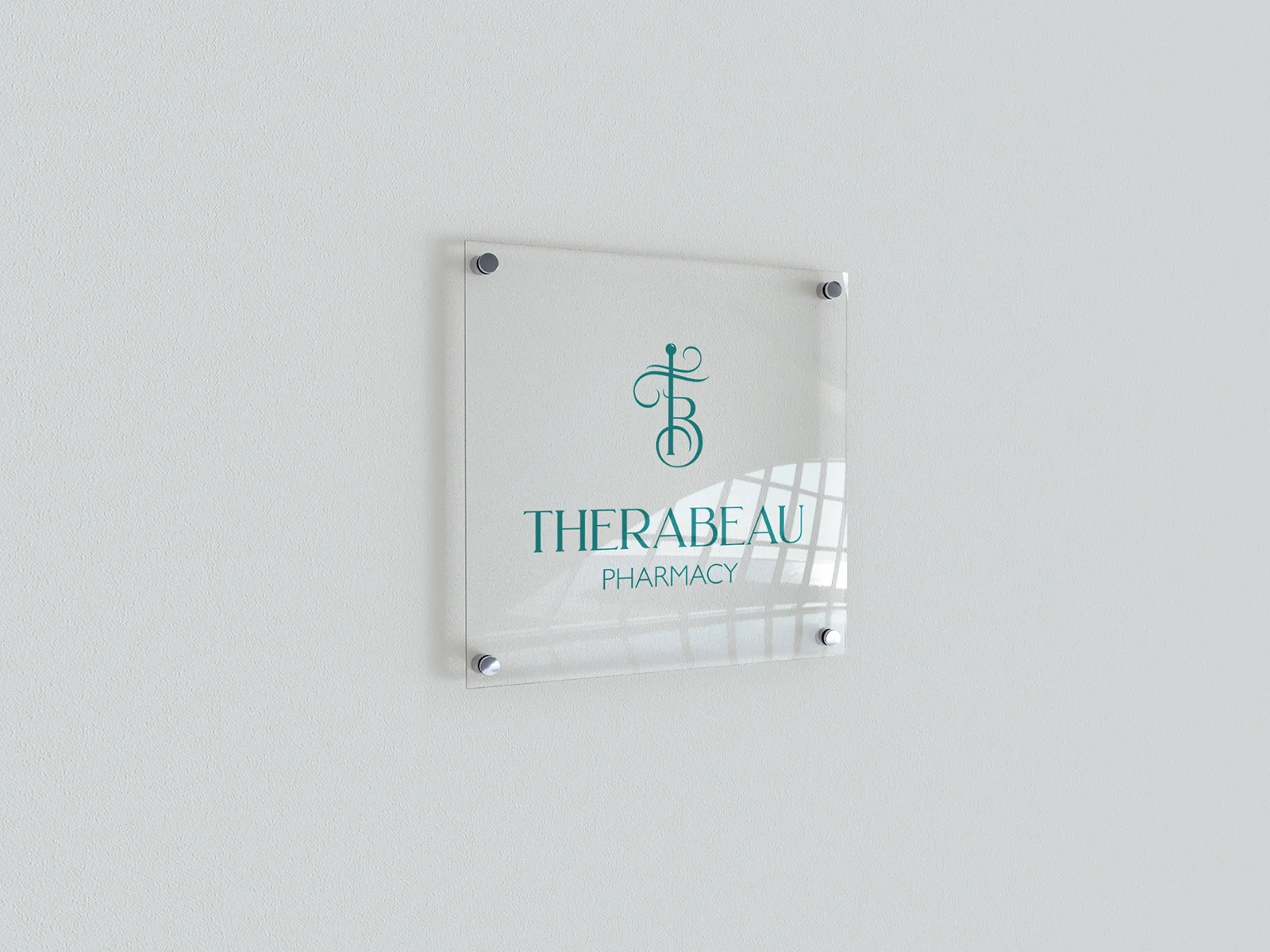
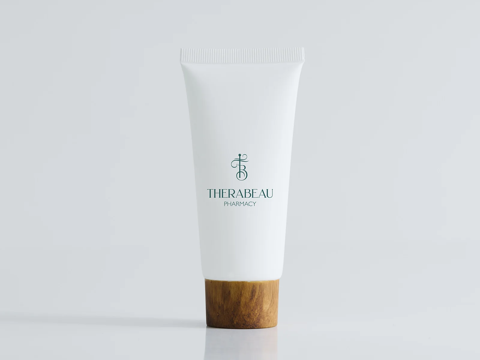
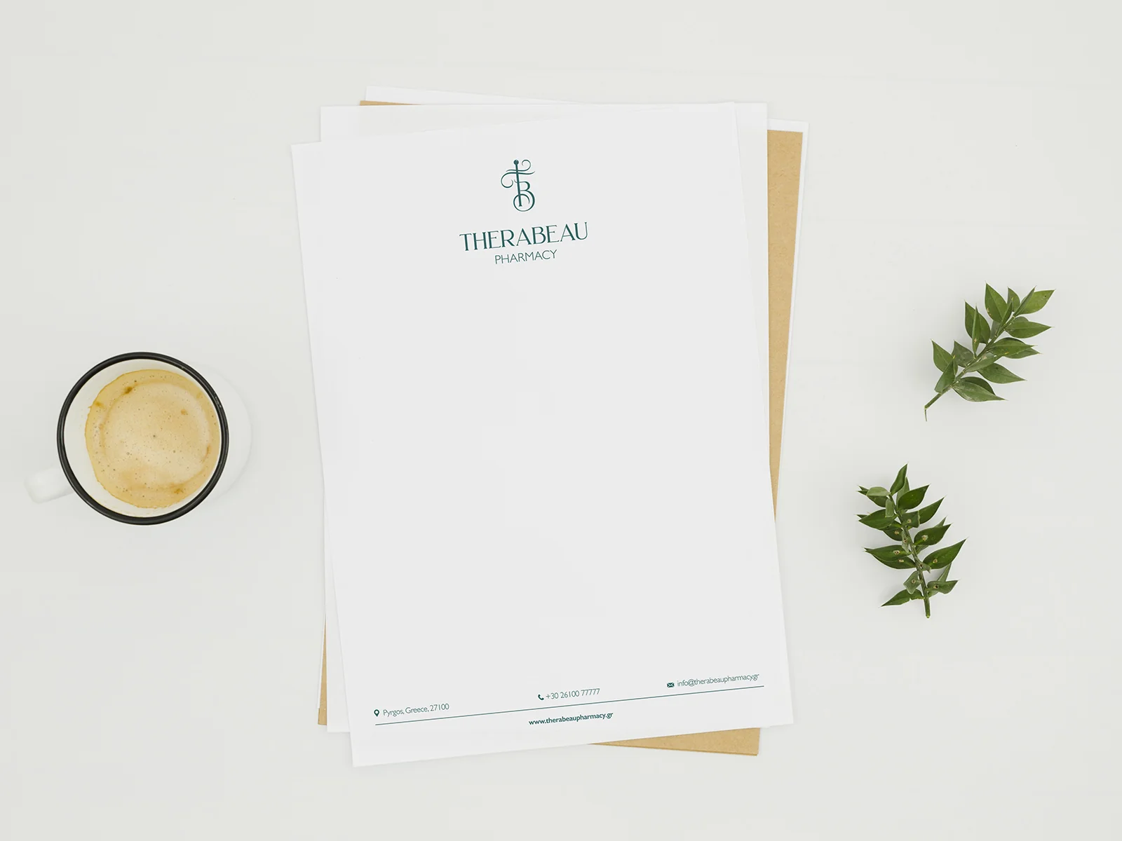
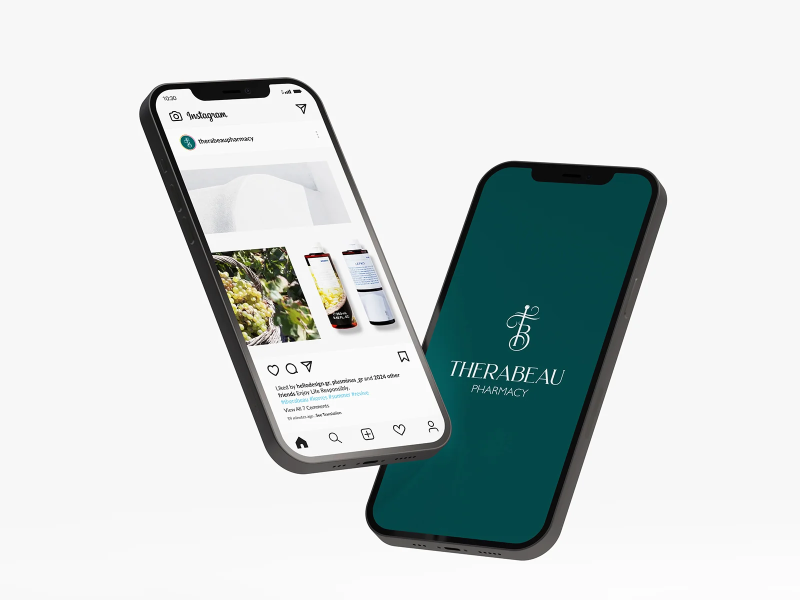
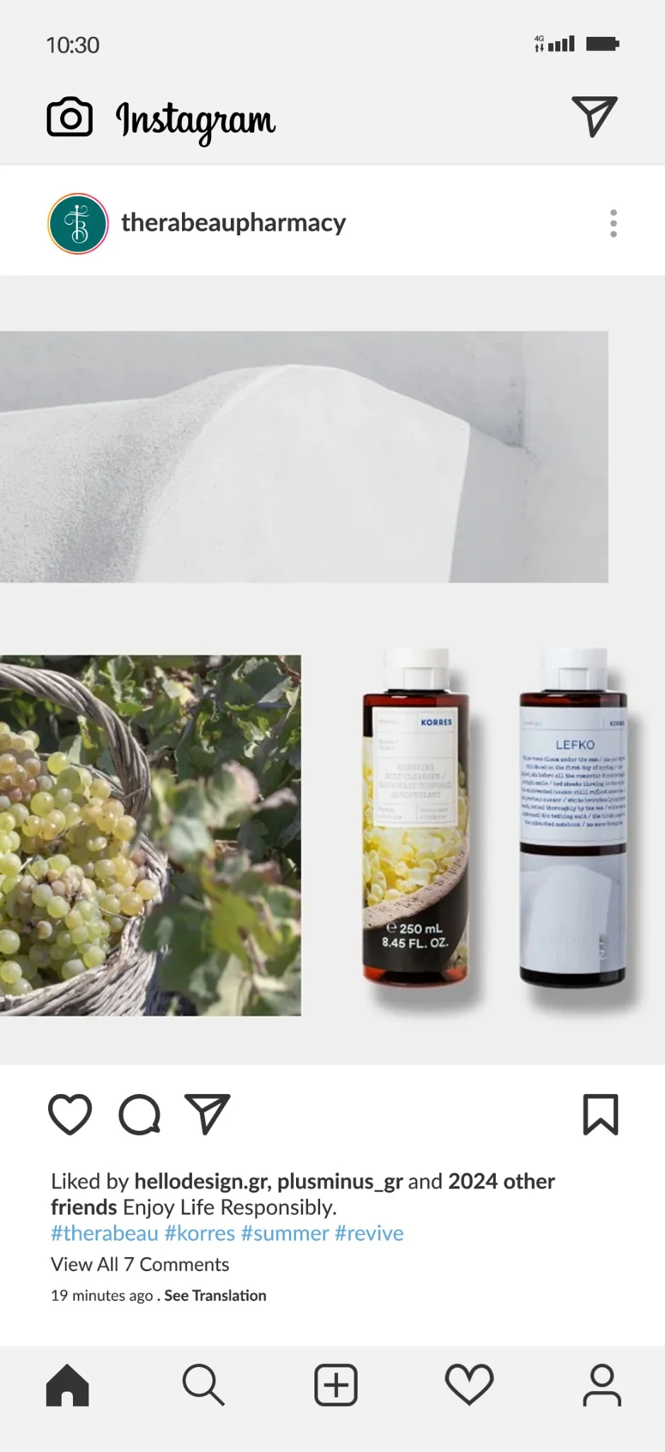
The images present design applications of the identity in mockups.
Save up to three projects as a starting point for our conversation. Your choices are stored temporarily in this browser tab.
You have no saved projects yet. Choose “Save project” on a project card or page.