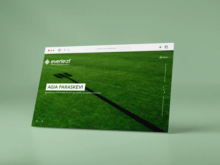
Everleaf
Corporate identity and website for a technical landscaping company.



FROM DECISION TO APPLICATION
Labarch’s name refers to Laboratory of Architecture. The identity and website connect that research-led character with the presentation of the practice’s work.
The initials L and A take their cue from the free movement of an architectural sketch. The mark gives the practice a recognisable signature linked to how it designs.
The logo and corporate applications show the same sketch-informed expression across different formats.
Gold and copper tones bring a tactile reference to the printed applications. They work with the expressive mark as parts of the same visual direction.
The stationery and business-card presentations show the relationship between the mark, colour and surface.
The website extends the identity into the practice’s digital presentation while giving architectural projects room to be explored.
The outcome connects logo, print and website. The client’s account highlights a shared language that relates to the practice’s approach and leaves space for the projects themselves.
Project scope: Logo design, visual identity, branding and website design and development.
Save up to three projects as a starting point for our conversation. Your choices are stored temporarily in this browser tab.
You have no saved projects yet. Choose “Save project” on a project card or page.