Hando Massage & Spa
Logo, print and environmental graphics inspired by the human touch.

DESIGN DECISIONS
A personal symbol needs to work on its own and alongside the practice’s everyday information. These two applications show the connection.
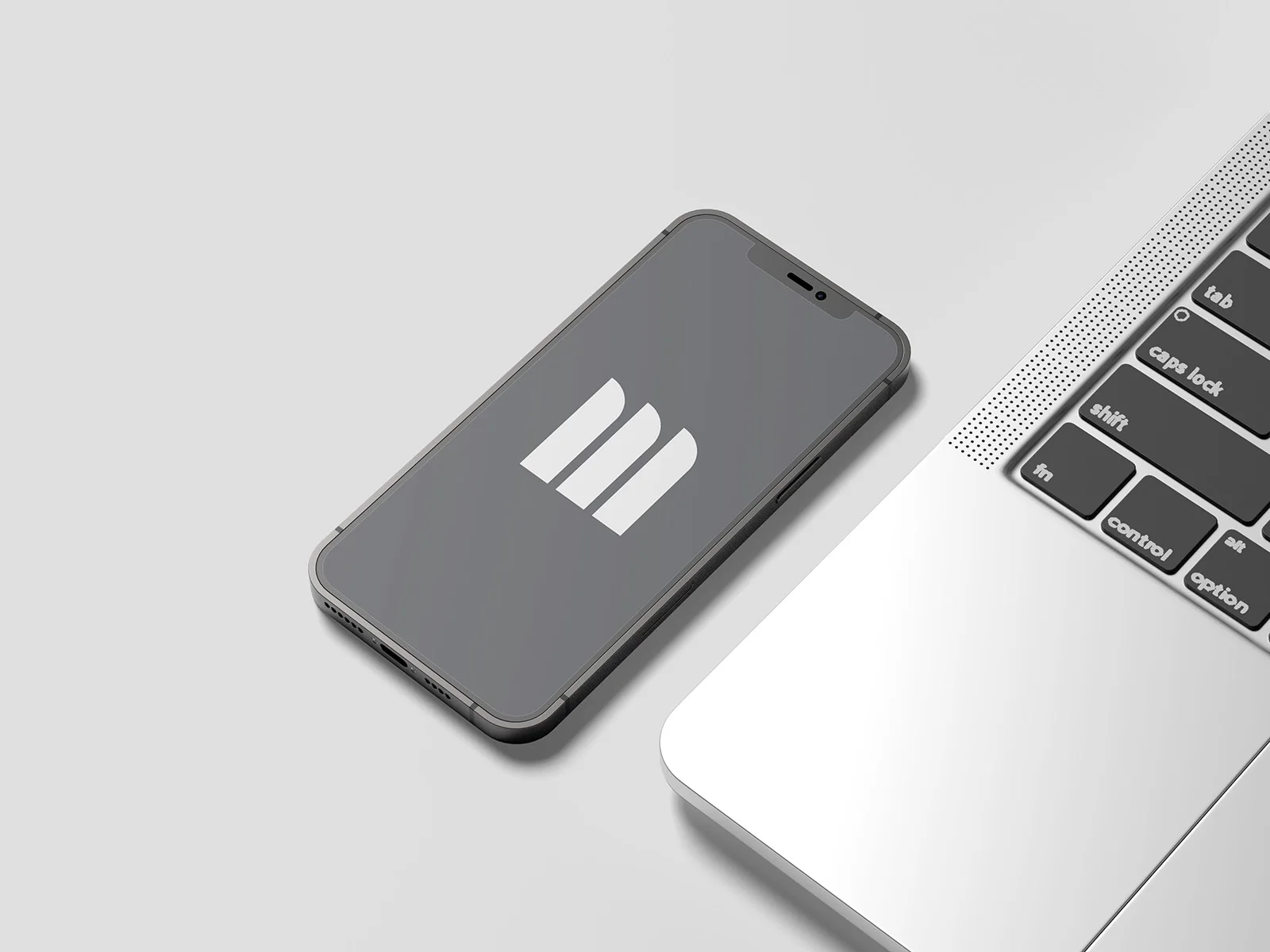
The symbol combines the initial M with references to the movement of a hand and a scalpel. In the monochrome screen presentation, its form remains clear without additional effects. The central idea also works without the full name beside it.
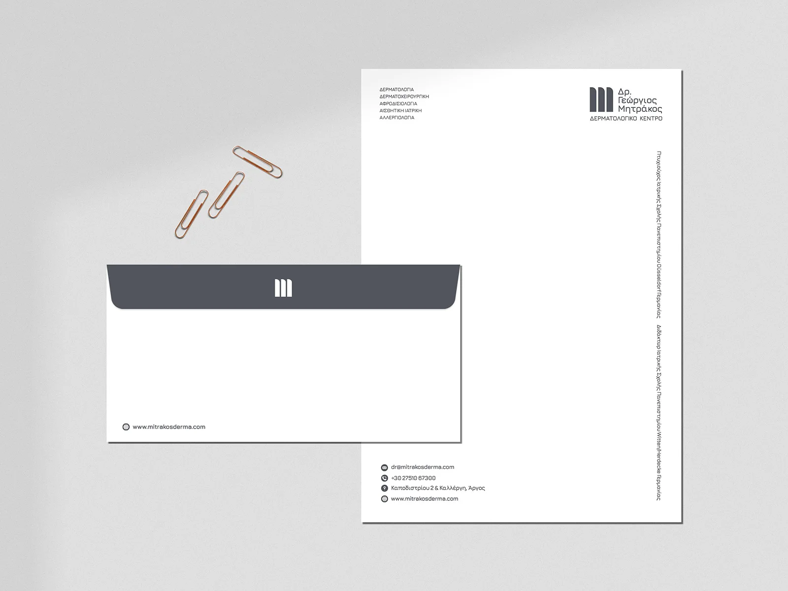
On the letterhead and envelope, the symbol, name and contact details follow the same restrained visual language. Grey, white and open space give the stationery consistency while keeping information readable.
Logo, visual identity and website: Hello Design. Images from the project presentation.


FROM DECISION TO APPLICATION
The identity for dermatologist Dr. George Mitrakos in Argos connects a distinctive symbol with corporate applications and a website. Its value can be assessed in that continuity across the practice’s communication.
The initial M combines with the movement of a hand and a reference to a scalpel. These elements establish a personal signature connected to the precision of the practice.
The logo provides the starting point for the corporate identity, rather than functioning as an isolated illustration.
The same design logic extends to stationery and the website. The digital presentation organises information about the practice and its services around the shared identity.
The project gallery shows corporate and digital applications together, making their relationship visible.
The client describes a continuing collaboration that includes print production oversight and regular website updates.
That account supports the practical outcome shown here: a common direction across the practice’s materials and its evolving website.
Project scope: Branding, logo and visual identity, and website design and development. Continuing print oversight and website updates are described in the client’s testimonial.
Save up to three projects as a starting point for our conversation. Your choices are stored temporarily in this browser tab.
You have no saved projects yet. Choose “Save project” on a project card or page.
Logo, print and environmental graphics inspired by the human touch.
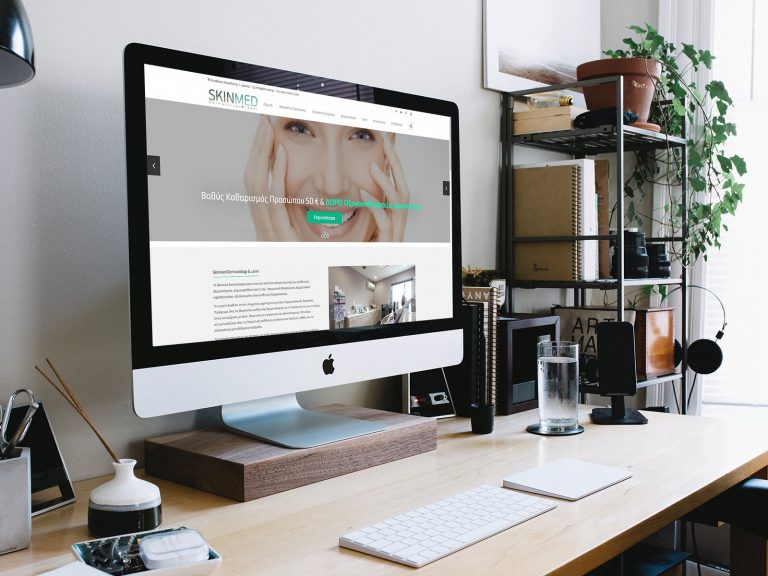
A dermatology website with clearly organised services, practice information and contact details.
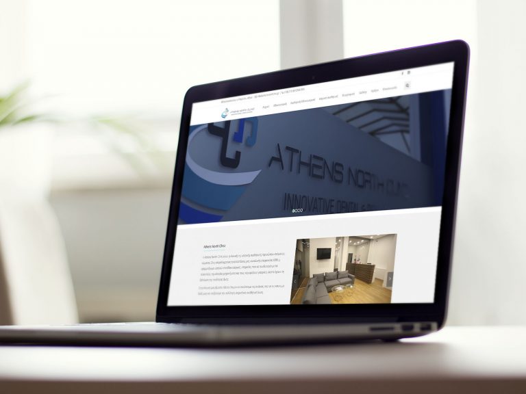
A website presenting the clinic’s dentistry and dermatology services through a clear, organised structure.