Everleaf
Corporate identity and website for a technical landscaping company.

DESIGN DECISIONS
From the business card to the project presentation, the aim was a shared visual language. Here is how two applications connect.
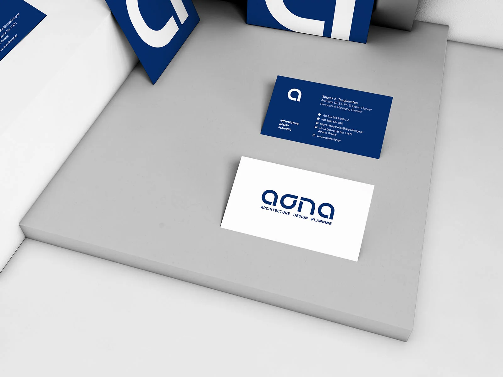
The logo keeps the name at the centre, with letters that share a geometric logic. On the cards, blue and white exchange roles while contact details retain a clear hierarchy. The same identity takes on different expressions within a small format.
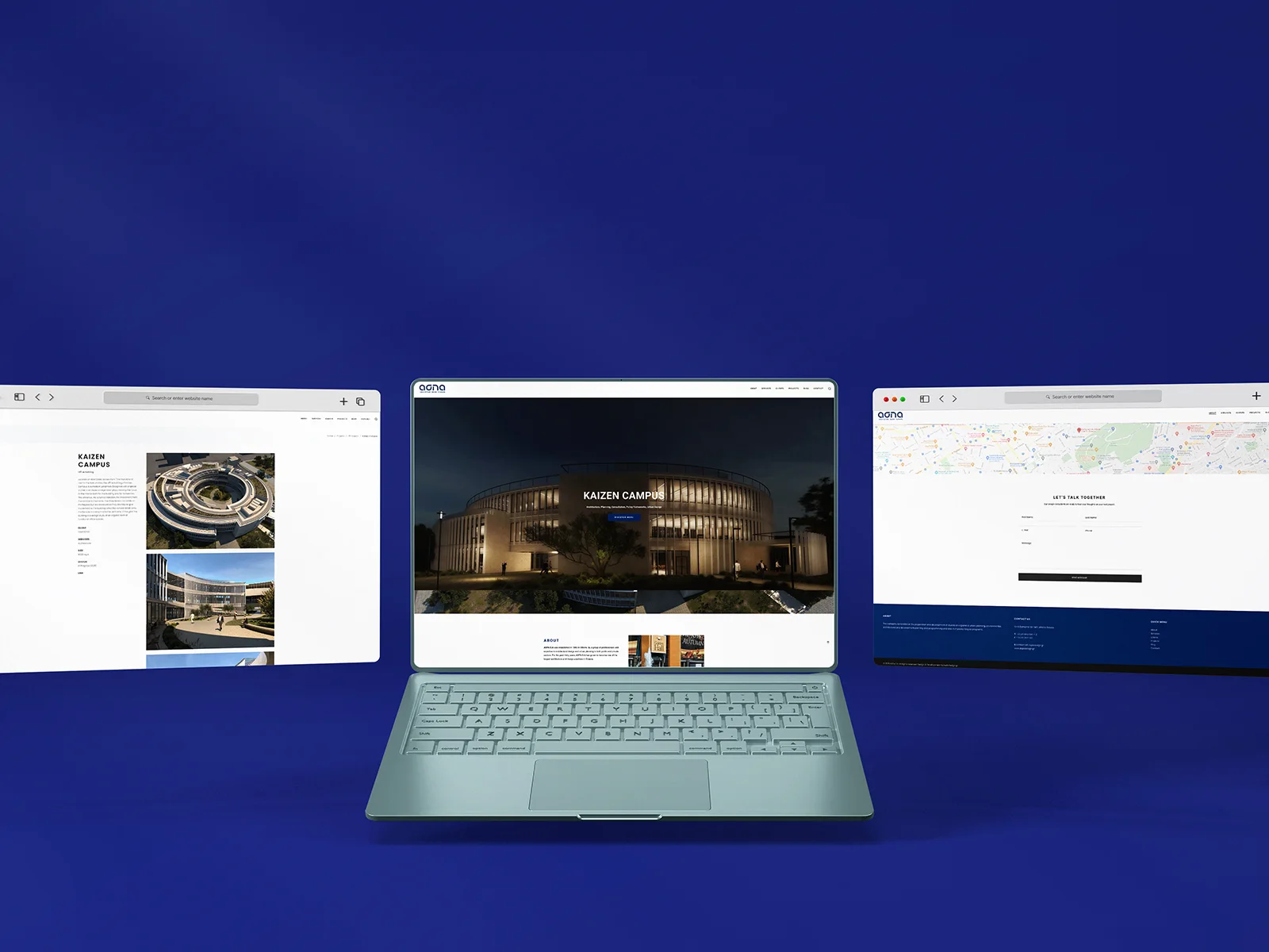
In the website presentation, large architectural images sit alongside restrained typography and clear sections. The logo and blue colour palette connect the screen with the stationery, giving the practice a consistent presence.
Logo, visual identity and website: Hello Design. Images from the project presentation.


Save up to three projects as a starting point for our conversation. Your choices are stored temporarily in this browser tab.
You have no saved projects yet. Choose “Save project” on a project card or page.