


From kingfisher to nest: The Nest Resort & Halcyon
When an idea for a restaurant gives a whole resort a new name.
This hospitality branding case study follows Hello Design’s work for The Nest Resort and its restaurant, Halcyon, in Hersonissos, Crete. The collaboration began as Golden Villas; the kingfisher identity designed for Halcyon then inspired the resort’s new name, nest symbol and shared visual language.
A first-hand case study by Hello Design · Identities 2022 · Menus 2023.
The starting point: Golden Villas.
The collaboration began under the complex’s previous name, Golden Villas. Hello Design had already completed its visual identity when a new requirement emerged: an identity for the restaurant within the resort. The brief gradually expanded as the space and its applications revealed further possibilities.
Halcyon and the kingfisher.
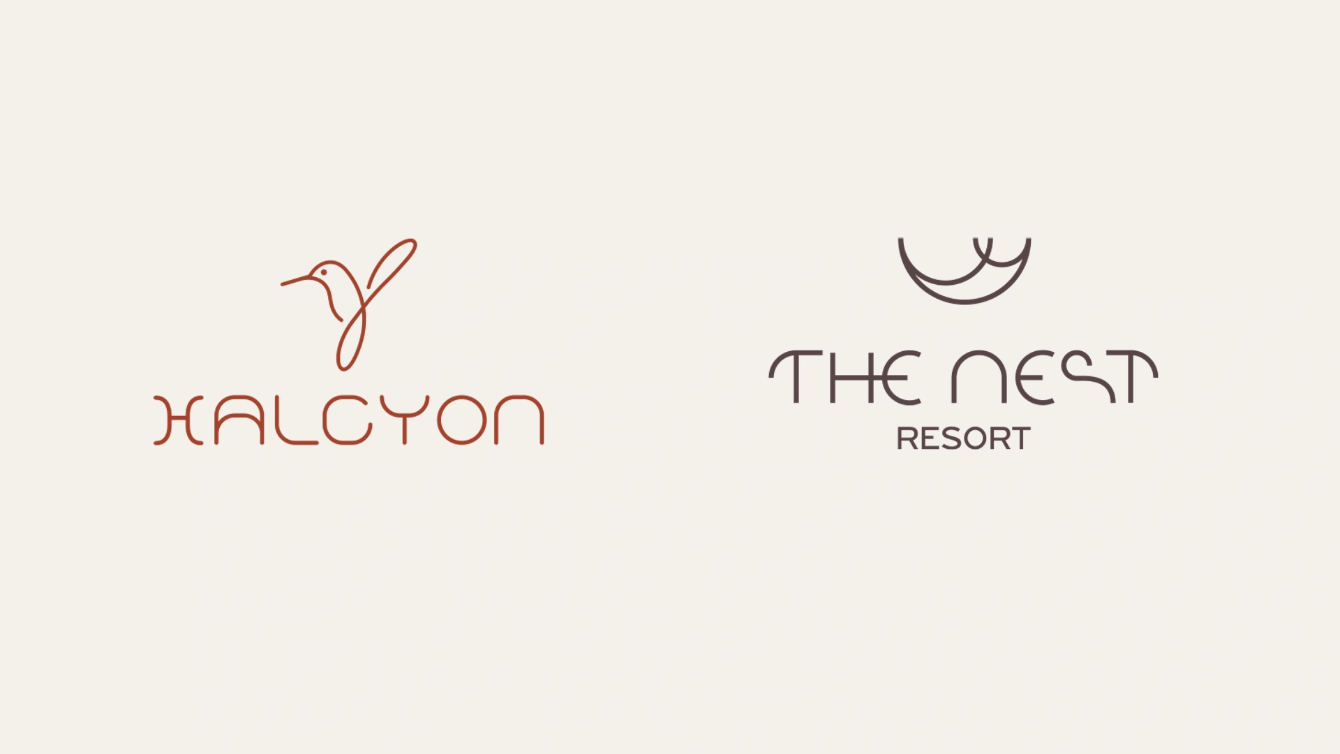
For Halcyon, we designed a symbol inspired by the kingfisher. The reference to the mythical halcyon days, calm and shelter gave the idea its conceptual depth. Its connection with Crete and the sea was expressed in restrained linework and a wordmark with the same design character.
The clients and project partners responded strongly to the symbol and wordmark. The restaurant identity had developed a character with the potential to support a broader idea.
A signage visit changes the scale.
Alexandros visited Crete to study the signage. Being on site also made it possible to consider the destination as a whole: arrival, accommodation, dining and the routes connecting them.
The ensuing discussion established that retaining the former name was no longer necessary. A new identity could express the evolving guest experience more clearly. The work on the restaurant became the starting point for reconsidering the resort’s central brand.
From the bird to its nest.
The move from Halcyon to The Nest gave the two identities a natural relationship. The kingfisher led to its nest: a place that welcomes, shelters and offers a sense of belonging. The name The Nest Resort extended that thinking across the destination.
The nest symbol was drawn with a few essential curves, continuing Halcyon’s restrained approach. The two brands retain their own forms and colours — deep warm brown for the resort, terracotta for the restaurant — while sharing a common design logic.
Bringing the idea into the guest experience.
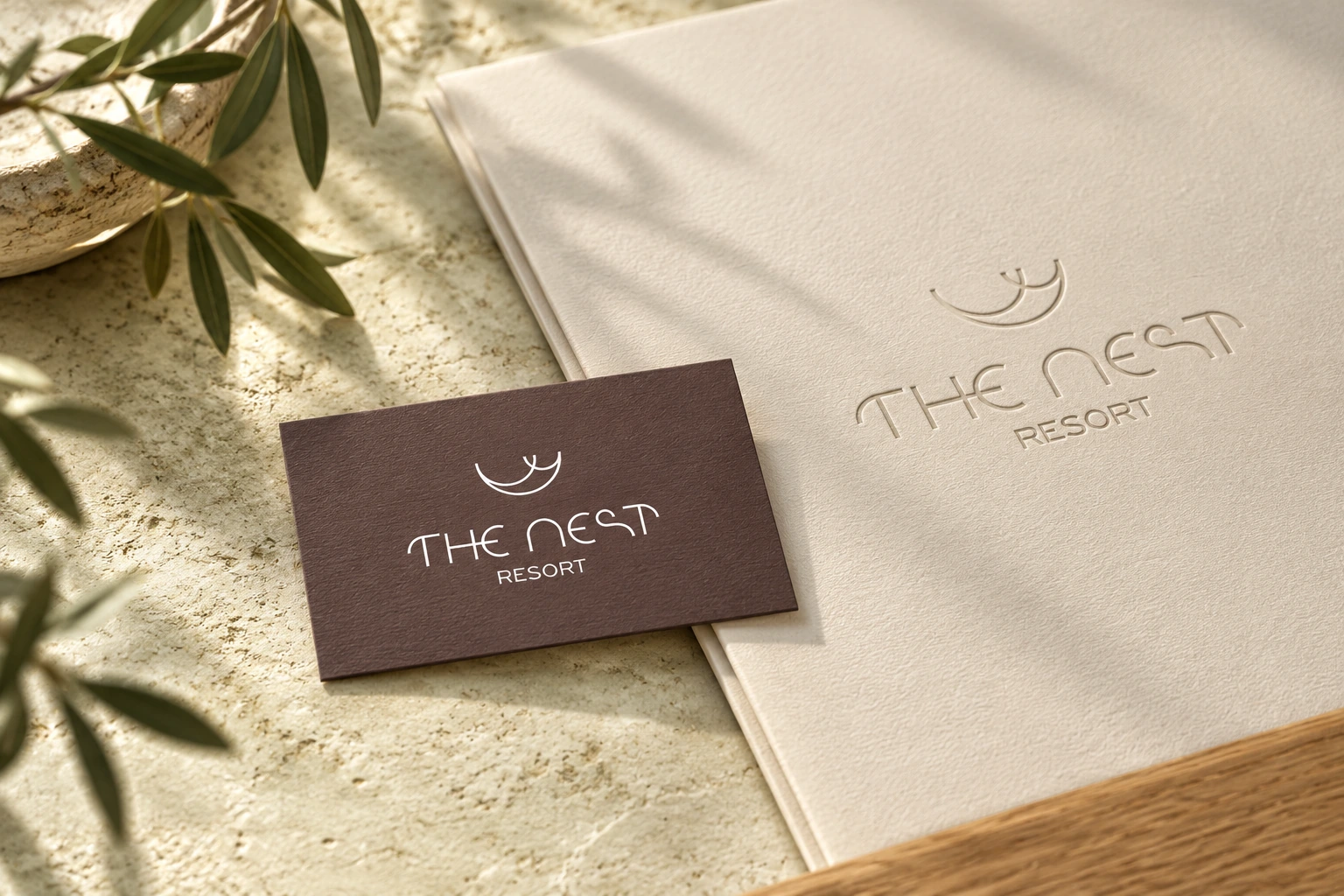
The identity developed across cards, guest stationery, room key-card holders and menus, alongside the study of signage, wayfinding and environmental graphics. The resort’s architecture and construction by MAMAproject provided the setting in which those applications needed to work coherently.
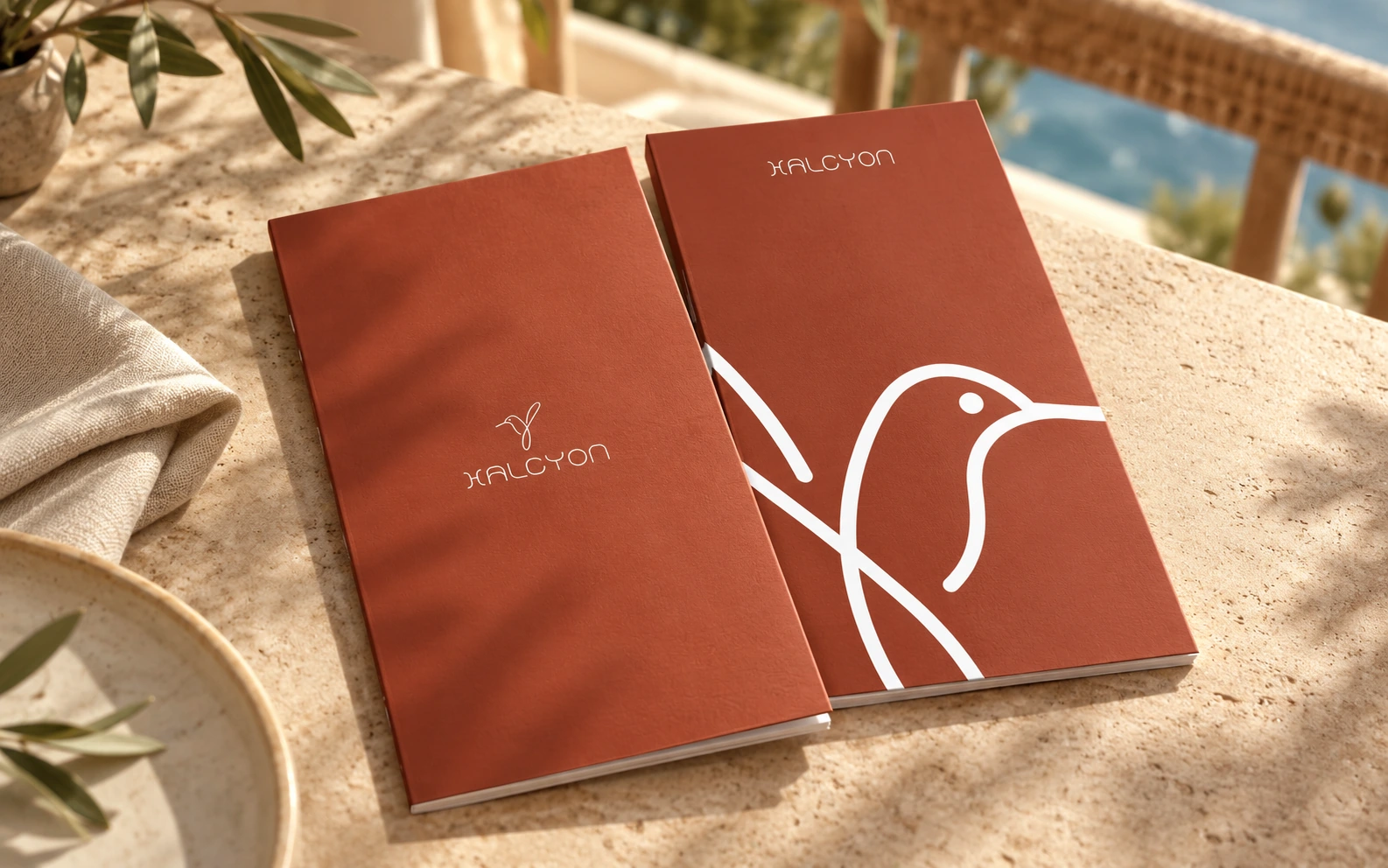
The bilingual menus developed in 2023 show the kingfisher linework operating at different scales. The same symbol works as a small signature, a large graphic and a connecting element across the applications.
What this journey demonstrates.
In this project, the relationship between the central brand and its restaurant took shape during the work. Attention to a specific need, the response of the people involved and a visit to the site made it possible to recognise a broader opportunity. The result is two distinct identities within one shared world of hospitality.
New application visualisations accompany the original final artwork and the archive mockup.
Explore the two branding projects.
The Nest Resort — naming and visual identity
Halcyon — restaurant logo and visual identity
Official references: The Nest Resort · MAMAproject — architecture and build