


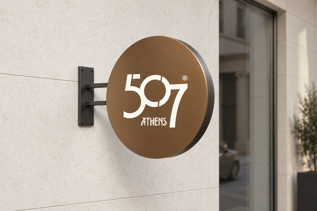
507 BC: a name rooted in Athens
The name points to the beginnings of Athenian democracy and the city’s enduring contribution to ideas of participation and public life. For a contemporary hotel, this historical reference gives the identity a specific sense of place. Athens becomes the starting point of the brand’s story.
The design carries that story into the present through clear forms, generous space and a restrained visual rhythm. Its character belongs to an urban hospitality experience: thoughtful, confident and closely connected with the city.
Custom typography as a bridge across time
The custom lettering of “ATHENS” draws on the visual character of ancient Greek inscriptions. Angular constructions and distinctive diagonal cuts give the word a recognisable, almost carved presence. Within the logo, this lettering is paired with fluid, connected numerals. The contrast brings an ancient reference into a contemporary graphic language.
The joined 5, 0 and 7 form one compact mark. The breaks in the circular zero and the extended seven give it its rhythm and silhouette. Bronze, ivory and charcoal allow the identity to move naturally between paper, metal, glass and fabric.
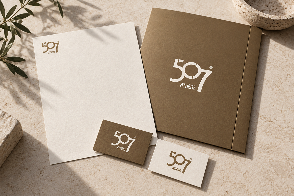
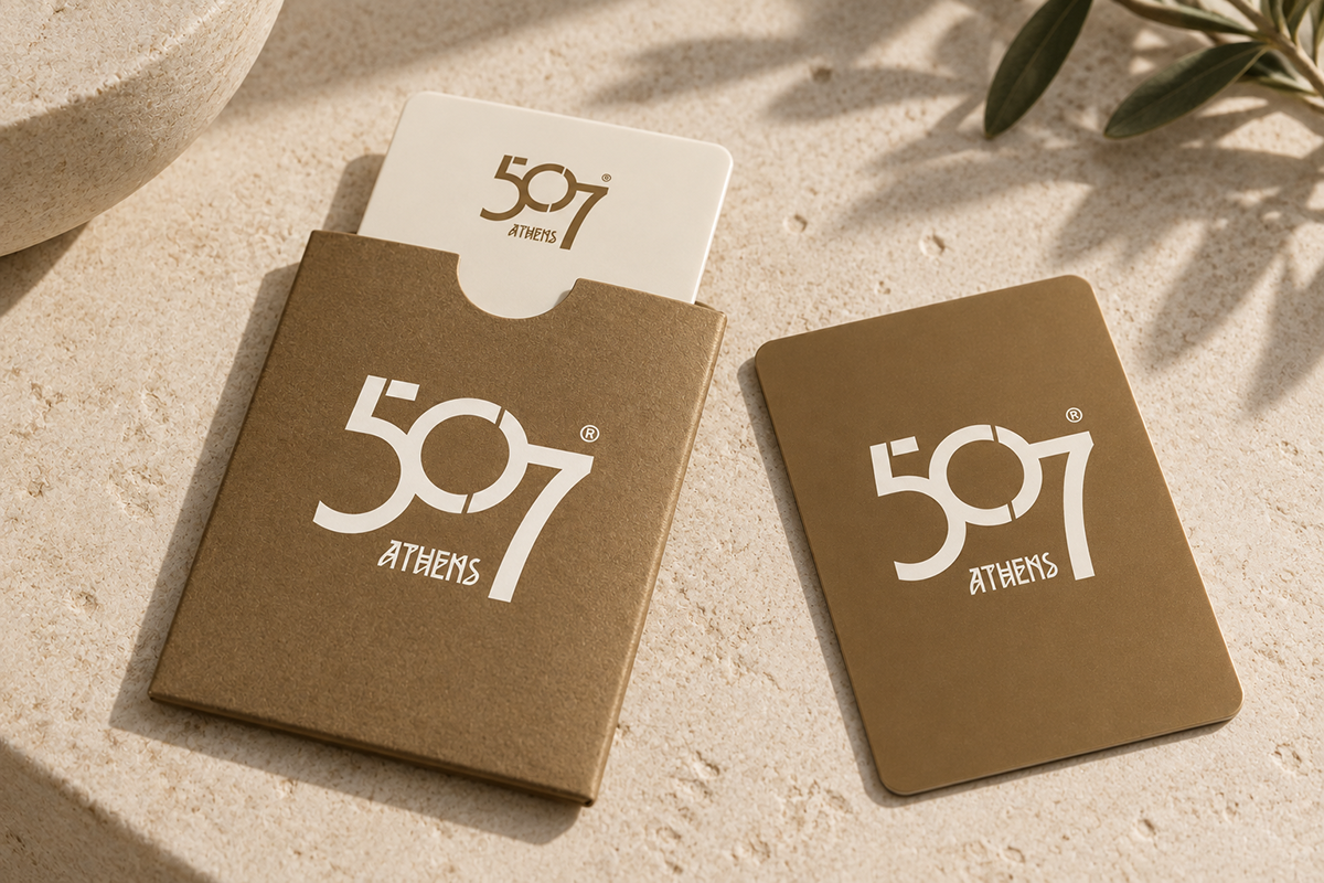
The first moments of a stay
Exterior signage introduces the mark at architectural scale. Stationery, business cards and the key-card sleeve bring the same language into the welcome: a consistent emblem, considered proportions and tactile materials. The identity remains recognisable as its scale and surface change.
A warm bronze sign against pale stone and a crisp ivory mark on textured paper express the same idea with different materials. These are small encounters with the brand that can give an arrival its particular character.
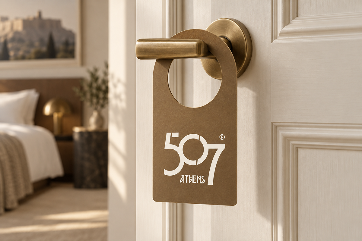
A shared language for everyday details
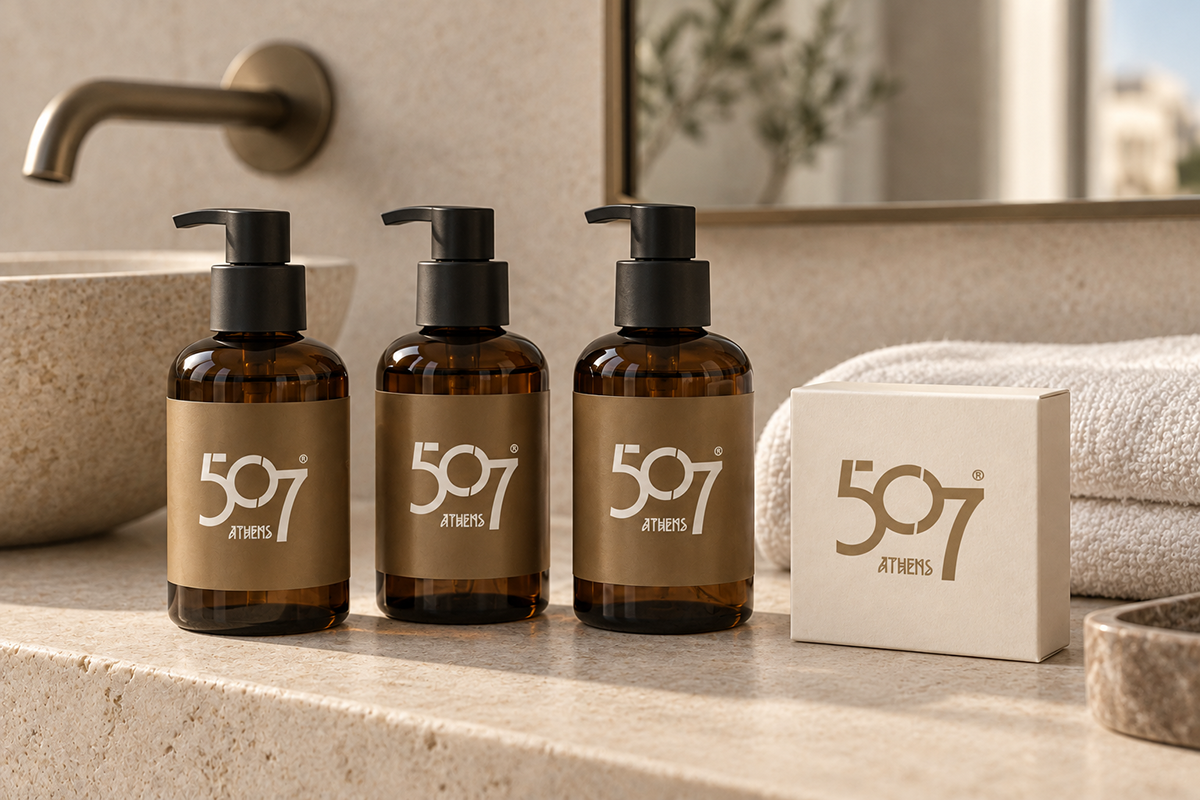
The door hanger and amenities packaging extend the identity into the room. Each application leaves room for the product and its function, using the mark at a measured scale. A common palette connects these details without making every object look identical.
The approach reflects the character of 507 Athens: contemporary comfort and privacy, with an Athenian point of view.
An identity to live with and take away
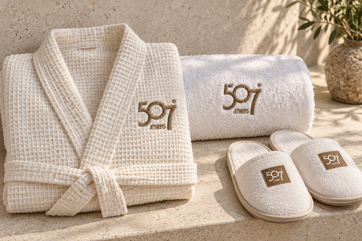
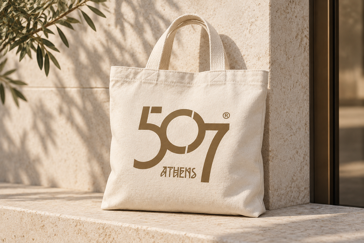
Embroidery on the spa textiles gives the graphic identity a tactile expression. The canvas tote carries it beyond the hotel into the city. Across the seven applications, the historical meaning of the name remains the common starting point, expressed through a contemporary hospitality vocabulary.
Visual identity, logotype and typographic direction: Hello Design.
Project: 507 Athens, Athens, Greece.
Identity presentation: 2023.
The seven images are concept mockups showing applications of the visual identity.