


Retroverse · Brand experience
Retroverse: how branding transforms the hostel experience
At Retroverse, check-in happens at a “Checkpoint”, floors become levels and a room welcomes you with “Level Up Your Stay”. These small shifts in the language of hospitality express a larger idea: branding can become part of the experience a guest actually lives.
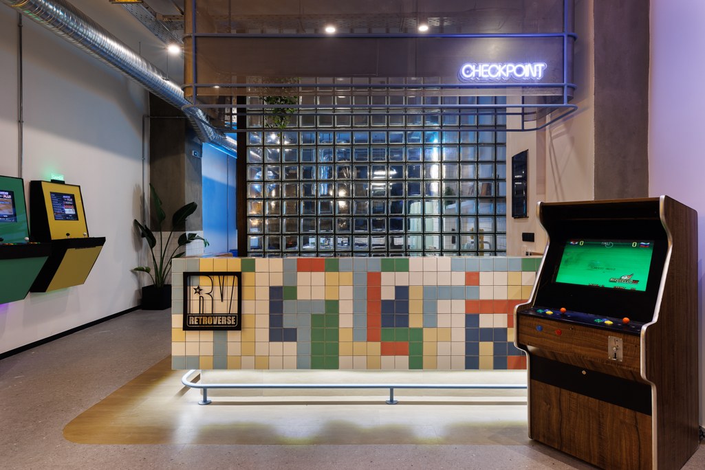
For Hello Design, Retroverse Hostel in Athens is a project that began before it had a name and continued through to production-ready artwork. We conceived the brand concept, created the name, logo, colours and visual identity, and designed the environmental graphics, signage, decorative posters and all neon signs. MAMAproject designed and delivered the architecture.
An idea rooted in Athens
The neighbourhood around Kaniggos Square and its connection with arcade culture sparked the initial brainstorming. Retro gaming offered a useful starting point for a hostel: a world that people can enter, explore, play in and share with others.
That thinking gave the project a direction. Every decision could serve the same story, from the first impression at the entrance to the smallest number on a bed. The concept became a shared reference for the identity and its applications throughout the building.
Retroverse: a name with room for memories
The name brings “retro” and “universe” together. It holds the familiarity of another era while opening a world for new memories. For travellers, that promise can connect discovering Athens with the people and moments they encounter during their stay.
The RV emblem with its star, emphatic typography and vivid red, blue, green and yellow give that world a visible form. The graphic language draws on the energy of the 1990s, music television and street culture, alongside the playful logic of pixels.
The entrance starts the story
Exterior signage and window graphics introduce Retroverse to the street. Inside, the reception logo and “Checkpoint” neon continue the narrative. Guests meet the hostel’s character before they reach their rooms.
“Checkpoint” works as both information and an idea. It identifies the reception while borrowing a gaming term for reaching a new stage. An everyday procedure gains a particular voice.
Wayfinding speaks the brand’s language
In a hostel, a guest needs to find a floor, room, bed and storage space. Signage has a practical task. At Retroverse, numbering, names and graphics were developed within one visual system.
Floors become levels; room identities and bed and storage numbers carry the language into smaller details. Consistency helps people recognise information and gives their route a sense of continuity. The playful character belongs to how information is presented, while clarity remains essential.
Neon gives each room a voice
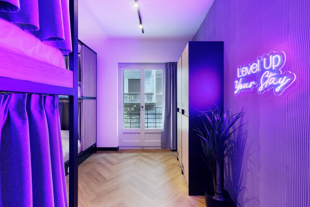
“Level Up Your Stay”, “Quest Accepted” and “Pixel Dreams Await” connect rest with the Retroverse world. We designed every neon sign as part of the same family, considering the composition, typography, position and scale of each application.
Light changes the atmosphere; a phrase gives the room personality. A guest can remember a space through an image and a message encountered there. The identity gains an emotional dimension in the everyday experience.
Posters create a world to explore
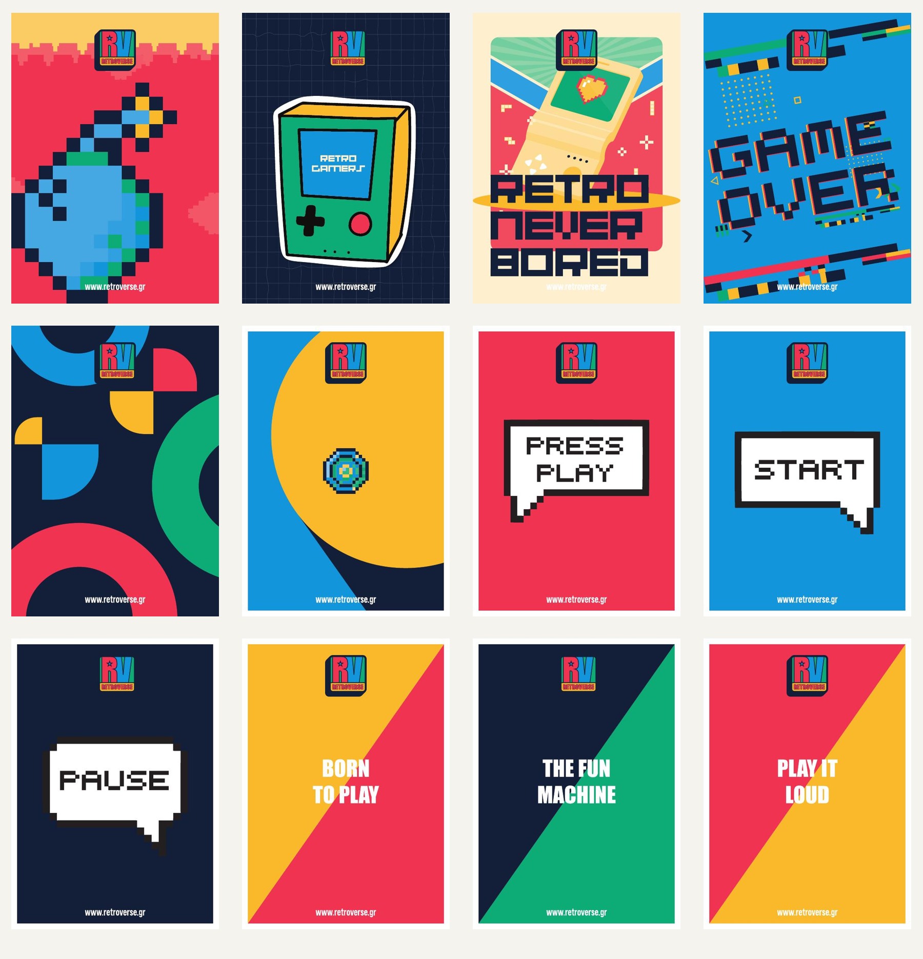
Gaming symbols, geometry, pixels and short verbal invitations build a broader poster system. “Press Play”, “Start”, “Pause” and “Born to Play” are different expressions of the same character. Each image works individually, while the collection holds the brand together.
Across rooms and shared spaces, these applications add details to notice and remember. They accompany hostel life and give its different moments a consistent visual setting.
From a stay to an image you share
A recognisable mark, a neon phrase or a poster can follow a guest into a photograph they keep or share. Retroverse frequently features the space on its official Instagram. A consistent identity gives those images a common character as viewpoints, lighting and people change.
A complete experience with one starting point
Retroverse shows what a common direction can bring to concept, naming, identity and environmental graphics. The same creative thread runs through arrival, orientation, rest and the images a guest takes away.
For us, that is the heart of the project: an idea expressed as a name, an image, information, light and a distinctive hospitality character.
Explore the complete Retroverse case study ↗
Brand concept, naming, identity and all graphic applications: Hello Design. Architecture & design/build: MAMAproject. Architectural photography: Panagiotis Voumvakis. Official Retroverse website.