


The starting point
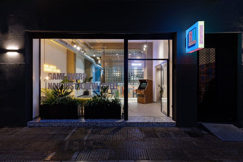
In central Athens, around Kaniggos Square, the neighbourhood’s connection with arcade culture became the spark for a new hospitality concept. We saw an opportunity to give travellers more than a place to sleep: a shared setting with the energy, colour and playful attitude of retro gaming.
A name that opens a world
Retroverse brings together “retro” and “universe”. Nostalgia becomes the starting point for discovery, connection and new memories. That idea gave the project a direction from the very beginning, before it became a logo or a sign.
The identity
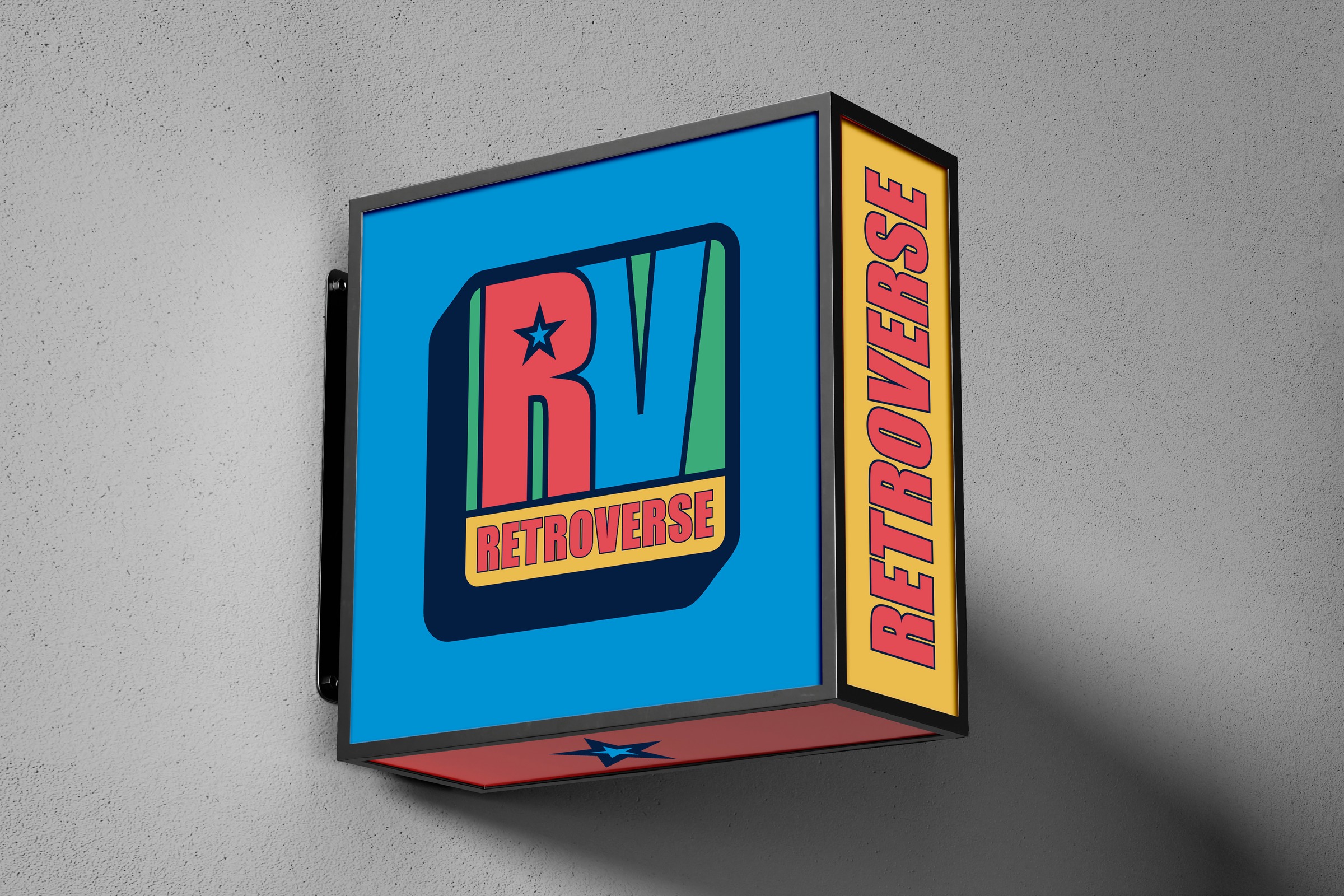
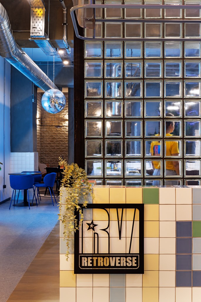
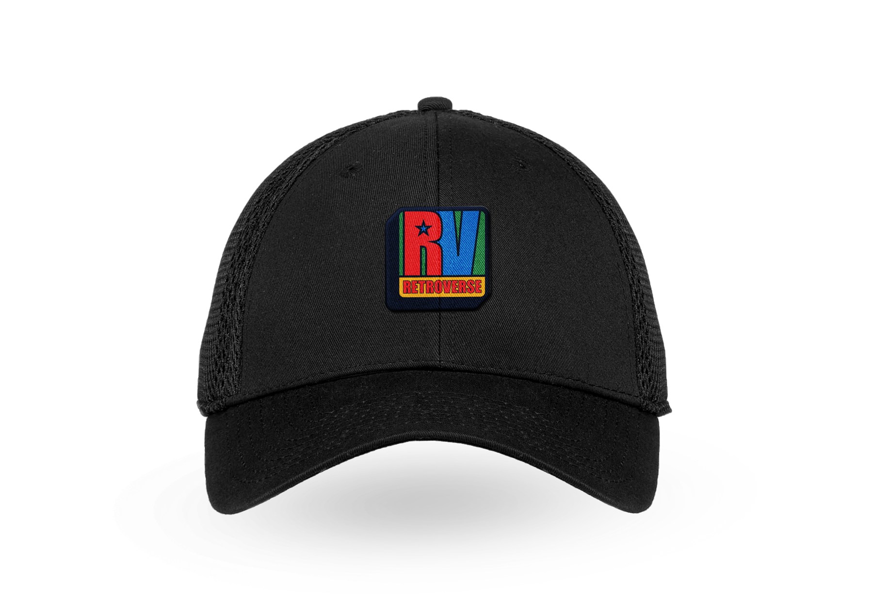
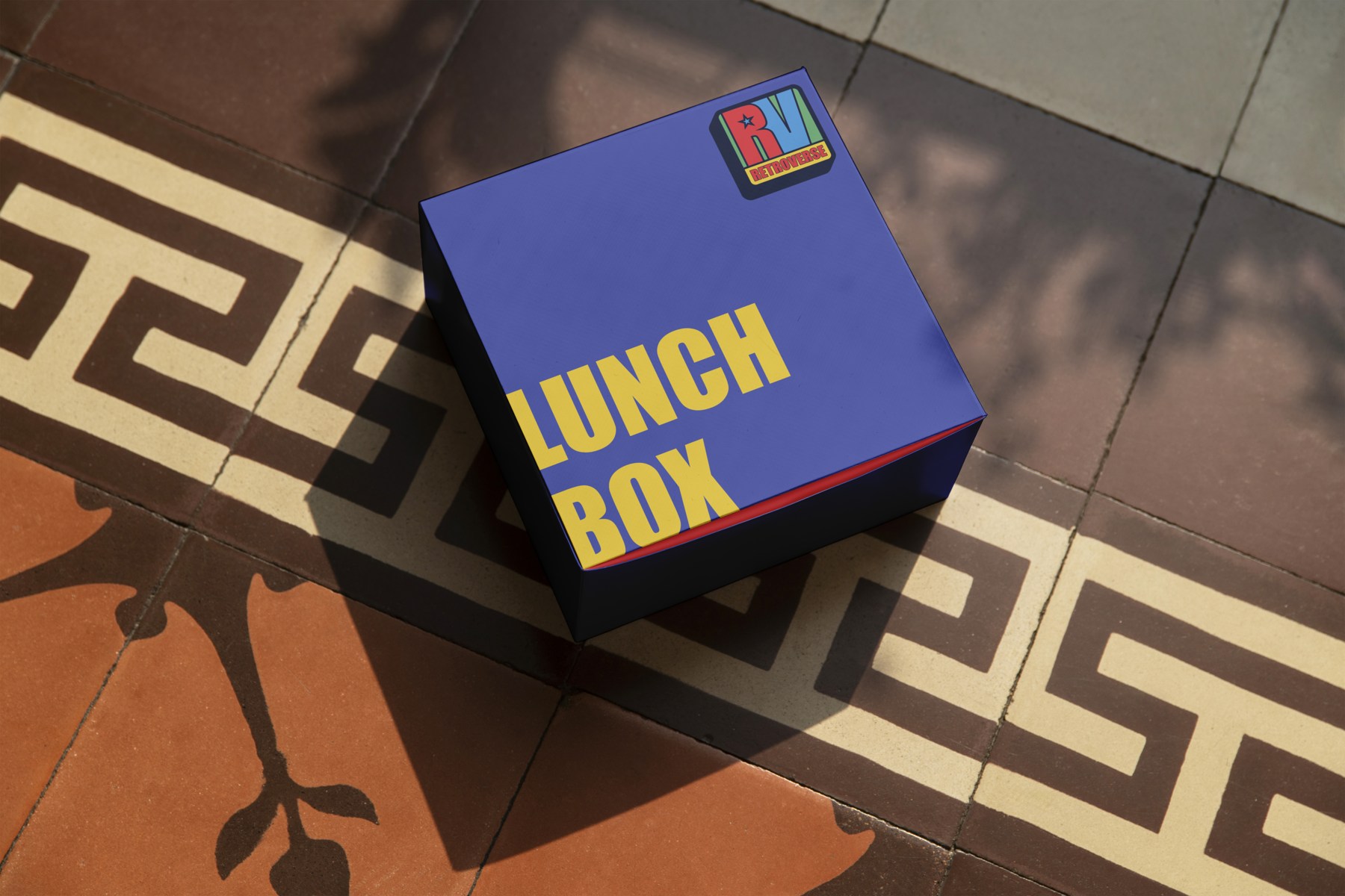
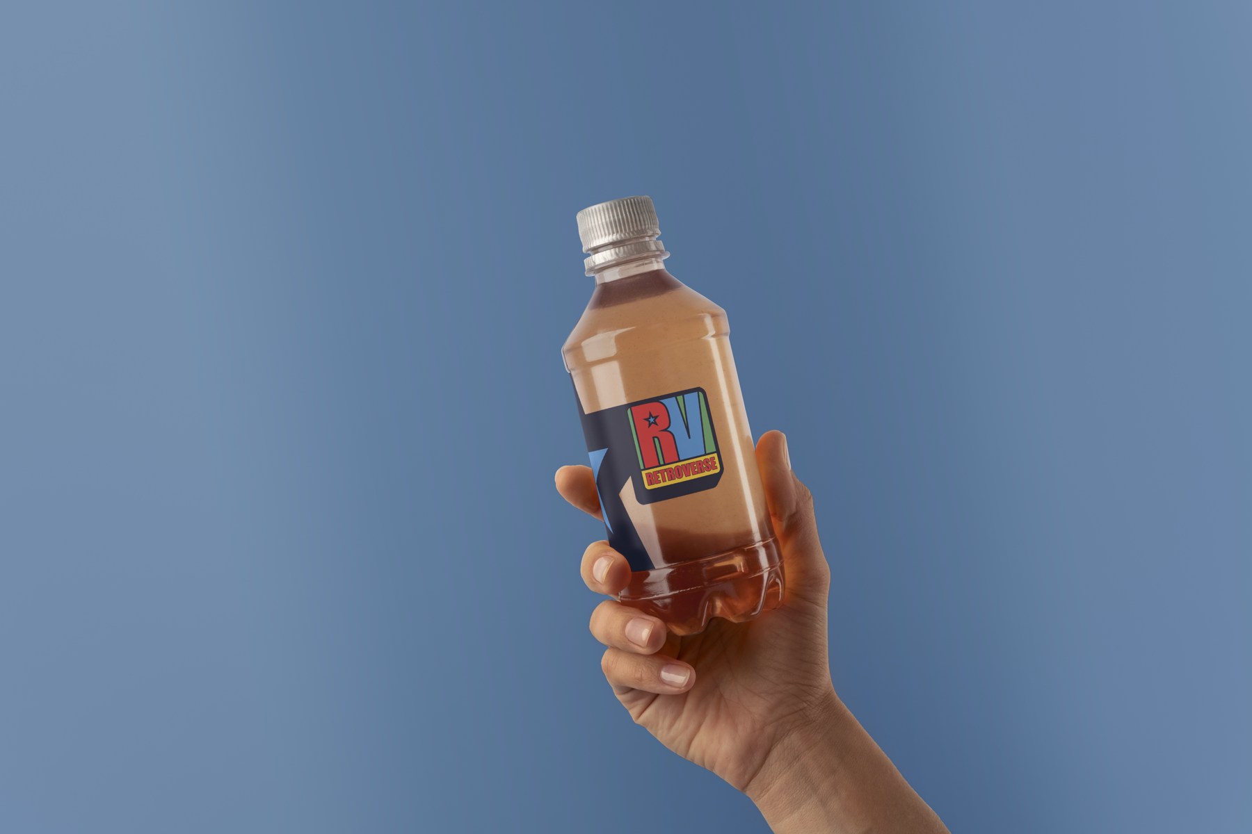
A bold RV emblem, a star, emphatic typography and a vivid palette of red, blue, green and yellow create a recognisable visual language. Its influences reach beyond pixels to the graphic energy of 1990s music television and street culture. The identity is designed to work as a complete family, from a compact mark to a large architectural application.
The brand becomes the stay
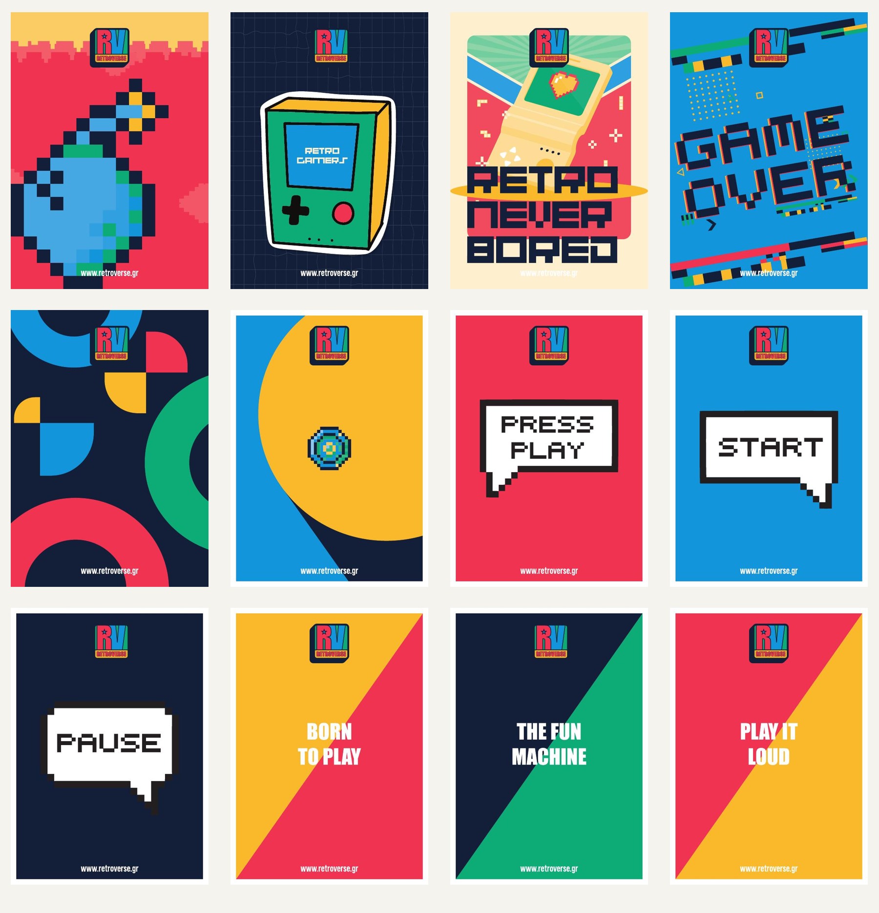
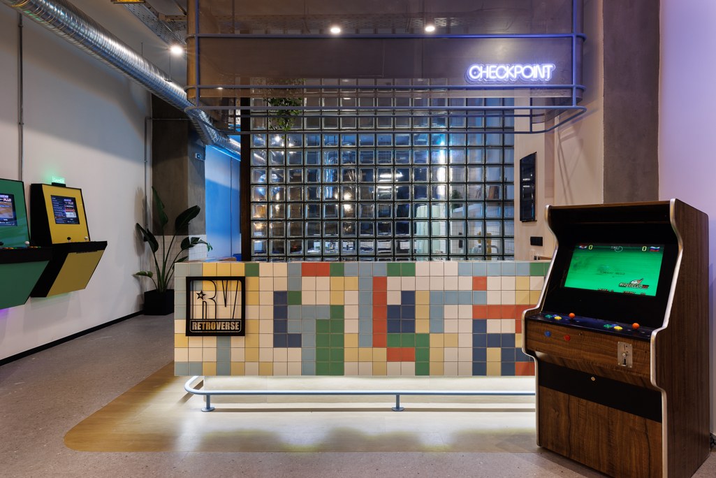
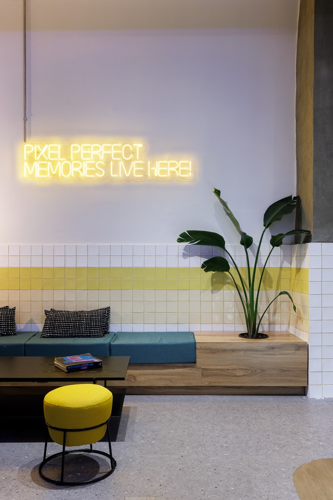
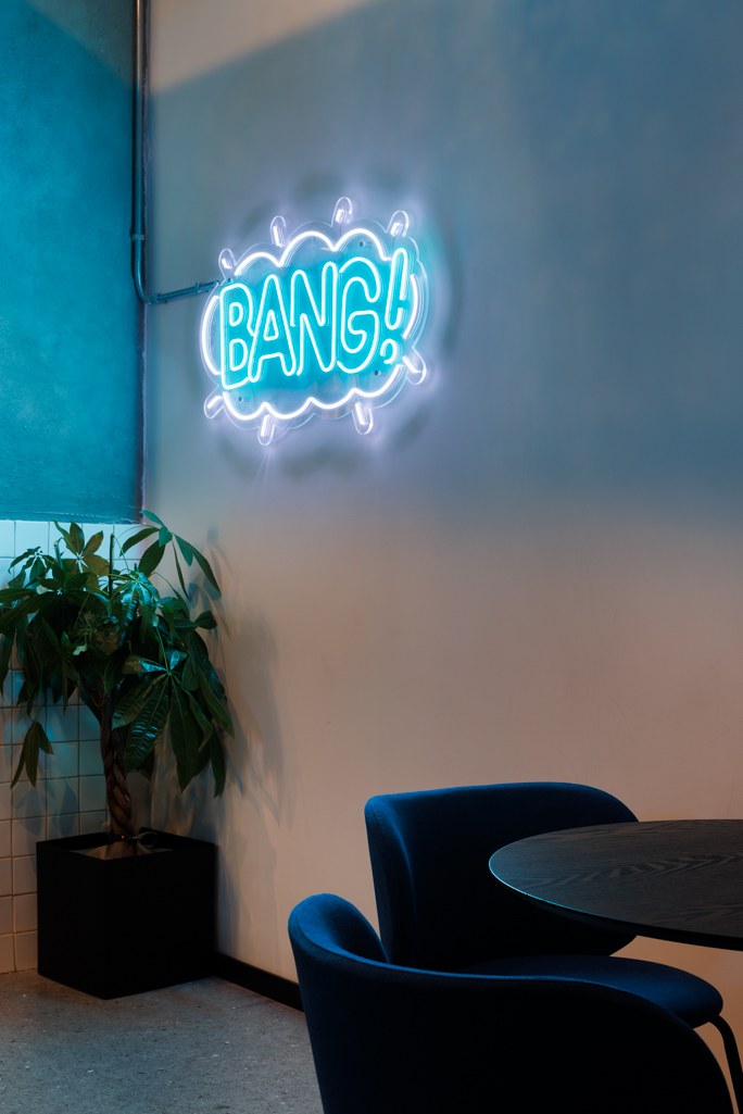
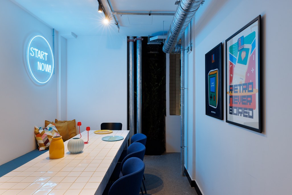
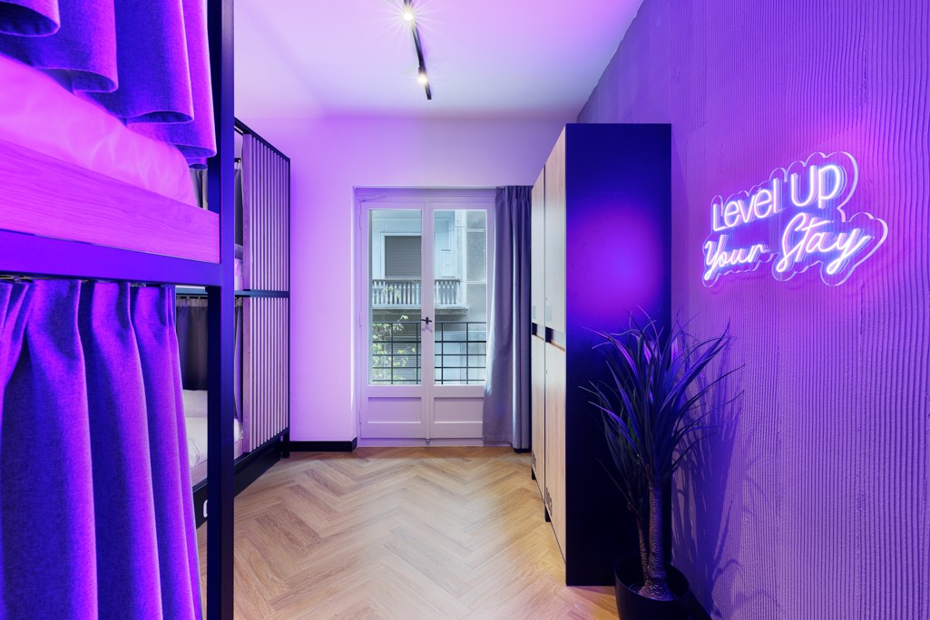
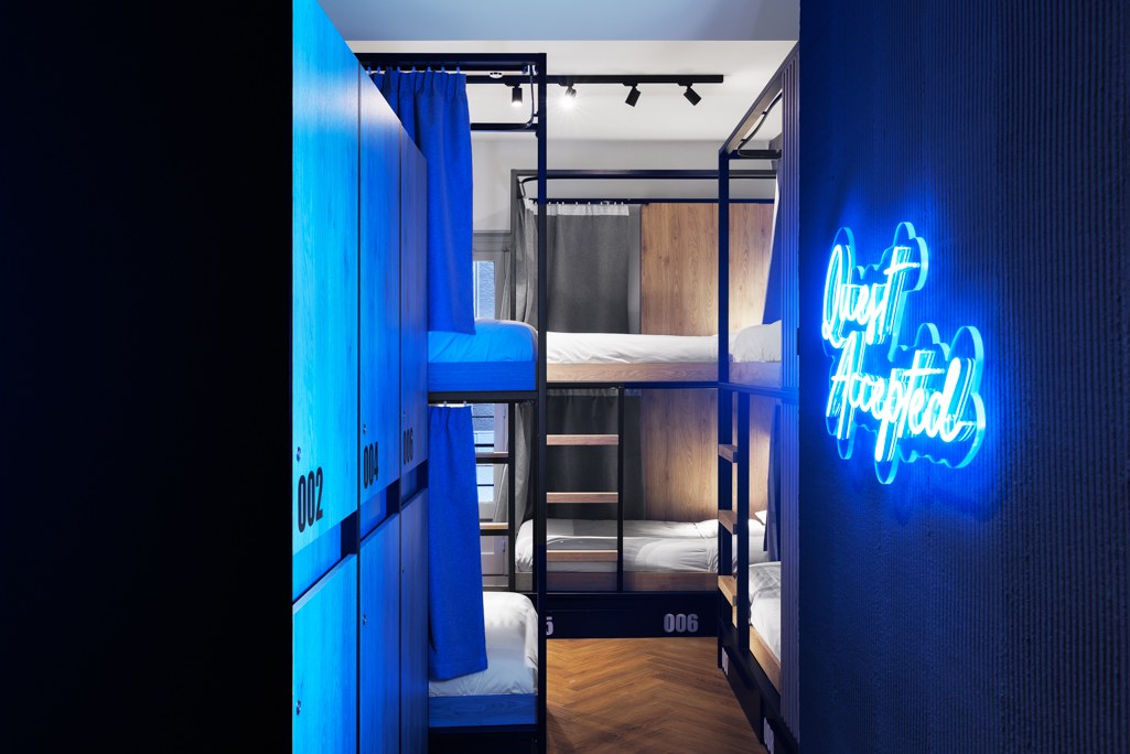
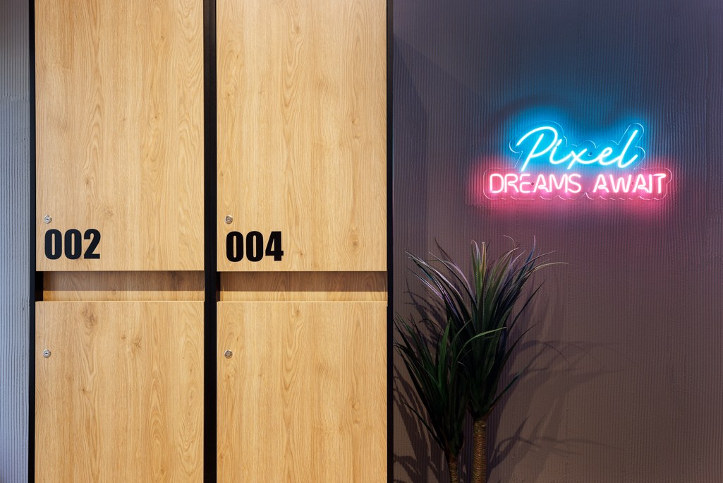
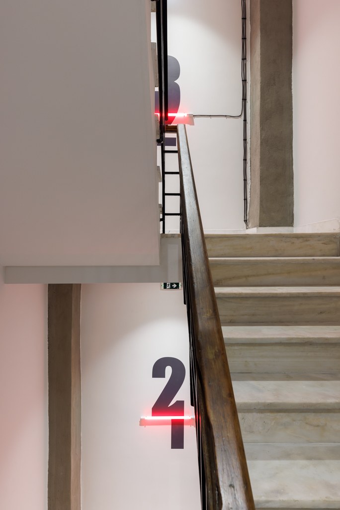
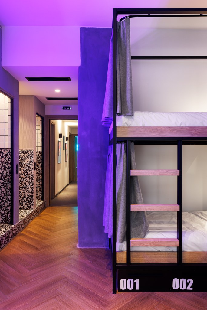
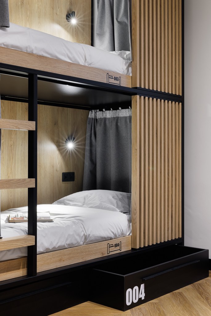
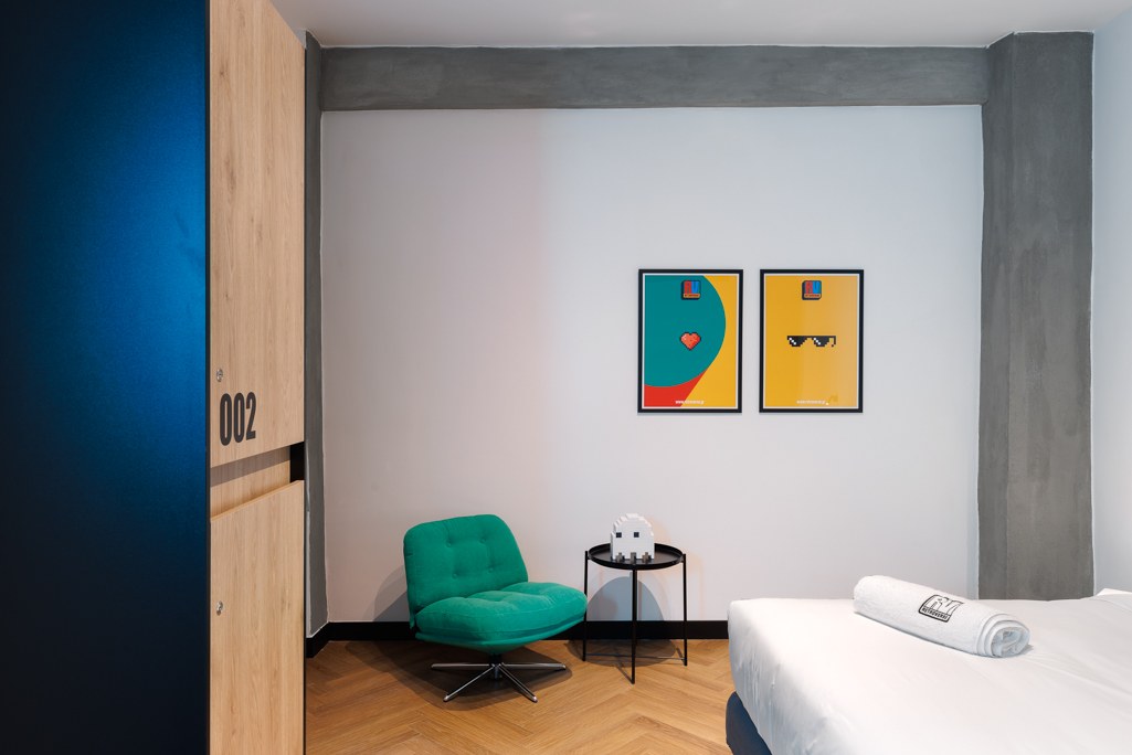
We carried that language through external and internal signage, room identities, floor, bed and storage numbering, environmental graphics, decorative posters and all neon sign designs. The reception becomes a “Checkpoint”; movement through the building becomes a journey through levels; messages such as “Level Up Your Stay” give each room its own voice.
Practical information and playful expression share the same system. A number helps a guest find their bed. A poster invites a second look. A neon message changes the mood of a room. Together, they make the brand tangible in everyday moments.
Exploring the applications
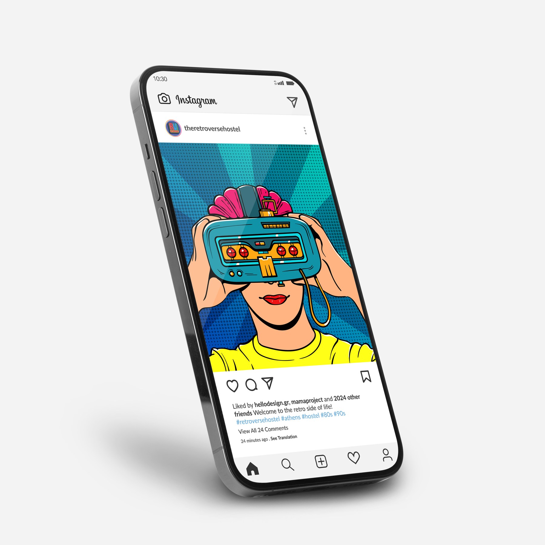
Τhe identity across signage, print, clothing, packaging and digital visuals.
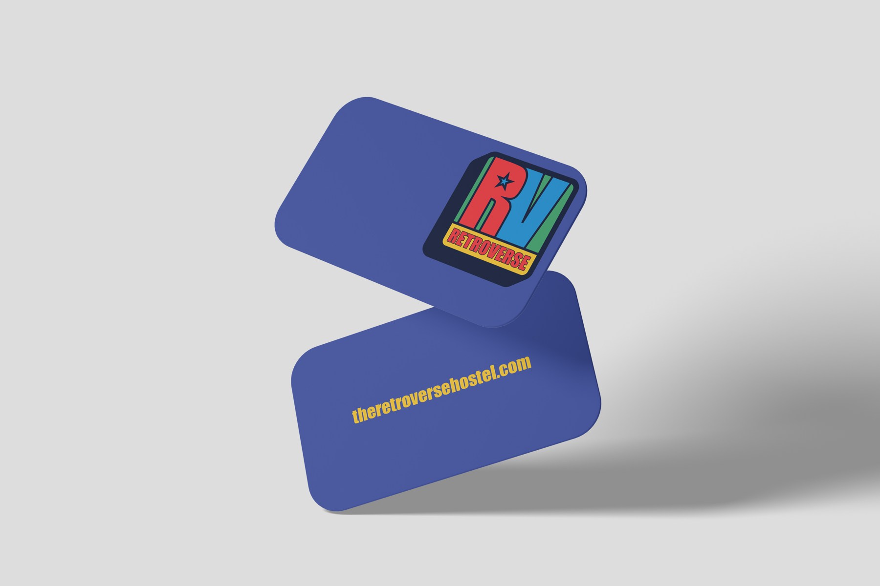
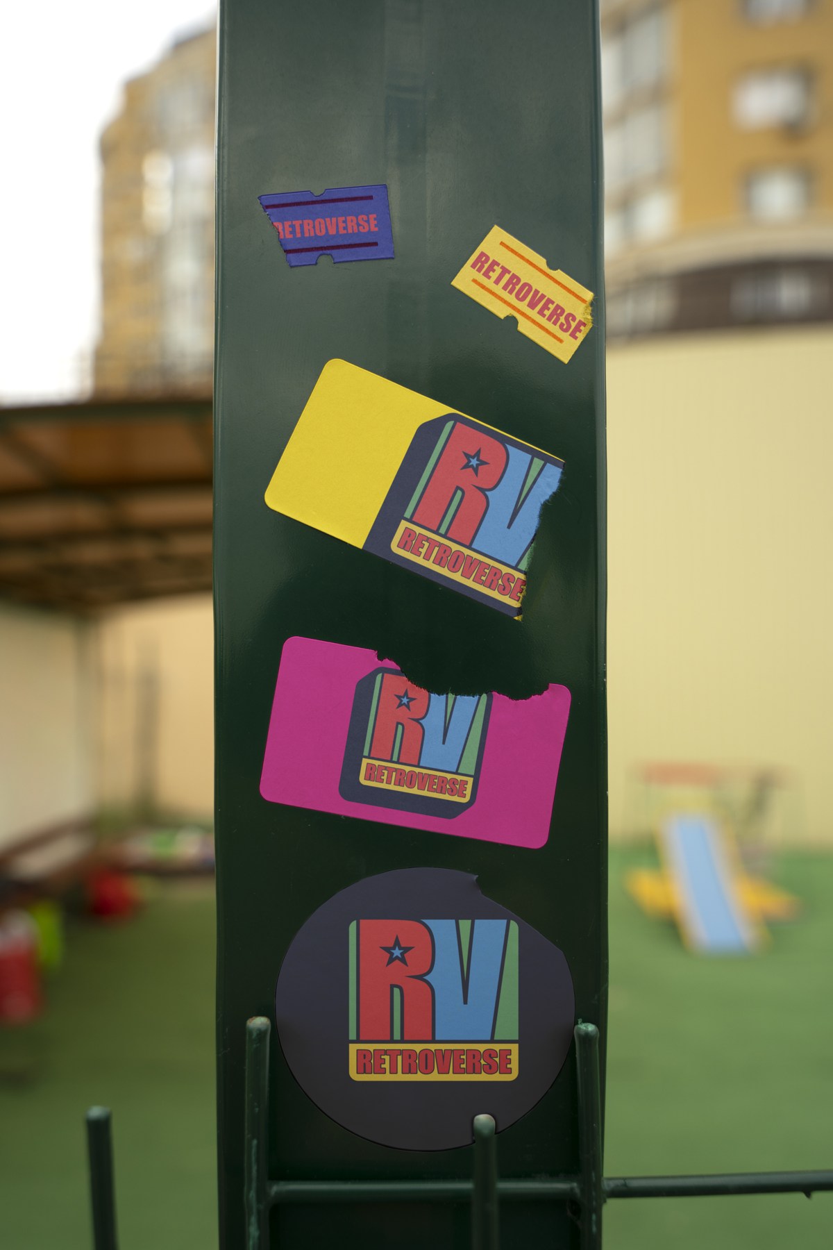
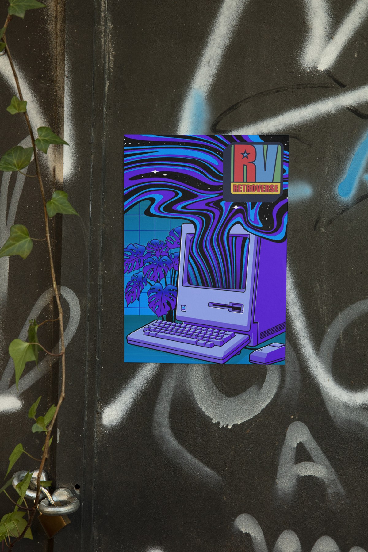
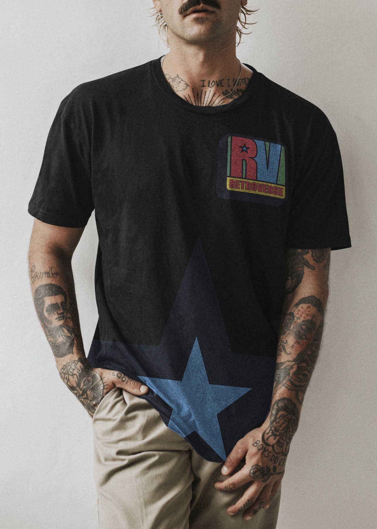
One idea, many touchpoints
The result is a hospitality identity that guests can encounter, navigate and remember. It gives the space a distinctive voice and a consistent presence in photographs and social content. Our contribution extends from the first concept and naming to the detailed artwork prepared for production.
Brand concept, naming, identity & all graphic applications: Hello Design.
Architecture & design/build: MAMAproject.
Architectural photography: Panagiotis Voumvakis.
Explore Retroverse · Instagram
Read the story: how branding transforms the hostel experience ↗